Antec NX700 Mid-Tower Case Review
Peter Donnell / 3 years ago
Complete System
Building a system inside this case couldn’t have been much easier. While I don’t mean this in a negative way, the design is pretty standard. So overall it feels very familiar and there were no unpleasant surprises to be found throughout the build process.
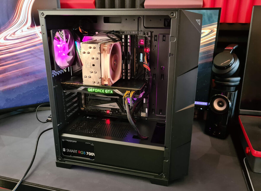
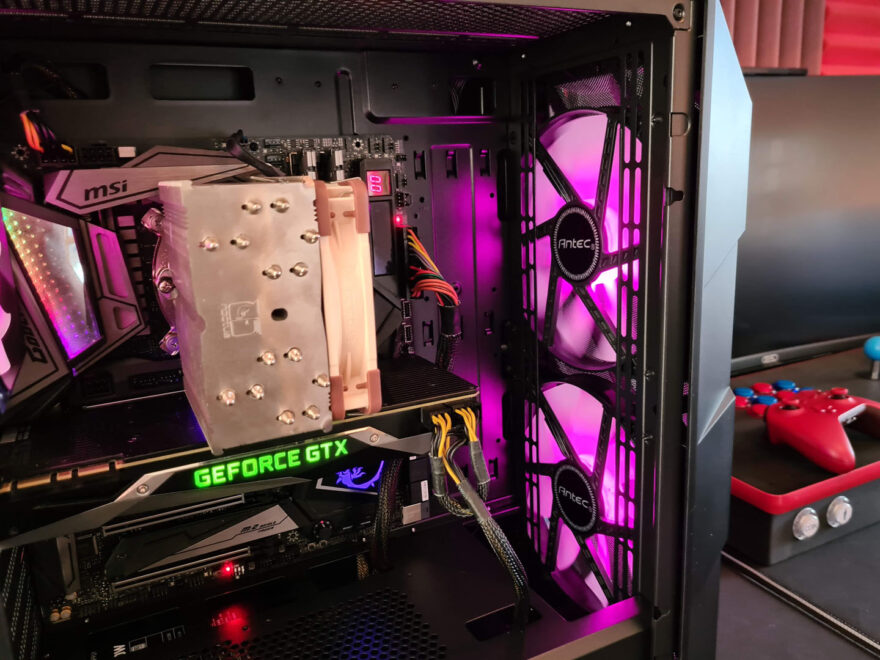
The cable management space behind the motherboard is a little bit tight, but otherwise, it was sufficient. And of course, having the power supply shroud meant that the bulk of cables can be stuffed underneath it, keeping things looking much neater and tidier overall. I put an E-ATX motherboard in here just fine too, but had to run the 24-pin cable vertically also.
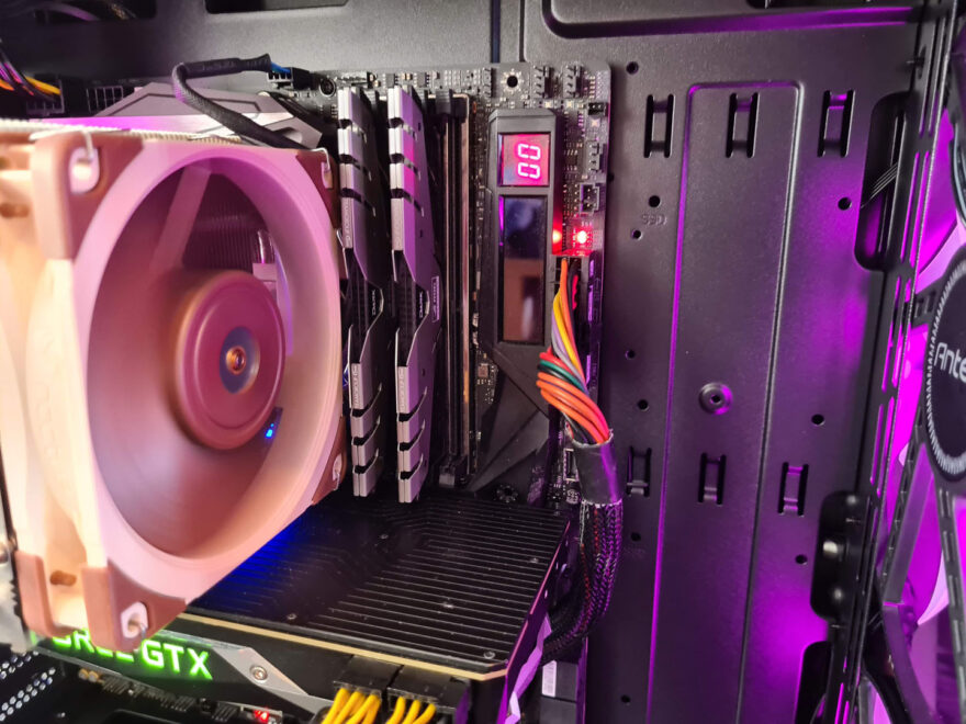
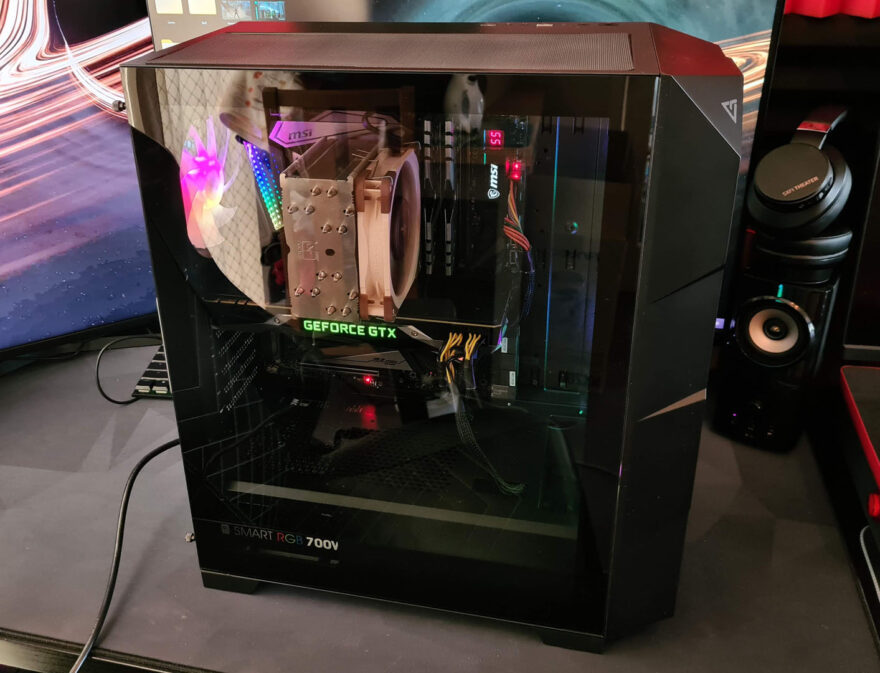
While the case isn’t huge, there is still a sensible amount of space provided in the main compartment, allowing for larger graphics cards as well as larger air coolers should the need arise.
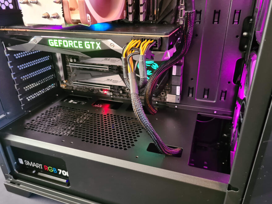
I suspect some of the more extreme graphics cards on the market may be a little tight on space, but overall, the bulk of hardware on the market today should fit; just be sure to measure twice and by once.
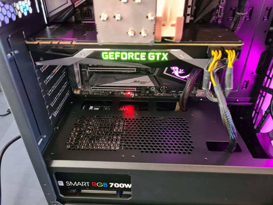
While some of the most extreme air coolers will also run into some compatibility issues, I really don’t see that being a problem for the bulk of customers. Especially when something like the Noctua U12S fit with ease.

This case does support the addition of radiators in the front. I really can’t see many customers opting for this solution though, given that the case comes with these gorgeous custom fans pre-installed. It would certainly be a shame to waste them as they provide a great amount of airflow. They’re also nice and quiet thanks to their larger design, meaning they can move more air at lower RPM.
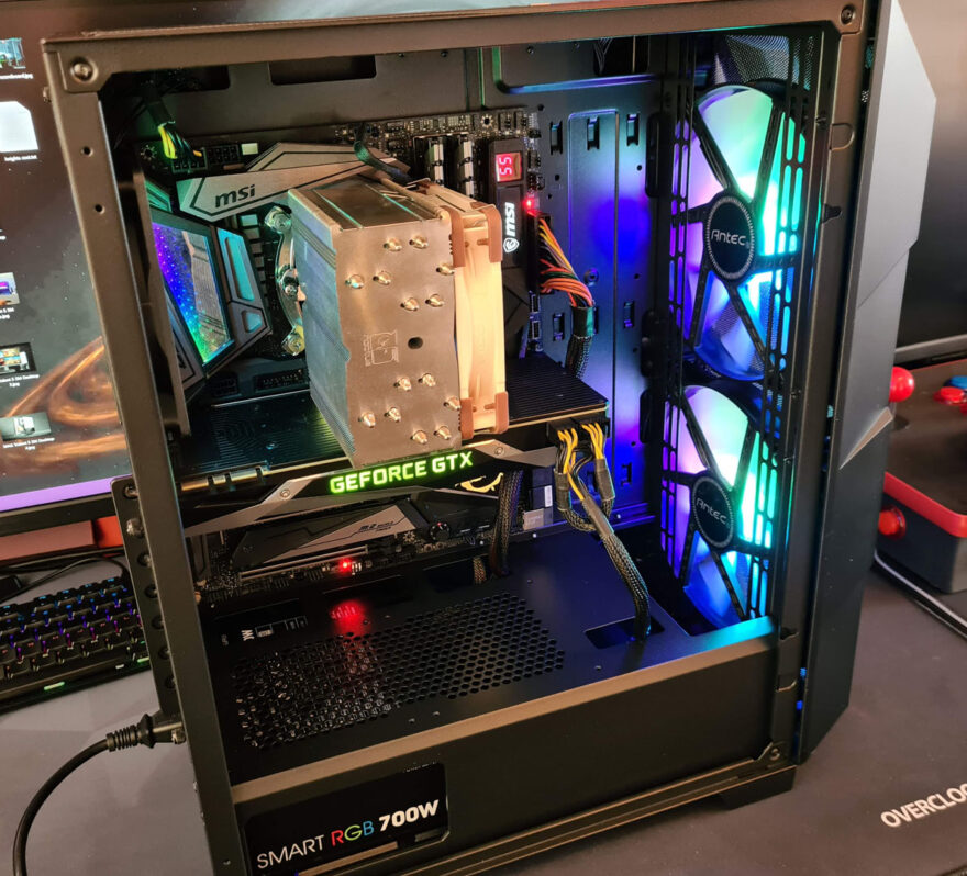
If you did want to add an AIO cooler, the optimal place for doing that would likely be at the top of the case. However, you will be limited to a slim radiator, as while there is a good amount of space, there isn’t a huge amount of space.
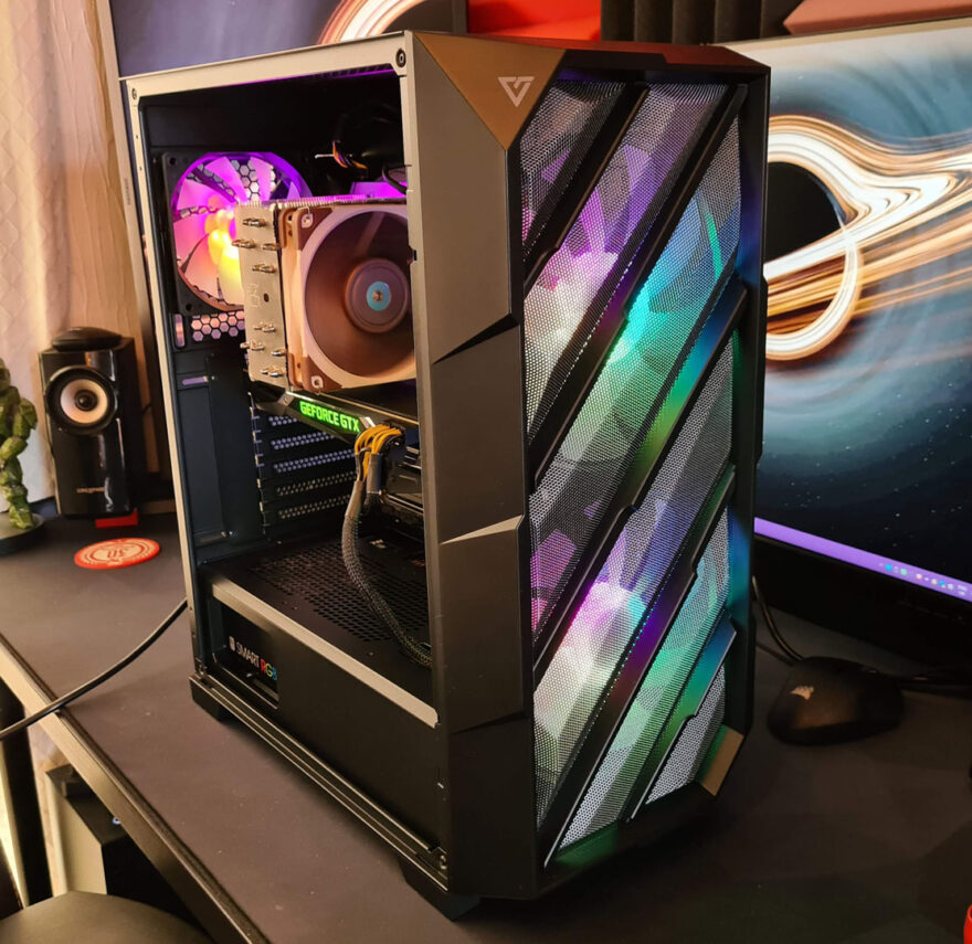
Overall airflow throughout the case is very good, with huge amounts of ventilation on the front panel. There’s plenty of exhaust on the top and rear of the case too, ensuring there’s no space for heat to build up. There really isn’t much more to remark on in regards to the interior of the case, as I said, is a fairly standard design, but at the same time, there’s little to find fault with too.
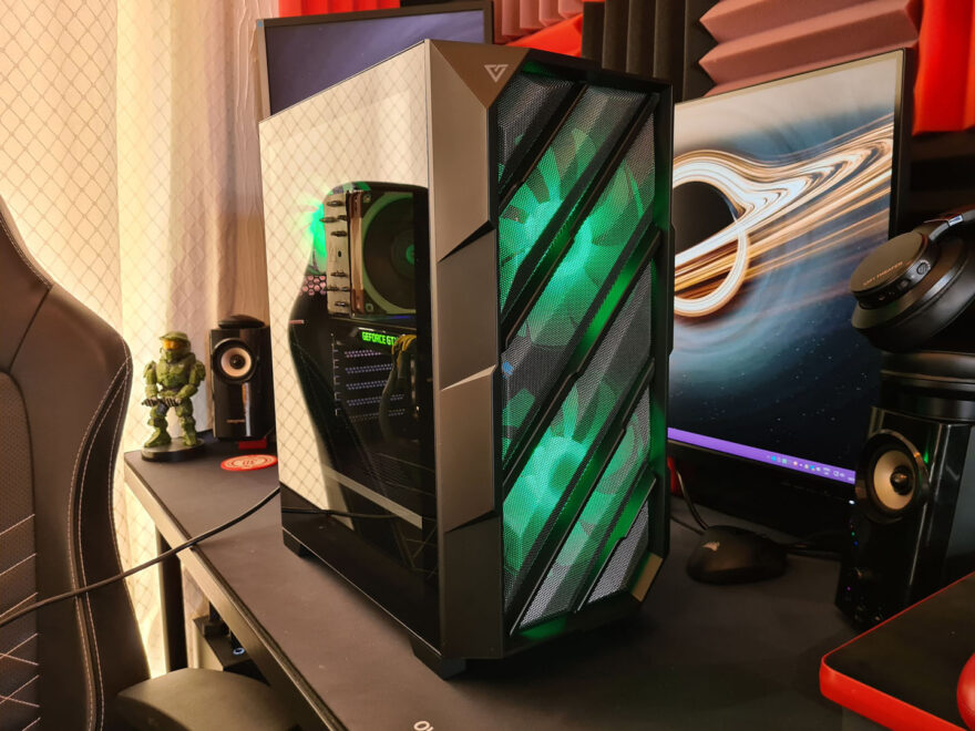
With the tempered glass back in place. You can easily show off your build and the RGB from the front fans provides you with ample interior lighting to show off your hardware.
Of course, those fans also provide some stunning lighting for the front of the case, which looked great before but looks even better now that it is lit up.
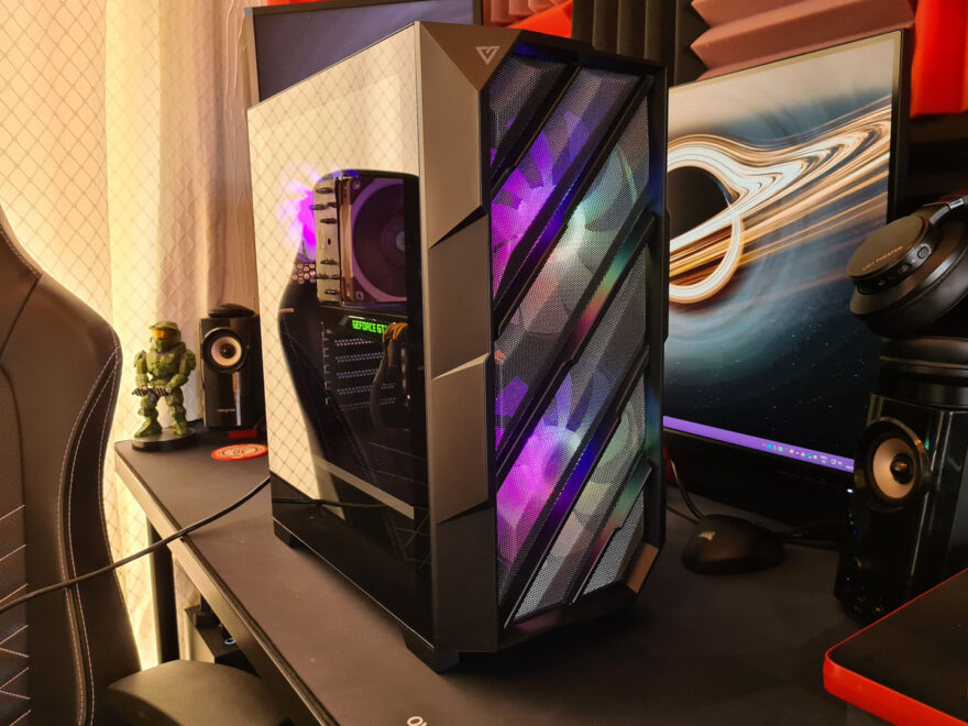
Whatever colour you choose is up to you, but overall I’m very happy with this unique front panel design.
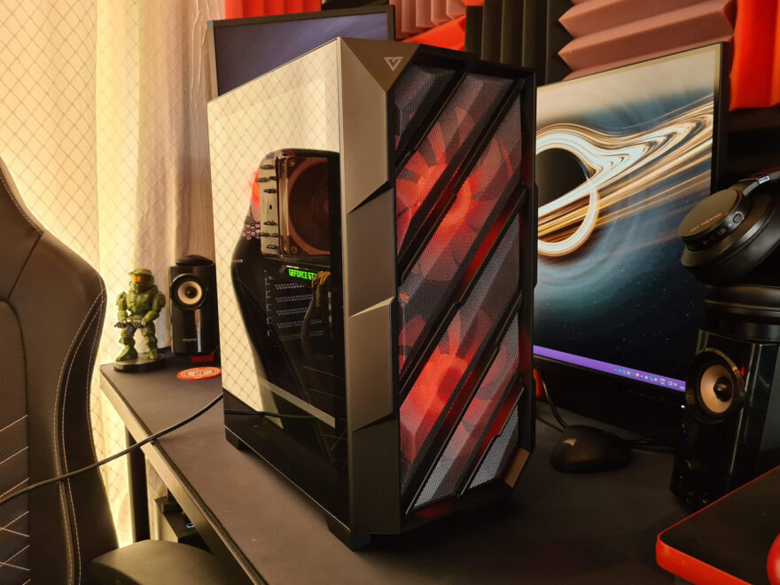
What do you think of the angular design, a bit too much or do you like these more unique designs?
