Antec P7 NEO Mid-Tower Case Review
Peter Donnell / 3 years ago
Exterior
This is a gorgeous looking case, a little old-school perhaps, but honestly, that’s kind of been the Antec look for some time now, and I like it. The lack of tempered glass is a welcome change, and instead, we get a thick steel panel on the left side.

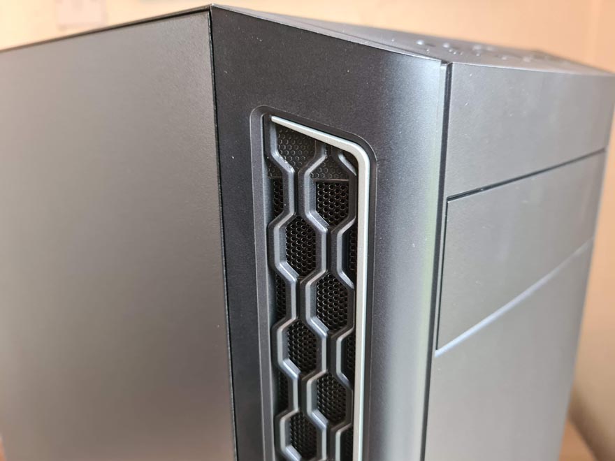
There’s a huge amount of ventilation on the sides of the front panel, too, much larger than we’ve seen on many enclosed models. Plus, the pattern they’ve given it looks great, and there’s a small bit of silver trim here to keep it looking smart.

As for the front panel its self, it’s just a clean look with a small Antec logo. It’s smart and doesn’t draw too much attention to its self. That suits me, as I tend to keep my tower in the living room, so I don’t want anything too distracting.

The right side panel is just like the left, another durable steel panel mounted by a pair of thumbscrews at the rear of the case.

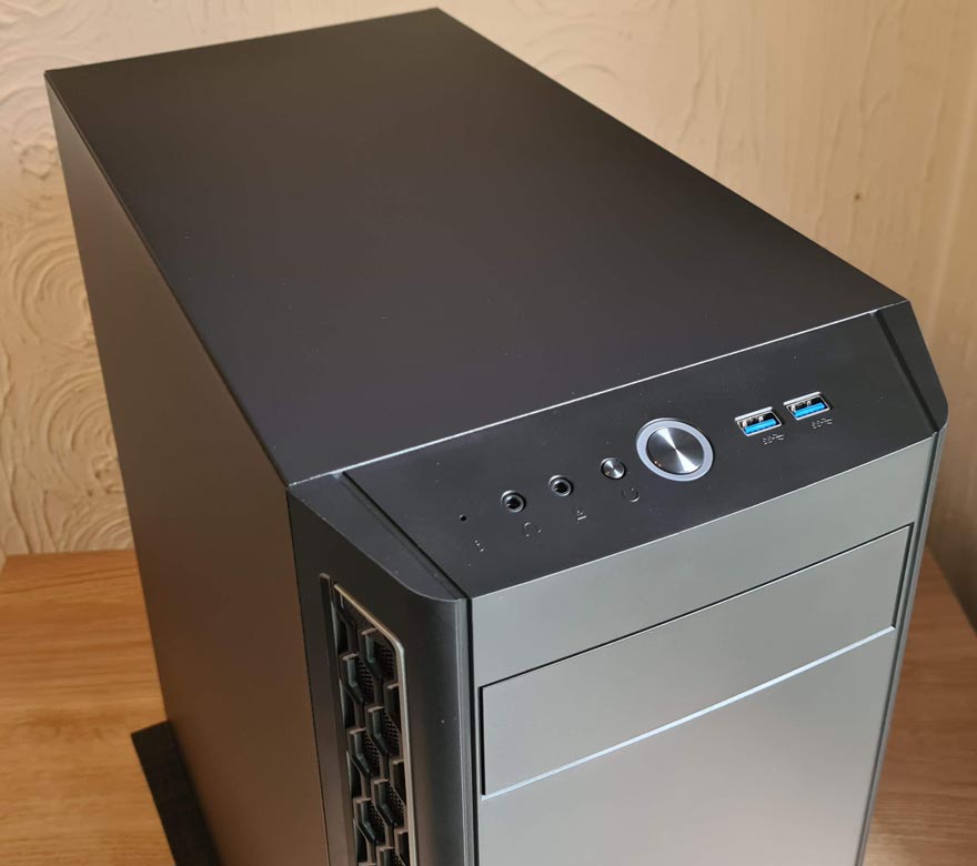
The front I/O panel is located at the top and slightly angled forwards. It’s got all the usual stuff, really, but it’s nicely laid out. However, you’ll notice the top of the case is solid steel rather than ventilated; this will greatly reduce noise levels from the case.

Around the back, there’s a 120mm fan mount with elongated screw holes, allowing you to adjust the installation height; handy for AIO cooler mounting. There are seven expansion slots, each equipped with ventilated metal covers, but keep in mind, they’re the snap-off kind. Finally, there’s an ATX PSU mount at the bottom of the case.


