AOC 27G2U 144Hz FreeSync Gaming Monitor Review
Peter Donnell / 5 years ago
A Closer Look
The monitor is pretty much what you would expect really. AOC isn’t the most imaginative when it comes to design either, so it looks pretty familiar to me. They’ve got a few panel types, resolutions, and display sizes throughout their range that are pretty much identical.
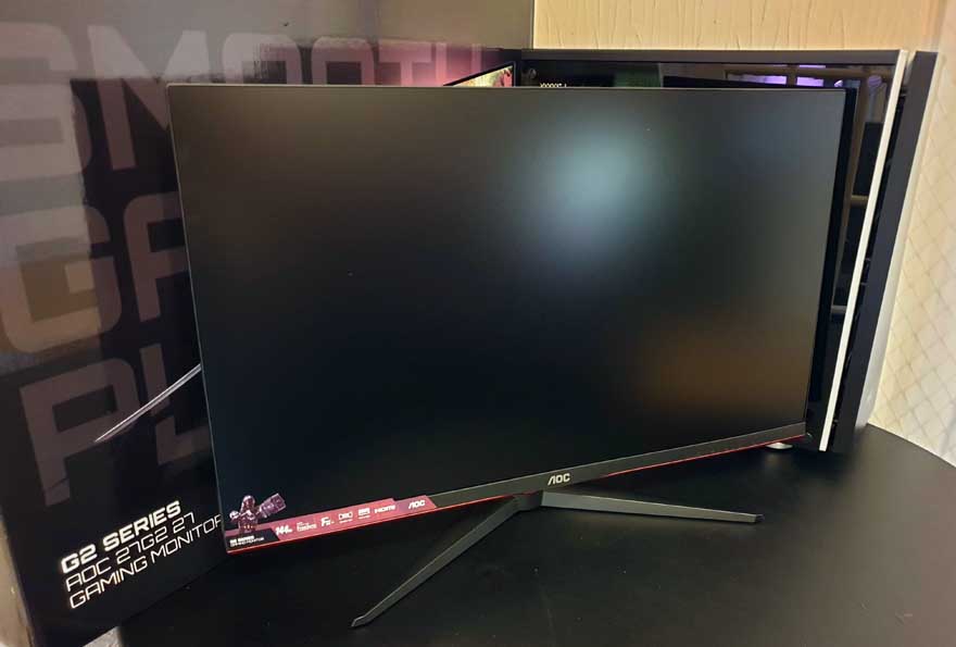
Like most monitors, it has a nice feature sticker on the front. Ya know, for those of you who managed to order, pay for, unbox and set up the monitor, and also forgot what it was that you bought.
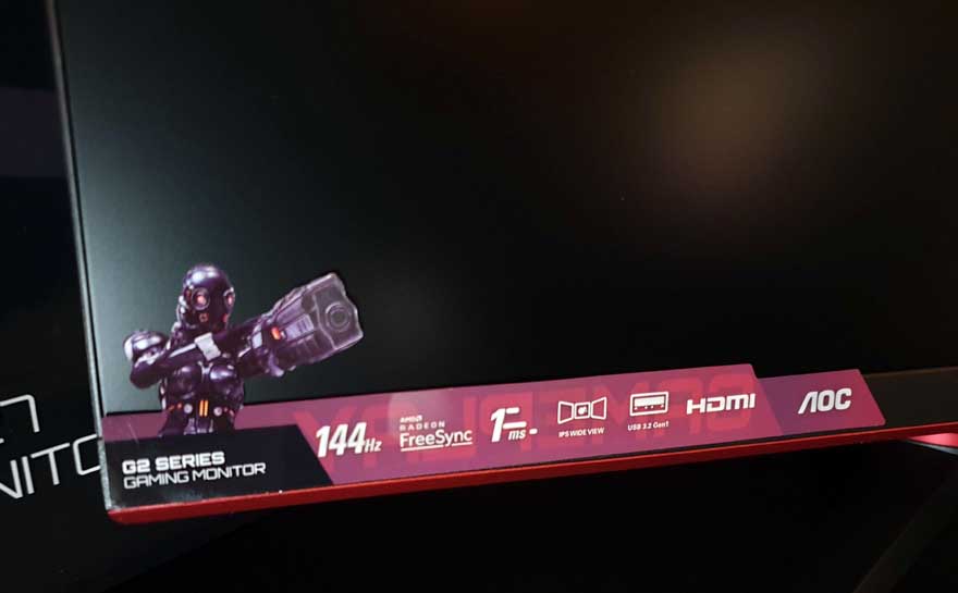
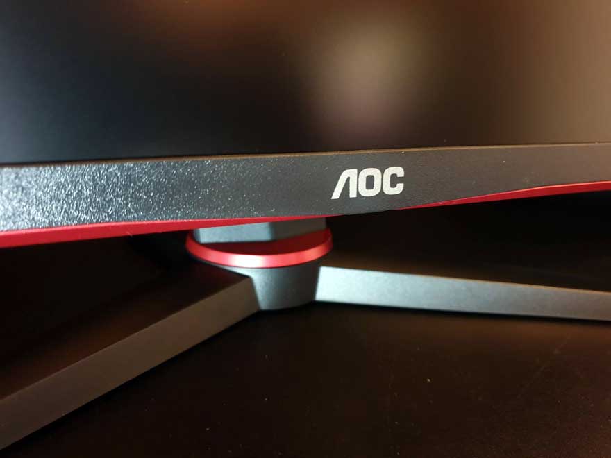
The branding isn’t too big though, which I do like, just a simple AOC logo in the middle. There’s a few nice red highlights too, which give it a bit more of a “gamer” look.
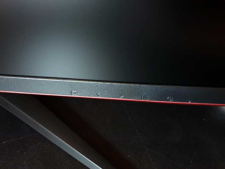
There are some real buttons on the underside too, they’re a bit small, but still far better than those silly touch buttons we’ve seen on previous models.
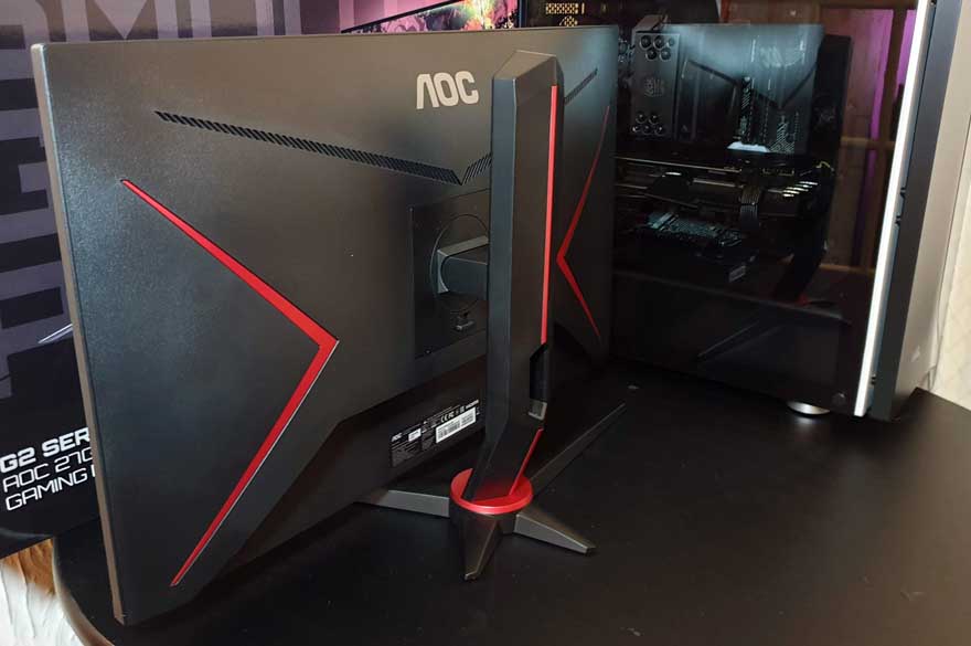
Around the back, there are a lot more of those red highlights. For me, I’d never see this as my desk is against a wall. However, if you’re in a more open setup, I like this attention to detail, even on the more affordable models.
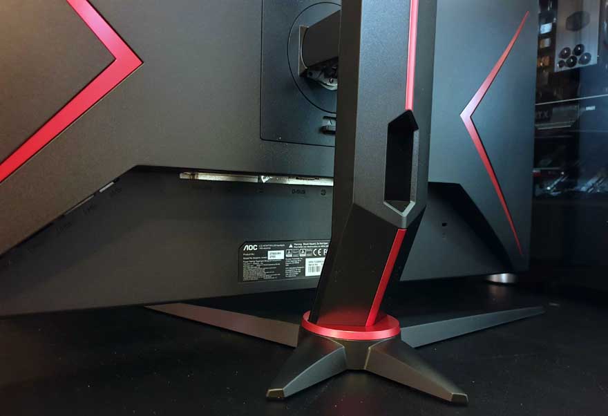
A handy cable routing hole in the back of the stand.
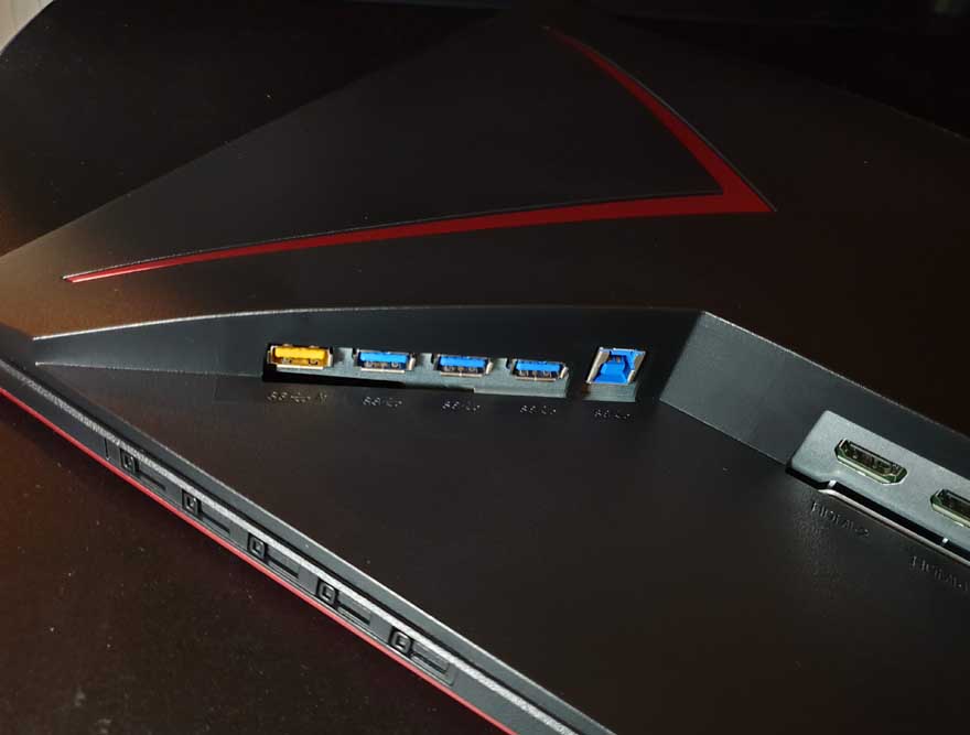
Connectivity is pretty fantastic too. There’s a pair of HDMI inputs, as well as DisplayPort, and even a VGA input!
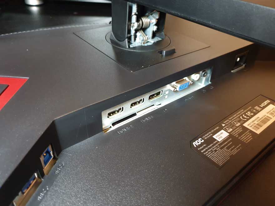
A USB 3 hub offers up four ports too, which is perfect for hooking up additional peripherals.
