AOC AGON Porsche Design PD27 Monitor Review
Peter Donnell / 4 years ago
A Closer Look
Of course, much of your investment in this monitor is on the display technology, that is the point of a monitor after all. However, it’s immediately clear that AOC and Porsche went above and beyond on the overall design and aesthetics of this monitor. I mean, just look at it, it’s a work of art!
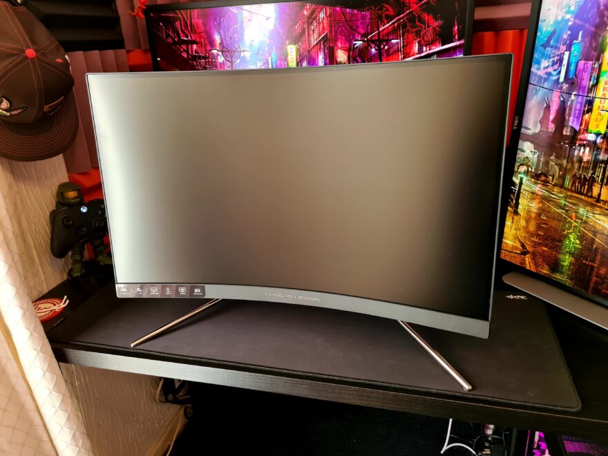
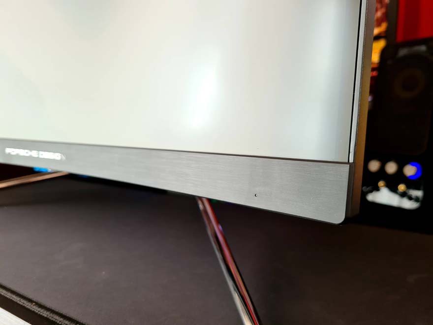
The trim on the bezel is nice and slim, but it’s little details in the fit and finish that really pop. It just has a premium quality look and feel from every angle.
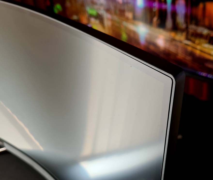
There a nice brushed finish to the bottom strip, which flows really nicely with the slightly curved design of the screen.
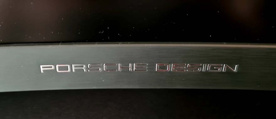
There’s a subtle and rather tasteful Porsche Design logo in the middle.
Around the back, another Porsche Design logo, but this time it’s a kind of P and a D merged into one. There’s also the AGON logo on the otherside.
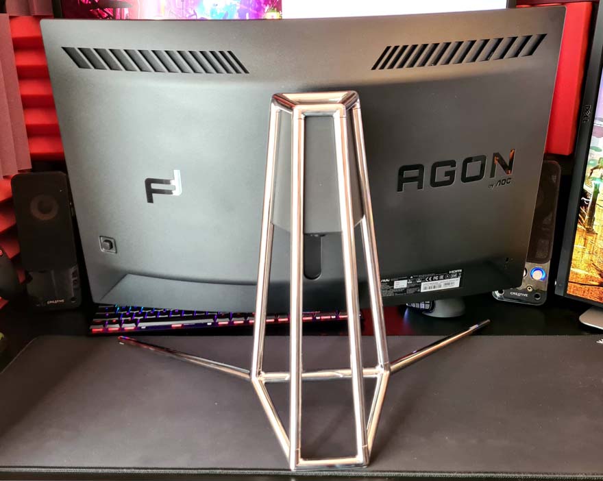
Controls for the UI come in the form of a handily little analogue stick at the back, which can also be clicked.

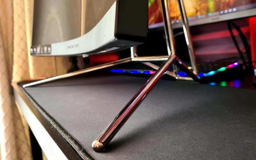
However, it’s the stand that really “stands out” I mean, it’s not like you could miss it. It uses an aluminium tubing design that is just gorgeous.
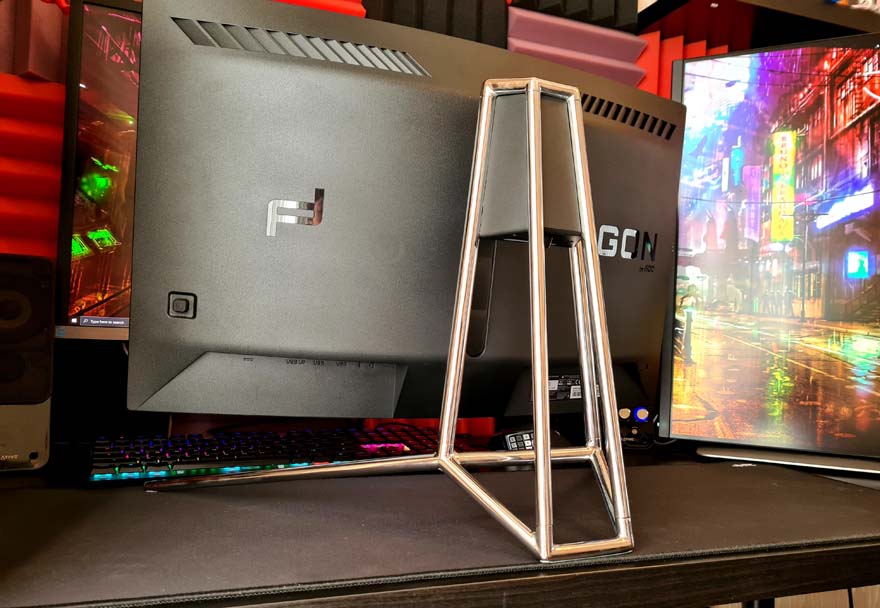
I’m guessing it’s designed to imitate the roll cage of a high performance car, or at least, that’s what it makes me think of.

The way it forms the box design at the top looks interesting, but it’s also incredibly strong too. It’s one of the best built stands I’ve ever seen.
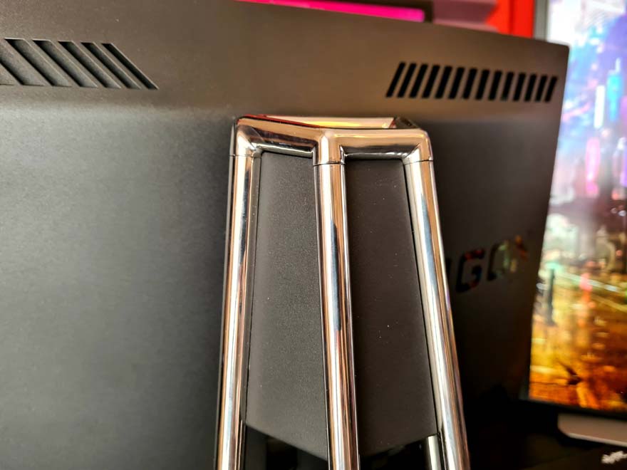
The monitor stand doesn’t stick out too much at the back, so you will be able to place it reasonably close to a wall.
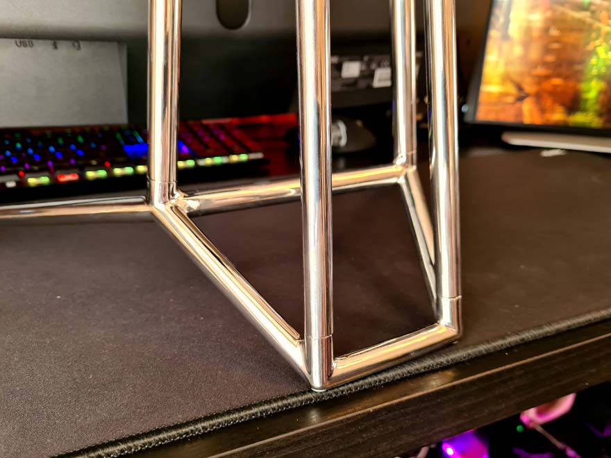
Plus, at the front, the legs are nice and wide, giving it excellent stability, but they should also be nice and clear of your keyboard too.
