be quiet! Pure Base 500 Case Review
Peter Donnell / 5 years ago
Exterior
be quiet! hasn’t done many white editions of their PC cases yet. They’ve been hitting that black and orange theme for years now. However, they’re certainly expanding, and it’s about damn time. I mean, looks at this thing, it’s stunning!

The addition of crystal clear tempered glass means it’s very bright and open. That means you’ll be able to show off your hardware easily, but your cable routing better be on point.

The top panel design is fantastic too. It has a noise isolation magnetic panel fitted by default. However, it still has just a bit of indirect airflow to prevent heat from building up. There’s a black magnetic dust filter included in the box too, should you wish to open up the airflow.
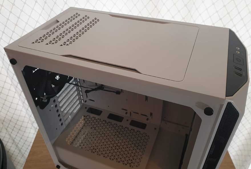
Eight magnetic strips? What they worried about, it growing legs and trying to run away?
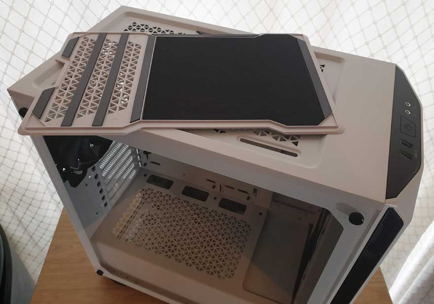
Even with the top off, it looks superb, with that same triangular airflow pattern.

I/O
The front panel is nice enough. It’s nothing crazy, but a pair of USB 3.0 ports, a couple of audio jacks, and the power controls are more than enough for your typical PC gaming rig.
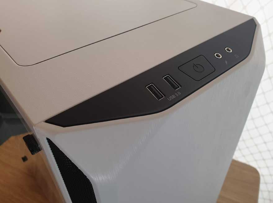
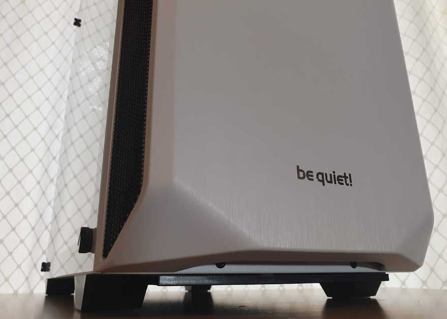
There’s a light texture to the front panel, which looks almost like a hybrid of brushed aluminium and a laminated wood effect. It is, in fact, plastic. However, it looks pretty damn good it has to be said.
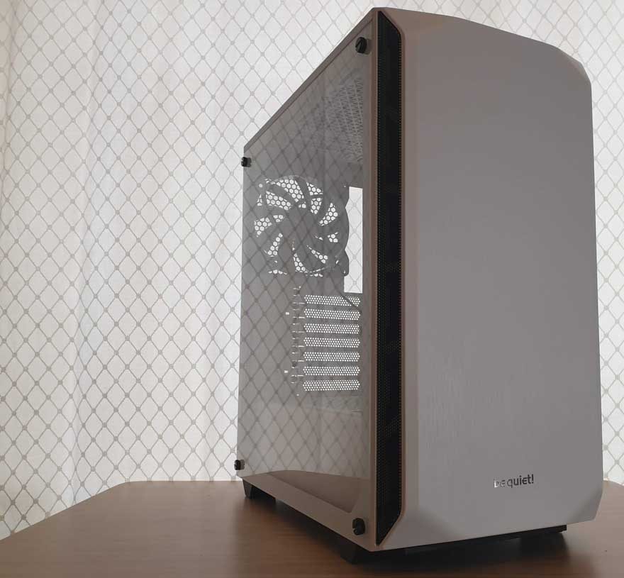
Plus the branding is kept minimal, with just a silver be quiet! logo tucked into the base. What I do love though, are those heavily rolled corners.
Around the Back
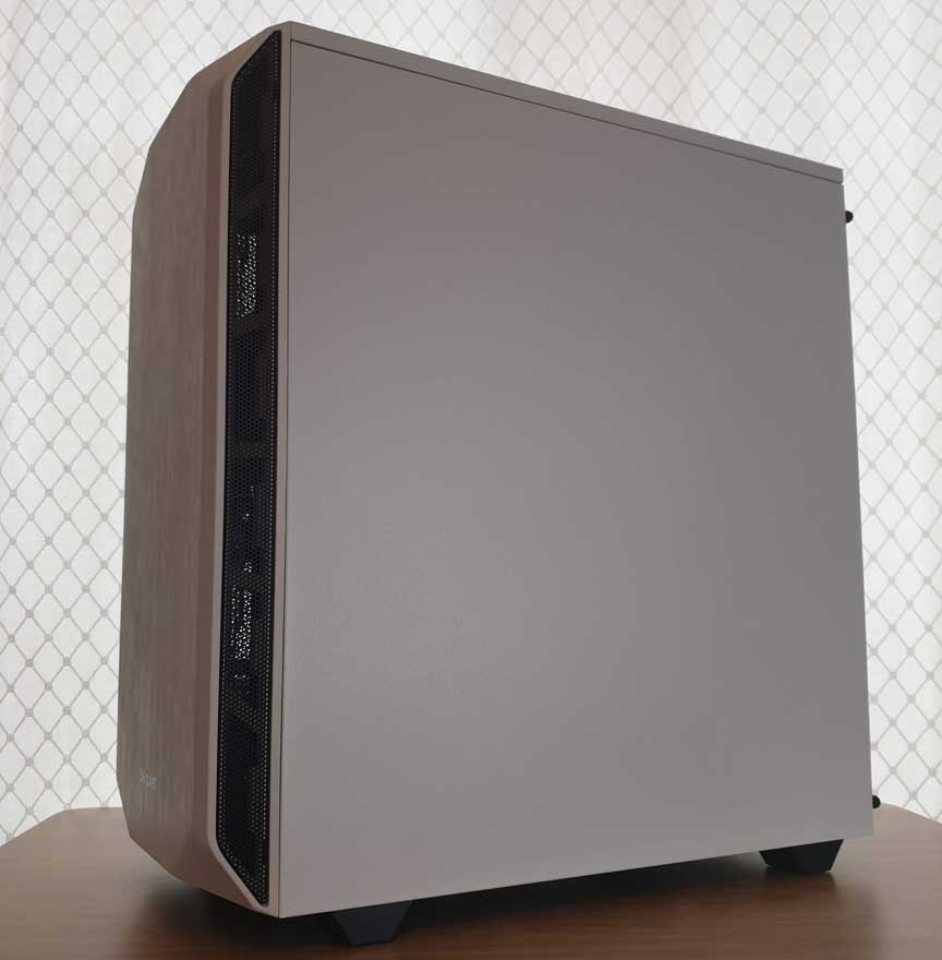
The right side panel is just matte white, matching up with the rest of the case. Clean, simple, and effective.
Around the back, it’s business as usual. There’s a rear 140mm fan pre-installed, although it’ll take a 120mm fitting too. There’s a bunch of ventilated reusable covers for the expansion slots and a rear mounting PSU bracket. As I said, pretty standard stuff, but there’s nothing wrong with that.

