Chieftronic M2 Micro ATX Gaming Case Review
Peter Donnell / 3 years ago
Complete System
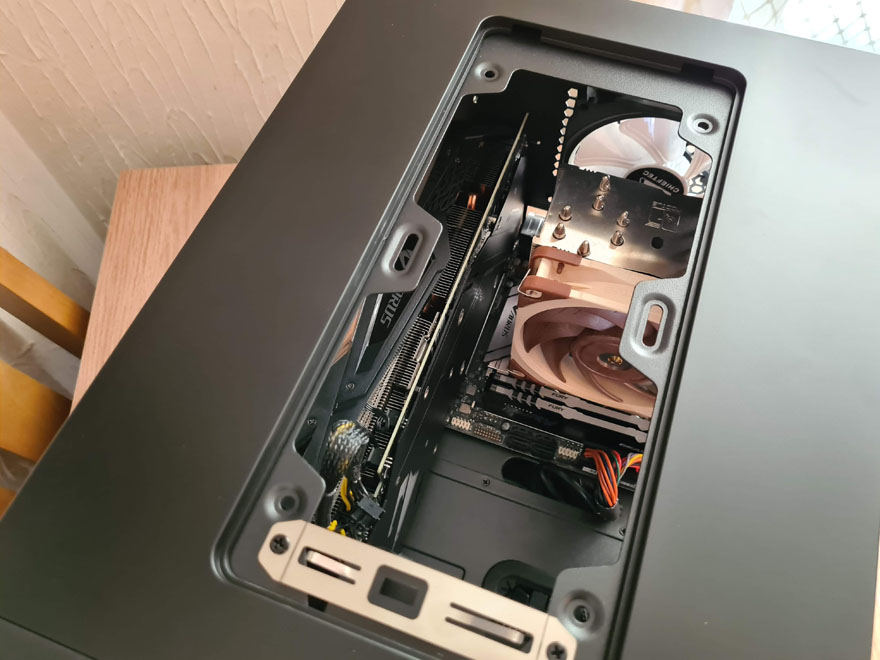
While this is a compact case thanks to its cube design, it’s actually surprisingly spacious on the interior too. Clearly, a huge graphics card isn’t going to be an issue here, and with the horizontal motherboard, you don’t need to use a riser cable to display your card like this.

The same on the other side, in this orientation you can see the CPU cooler more, rather than just the top of it. There’s a bit of cable gore going on here, but don’t worry, that’ll be hidden in a moment.

The routing holes aren’t perfectly placed, but they do the job well enough. One closer to the GPU side would have been nice though.

There’s a lot of room for cable cramming here, albeit I regret using a non-modular PSU here. However, since I’m not using the 3.5″ bays, the extra space did come in handy.

The airflow path is excellent, with the front fans feeding the GPU and GPU directly, and a clear path to the exhaust fan too.

From the top-down view, you can see there’s a decent amount of space. The top would be perfect for a 240mm AIO for the CPU.

As for cable routing, I sort of missed this part earlier. While the exterior is full height glass, it’s a trick. As you can see, the interior is only 3/4 glass, thus hiding the cable gore at the bottom of the case; classy.

All panels back in place, and that dark tinted glass looks awesome. The build is in there, but it’s a little hard to see.

Fire up the lights and BOOM! Would you look at this beauty! The front and rear fans look stunning with really rich and vibrant colours and effects.

Plus, with the built-in hub, you never need it connected to the motherboard if you don’t want to, just provide a SATA power cable.

Dim your room lights and you can see through the glass nicely, it looks very clean and tidy.

The front fans are set a little back, so they’re not too blinding behind that mesh.

The same on the right side, with the front fans illuminating the motherboard area perfectly.


