CM Storm Sonuz Gaming Headset Review
Tim Mammatt / 12 years ago
The design of the box is typical of CM Storm, which is to use a red and black colour scheme that fits in with brand colours. The front has a windowed section which allows you to see the right ear cup, mic and inline controls. The front has been kept simple, with just a graphic of the headset and a small highlighed area boasting about the 53mm drivers.

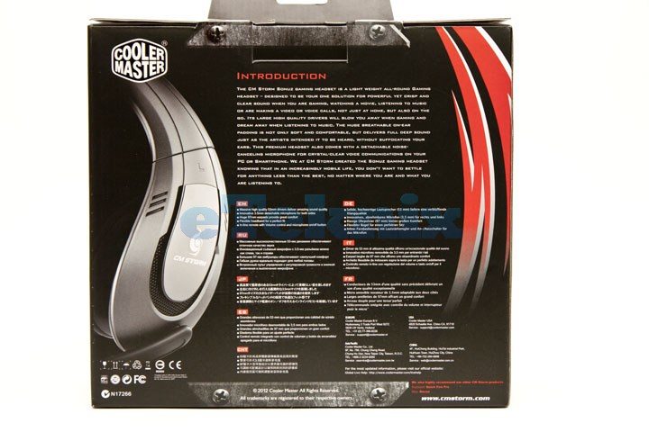
The back features some more graphics and an introduction to the Sonuz, enlightening you on what to expect. Below that are several translations of the basic features of the headset.

The features of the headset are picked up more upon on the sides of the box, with a small diagram detailing each feature.

Normally we’d show the contents of the box, but in this case, the contents just consist of the headset and a user guide – nothing exceptional, so we’ll go straight into having a closer look.


