Cooler Master CMP 320 Mini-Tower mATX Case Review
Peter Donnell / 2 years ago
Design
I typically find the cheaper the case, the more outlandish the front panel can get, and Cooler Master is no exception here, but it’s not so over the top that the case looks “cheap” but it’s certainly eye-catching. The “Mesh Geode Front Panel” design does look great though, and with the mesh panel, you can see it’s going to allow for a lot of airflow to the system.
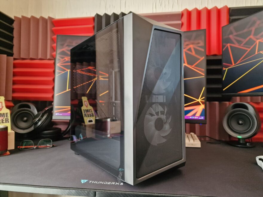
The case is otherwise a fairly standard mATX compact mid-tower, in terms of dimensions, but still big enough it can support additional cooling hardware in the front, top and rear of the case.

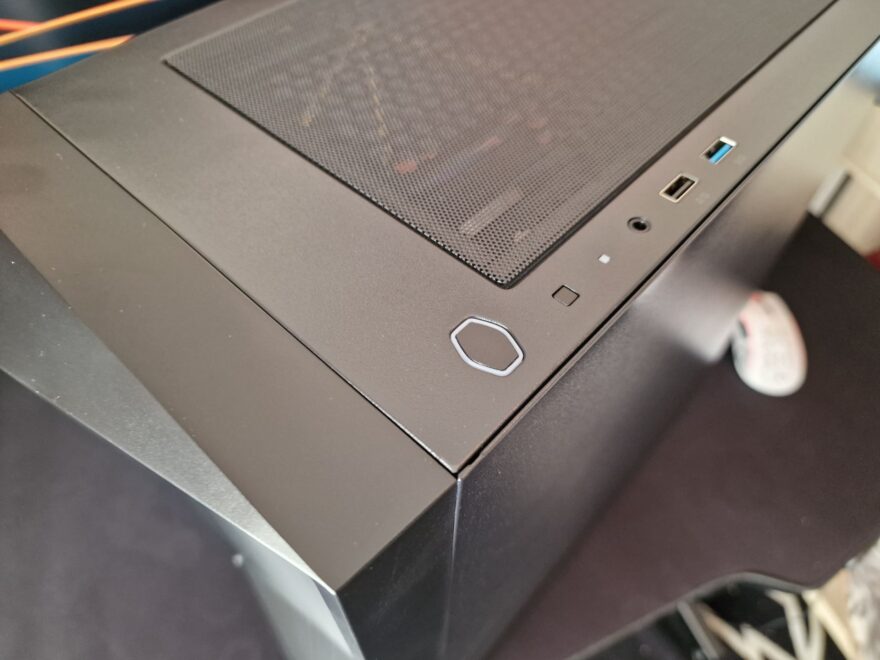
The Cooler Master branding has become their low-key logo with this hexagon-shaped power button.
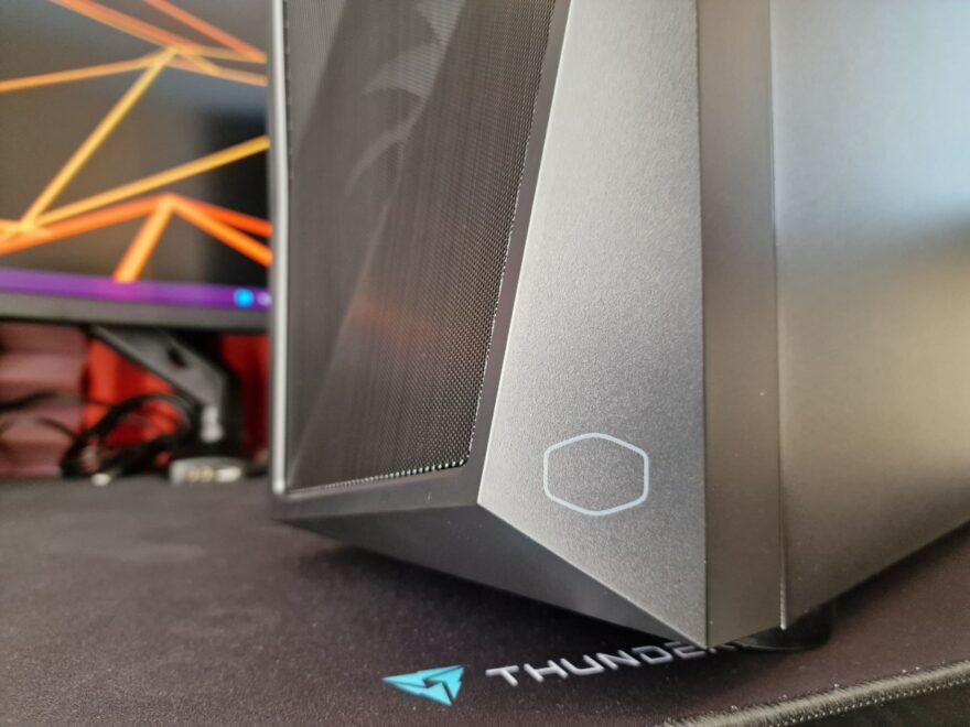
It’s also stamped into the bottom right of the front panel, and I love this much more than them simply scrolling their brand name on the case.
The right side panel is plain and simple, but hey, it certainly gets the job done.

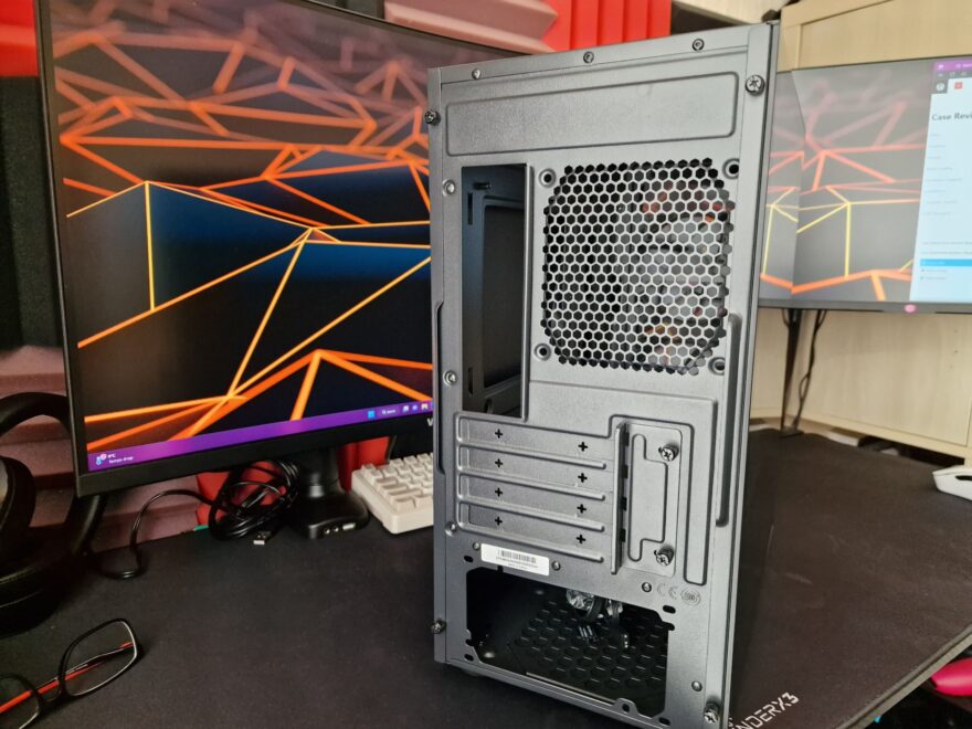
Around the back, you can see there’s a little extra height above the motherboard, which should improve the cooler support. There are four expansion slots, and an ATX PSU mount, but overall, no big surprises in terms of design.
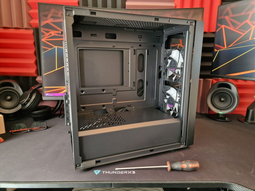
The case is nice and uniform with a soft matte black paint job inside and out that keeps things looking nice and tidy. The only light part in the case is the front panel fans, which offer up ARGB lighting to add a little more flair to your build. If you don’t like RGB, you can simply leave the RGB cable unplugged and use them as normal fans.
