Cooler Master CMP 520 PC Case Review
Peter Donnell / 2 years ago
A Closer Look – Exterior
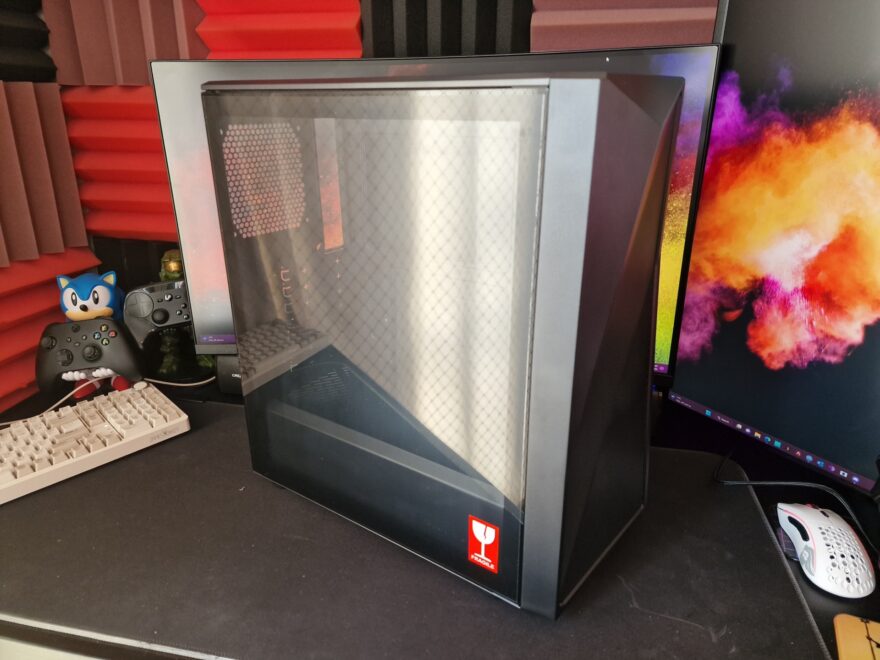
The Cooler Master CMP 520 looks pretty decent the moment it’s taken out of the box. I must admit the design feels somewhat familiar, but while it’s not bad looking, it’s certainly a common design for a PC case these days. Down the left side, there’s a large tempered glass window, and they’ve given it a thick black trim to hide the inner framing.
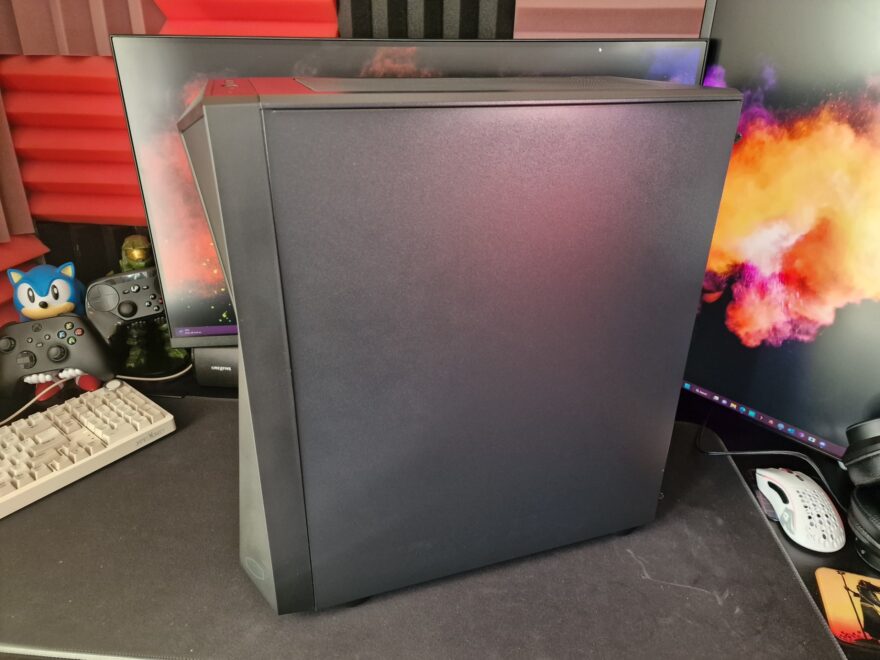
The right side panel is just a steel panel, nothing surprising really, and it’s held in place with a pair of thumbscrews at the back of the case.
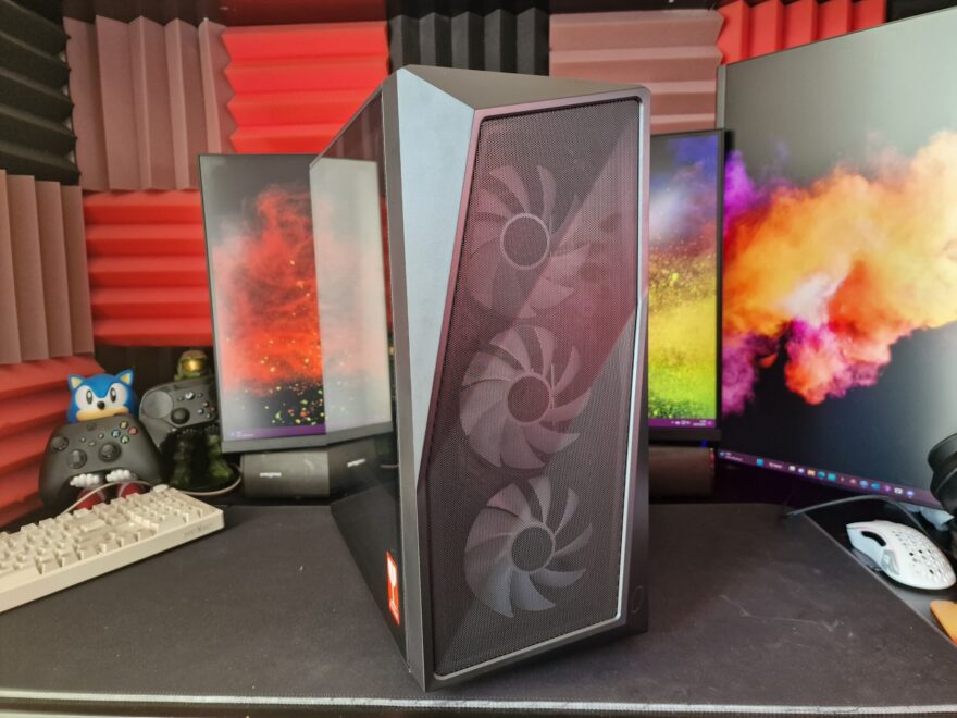
the front panel is the main feature here, and it does look pretty great with its angular geometric design. There’s a lot of airflow too, thanks to a fine mesh design, which should help with the overall cooling performance.
Around the back, you’ll find a rear fan mount with support for a 120mm fan.
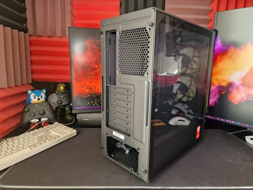
There are seven expansion slots on this case, but they come with those bloody awful snap-off covers, which I don’t like at all. However, if you’re only building in a case once, it’s not a big deal.

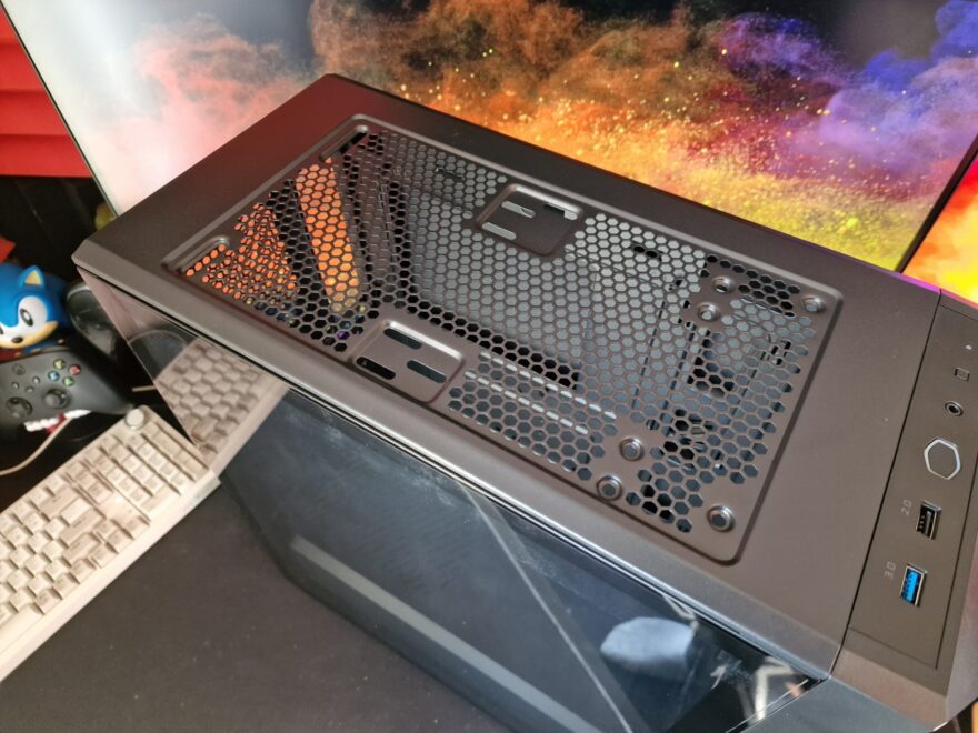
Up on the top, you’ll find a large magnetic filter, which will keep dust and debris from falling into your case.

Of course, lift it out of the way, and you’ll have access to install 2 x 120mm or 2 x 140mm fans. The I/O panel is simple enough, offerings up a USB 3.2 Gen 1 Type-C, a USB 2.0, and a 3.5mm headphone jack. The power button is in the middle, in the shape of the Cooler Master logo, and there’s a small reset button which can be used to cycle through RGB profiles.
