Cooler Master GM238-FFS Gaming Monitor Review
Peter Donnell / 2 years ago
A Closer Look
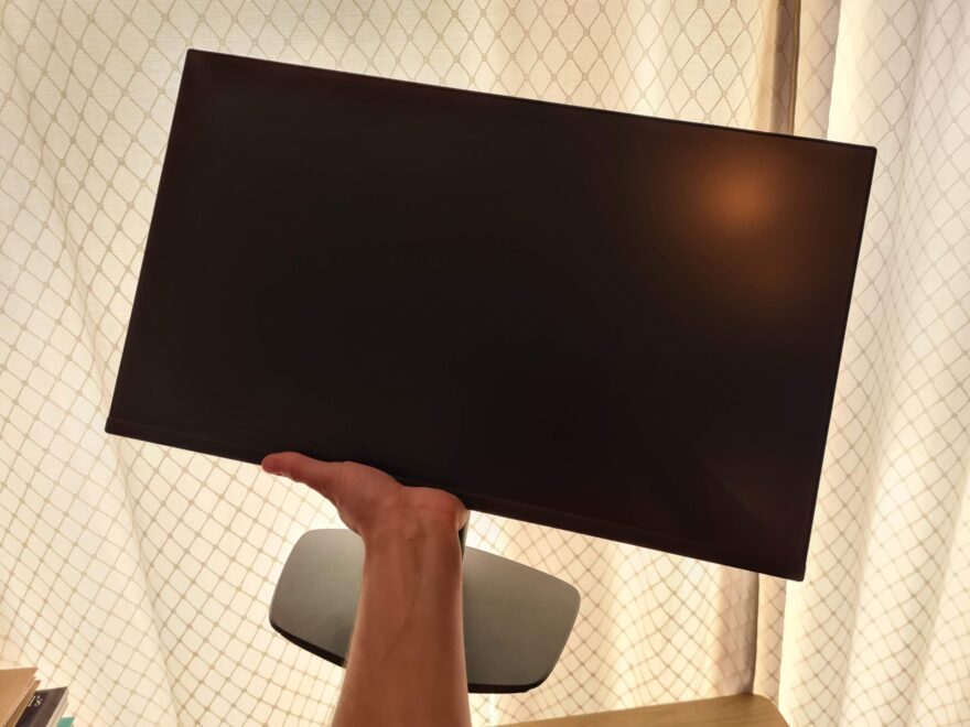
My first impression of this monitor is excellent, it’s a lovely-looking thing. Very clean, simple and understated, as a monitor should be really. It has a really easy to assemble stand too, that required no tools, just clip it together and you’re ready to rock, which I really like.
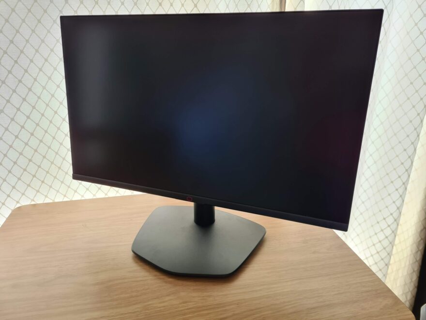
The stand is very basic, I must admit, but the monitor is reasonably small and lightweight, so turning the whole unit left to right really isn’t a bother. Plus, as you can no doubt see, it has a pretty spectacular anti-glare coating on the screen. I can normally see my own reflection in monitors, but this one is inky black.

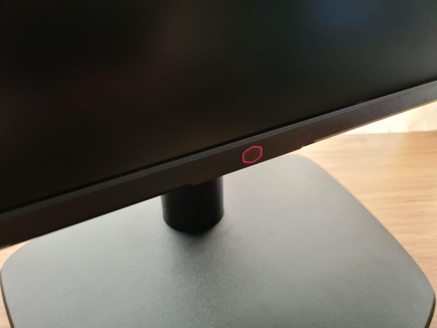
There are a few little details, such as this cute Cooler Master logo on the front, but otherwise, branding is kept minimal, which I appreciate a lot.
The stand has a little of that logo shape too, a small detail, but it helps with the aesthetic.
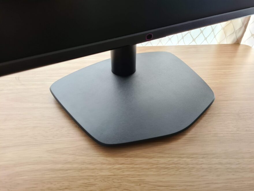
It’s a reasonably slim unit, but thicker than some more expensive models. That’s fine with me though, as it actually feels fairly robust for a monitor that weighs just 3KG.
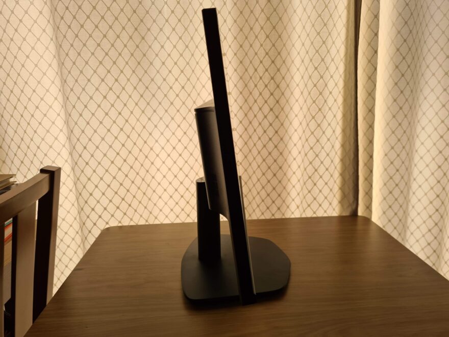
Around the back, you can see the stand is a fixed portrait mode, but it does offer -5°~+15° tilt, which is certainly welcome. What’s nice is that the monitor has a VESA mounting, which is often missing on models to trim cost, but not here. This gives me an idea of how I’m going to be using this monitor… more on that soon.
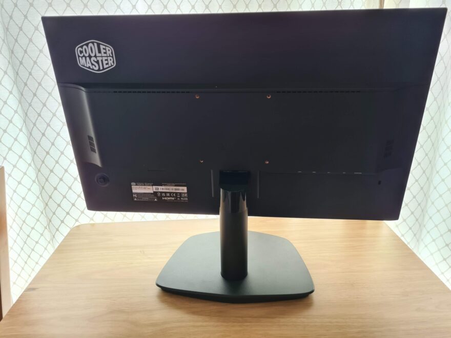
A nice Cooler Master logo on the back, again, simple and stylish.

A really nice stick control for the UI. It has a nice firm click to it too, so it’s very pleasing to use.

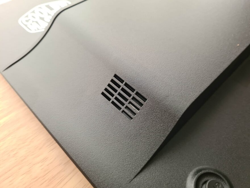
I thought these were speakers at first, but it’s just some passive ventilation.
It’s not lacking for connectivity either, with two HDMI 2.0 and 2 DisplayPort, so hooking up consoles and computers should be a breeze.

Overall, it’s pretty awesome, and despite being lightweight, it looks and feels like a premium gaming monitor. So, let’s get to testing!
