Cooler Master MasterCase H500P Chassis Review
Peter Donnell / 7 years ago
Complete System
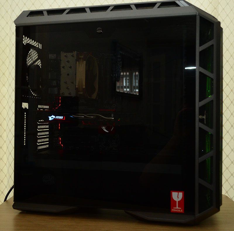
Building a system inside the H500P was laughably easy. OK, I didn’t like having to remove so many screws to remove the PSU cover, and the rear cable covers are a bit pointless, but the amount of space is staggering. I used an ATX motherboard, and a massive 1070 Ti GPU and they look humbled in this cavern of a chassis.
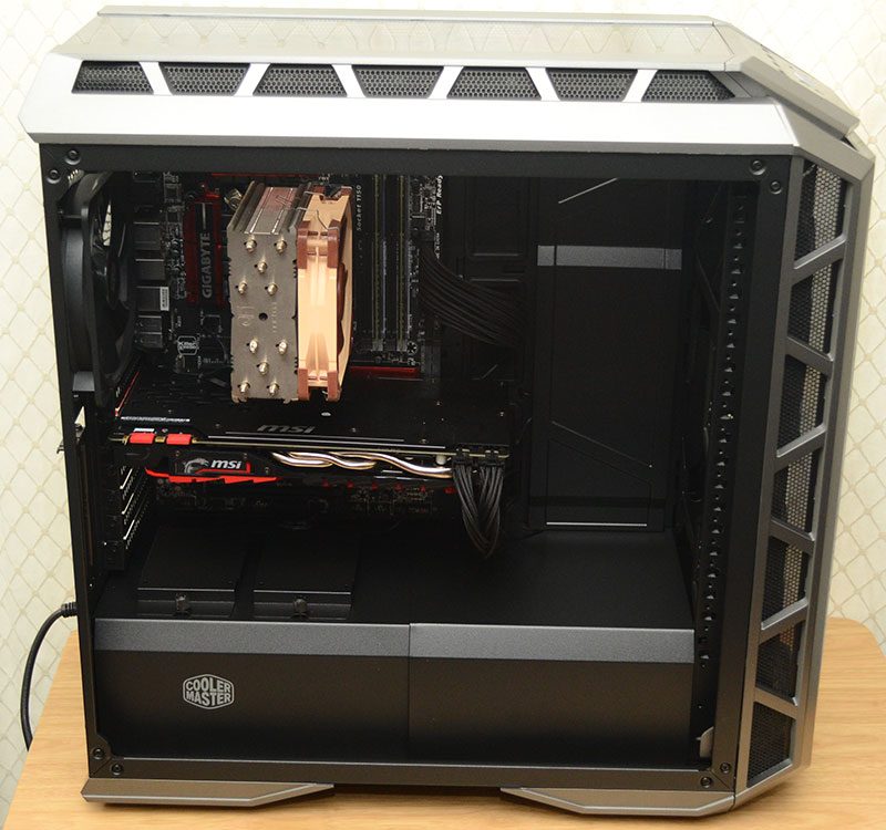
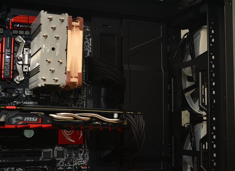
Just to prove a point. I didn’t reinstall those rear cable covers, and if I hadn’t of told you, would you be able to tell? Cable routing looks smart, clean and super tidy either way.
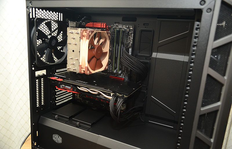
However, a vertical GPU power cable passthrough would cut down on cable trail even more, but it’s hardly a mess as it is.
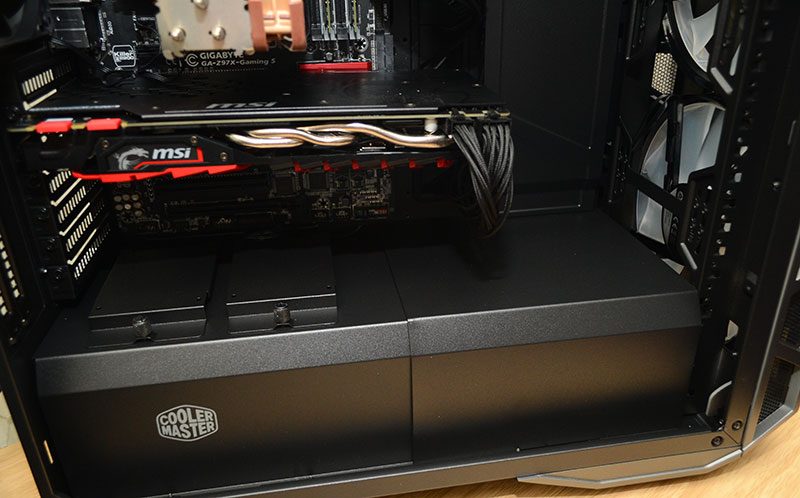
Airflow in this chassis is simply staggering. There’s a lot of ventilation surrounding the chassis, as well as those 200mm fans in the front. That’s a huge wall of air hitting every major component, and they’re exceptionally quiet too.
With all the panels back in place, it looks properly fantastic. Sure, I’ve griped about a few minor things here and there, but I can’t complain about the aesthetics of the end product.
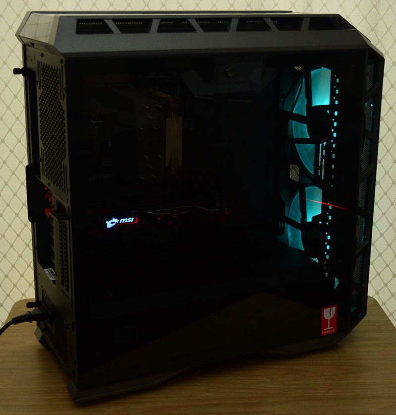
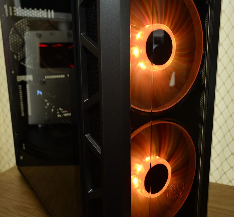
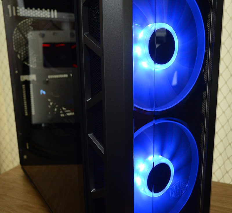
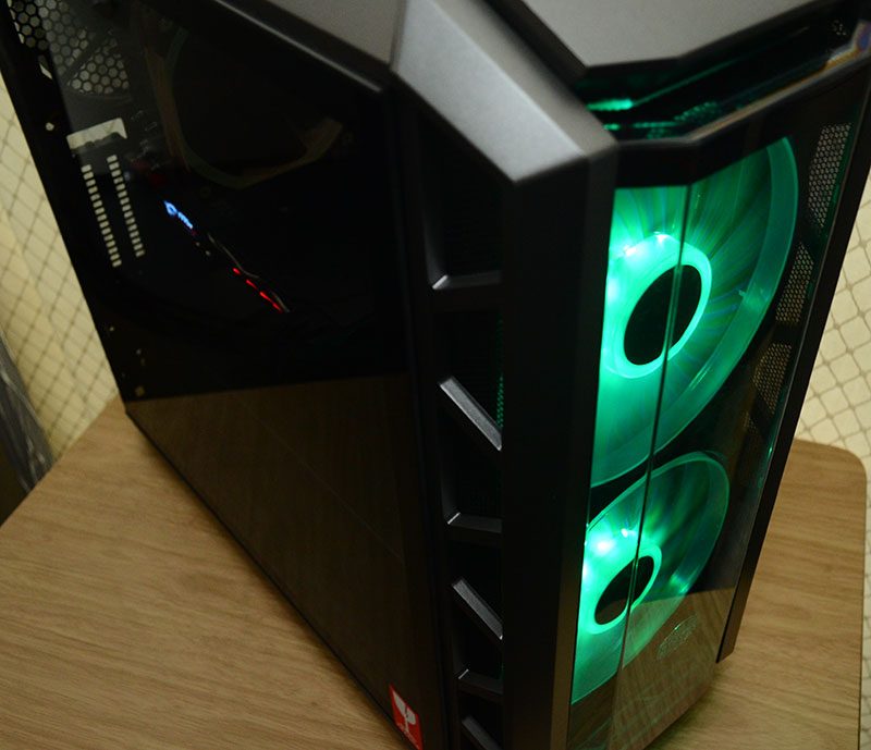
If anything, this chassis is crying out for more lighting. If you’re rocking RGB on your CPU cooler, motherboard, and GPU, it’s really going to shine. The front fans light up a lot, but that’s a big interior to illuminate.
There’s no RGB controller built into the chassis, so you will need a third-party solution, such as those found on your motherboard. My motherboard didn’t have one, so I used the cheap little controller Cooler Master bundle with their latest CPU coolers. Why they didn’t include that with the chassis boggles the mind, as it clearly did a great job for me.

The fans look great. However, I must stress again that the freaking ugly black dot on the fans is gone in the retail release; phew!
