Corsair iCUE NEXUS Companion Touch Screen Review
Peter Donnell / 4 years ago
Performance
The setup of the NEXUS really couldn’t be easier. You plug it into your PC, easy enough, you download and run Corsair iCUE software, easy. Even easier if you already have iCUE for your other Corsair peripherals and RGB control, just update the software and you’re done.
The interface is a virtual NEXUS. Just click on the display where you want to add something.

Button or widget, and choose the size, from 1×1 up to 1×6 for a single button that fills the whole display. Then choose the action.

Actions are basically ANYTHING that can be represented via macros and shortcuts. They can be programmed, recorded, edited, timed, triggered, and more.


You can even give them a sound effect, which could be good for the Streamers out there. Actually, it could ONLY be a sound effect if you need to make a touch-panel fart machine or something.

What’s really cool is you can have widgets, which offer up things like system monitoring. Want to see the CPU or GPU load? How about the MAX temperatures?

It’s great as you can clearly see the updates on the display while you’re running your games, benchmarks, overclocking tools, etc.
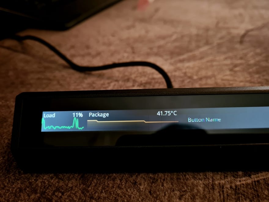
You can even make a cool multimedia controller, and even forget to name the volume up button anything more than the default “button name”.

It looks really cool.

Better with the typo fixed. Keep in mind, icon, background image, text colour, everything can be completely custom per button.

Why not have a full width button that’s JUST for launching eTeknix.com.

Corsair says you have 200 pages, TWO FREAKING HUNDRED. I mean OK, I doubt anyone will hit that limit, but it’s nice to know. I can think of like 6 or 7 pages worth of things I could use. How about you?
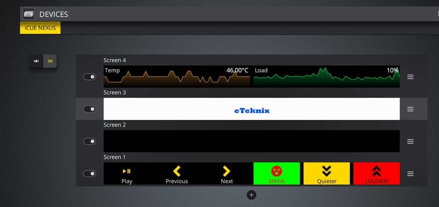
Multimedia controls, photoshop shortcuts, a page per game perhaps, streaming shortcuts and more.

The interface is really good though, it’s easy to customise everything and there’s a lot of easy to understand options. The display is bright and clear, albeit I do think the backlight is a bit bright and tends to torch in the corners a little. It’s a lot more exaggerated on my camera though, it looks “blacker” in real life, but not perfect. Perhaps an OLED one would be interesting in the future.
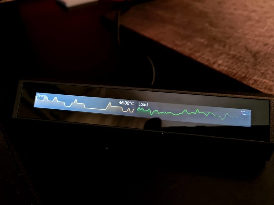
Corsair may want this on your desktop or keyboard, but with a little double-sided tape, you could put it on the edge of your desk, or even here… can you guess where?
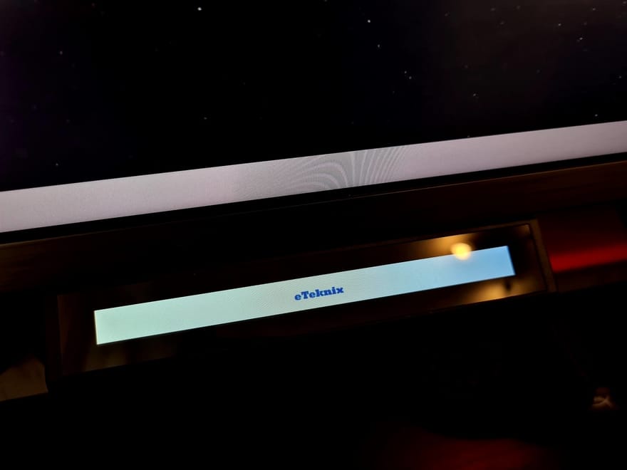
The bottom of my monitor! How cool does that look.

What a pointless thing I didn’t know I needed. Well done Corsair, you’ve done it again.

