DeepCool CK560 Mid-Tower Case Review
Peter Donnell / 2 years ago
Design
The DeepCoool CK560 doesn’t break from convention much, but that’s no bad thing, as it’s still a great and interesting-looking case. There’s a large tempered glass window down the left side, so you’ll be able to show off your build.
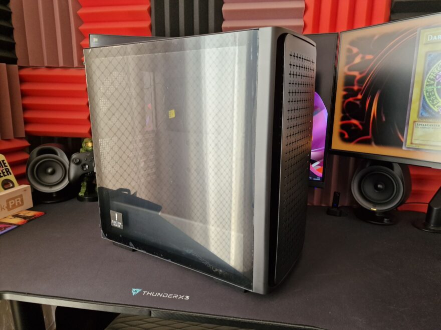
The front panel is quite deep but curved around to give it a nice flowing look. I love that the USB ports and the DeepCool logo have that little touch of colour matching too, little details add up!
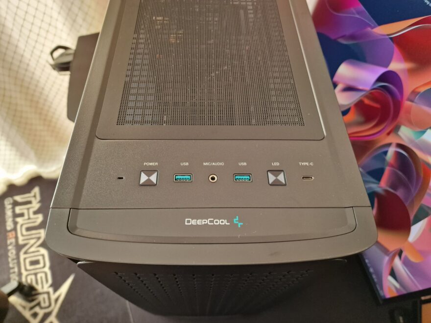
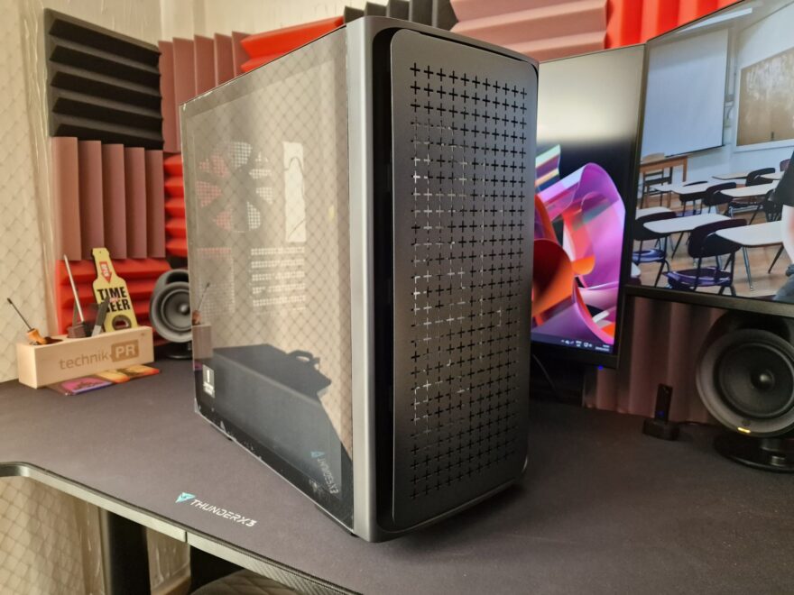
This is the star of the show, with a large floating panel on the front with plenty of ventilation on it, but there’s a huge gap on all sides too, so airflow is going to be excellent. Plus, it looks pretty unique too.
The right side panel is just a solid blank panel, nice and simple, but it gets the job done.
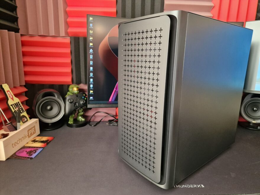
Around the back, there’s a nice amount of additional ventilation, all with a very neat-looking square cut pattern. The “+” pattern on the front and the tightly packed squares on the back can be seen on products throughout the DeepCool range, so I like that uniformity.
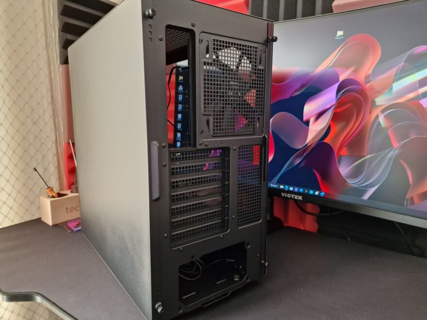
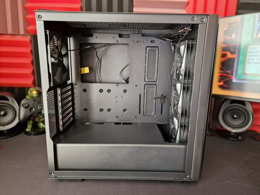
On the interior, it’s all straightforward again, no big surprises, but nicely finished in black, big grommets, and a full PSU shroud help keep this looking clean and tidy.
