Facebook 4.0 With Brand New Flat UI Available For Android Devices
Gabriel Roşu / 11 years ago

Since the recent changes we saw on iOS and even Web in terms of UI design, Facebook has neglected the Android version. Facebook needed a new revamp for the Android platform to be able to compete with its “neighbors”, like Twitter and Pinterest, and as it goes we can now have a look at version 4.0. Though the Facebook 4.0 app has not yet been officially released, it shows quite a bit of improvement done compared to the previous version.
Taking a look at the app, we can see a title banner which has been added to the left side of the action bar and also a Search icon has been added to the right side. The 5 icons below the title banner consist of the News Feed, Friend Requests, Messages, Notifications, and the Menu. At the bottom of the page, we see the usual Status, Photo and Check In buttons. Take note that the UI is subject to change, as it did with a previous 4.0 build. The bottom buttons have had changes made to the colors as shown below:

| 
|
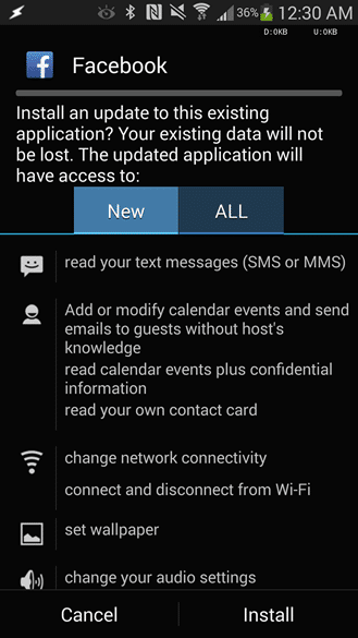
Also, here is an insight of the new permissions you have to agree with (or not) in order to install the application on your android device:

Another thing to point out is that Facebook has server-side control over the UI and can be changed on the fly, depending on what they are cooking up next. Hopefully, we will have a stable version soon. For those of you who still want to try out the 4.0 beta version however, the .apk can be downloaded from here.
Thank you Android Police for providing us with this information
Images courtesy of Android Police


