Fractal Design Era mini-ITX Case Review
Exterior
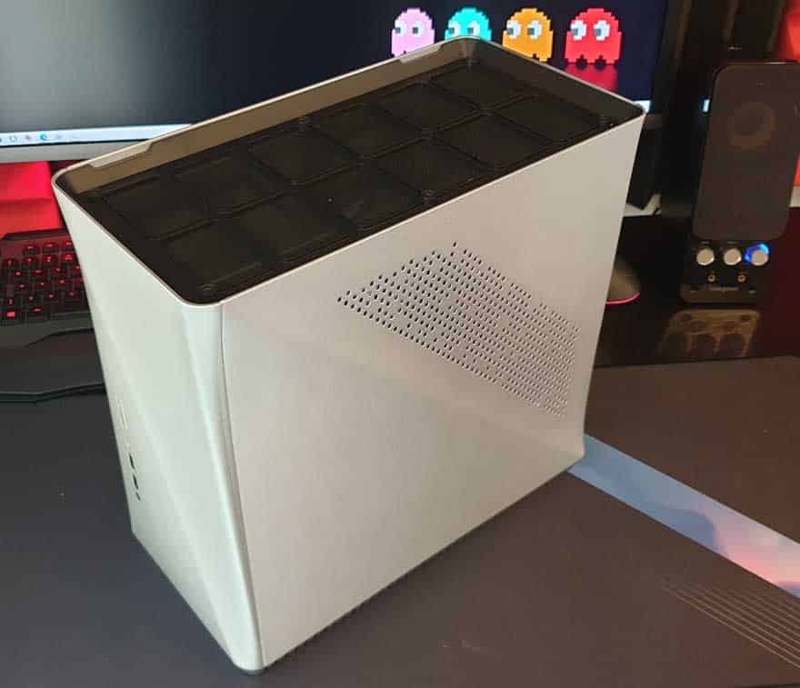
The Era is a little more unique than most other cases I’ve seen in a while. Tempered glass? Nope, none of that here. What about RGB? Nope, none of that either. Instead, you get lashings of brushed aluminium on the side.
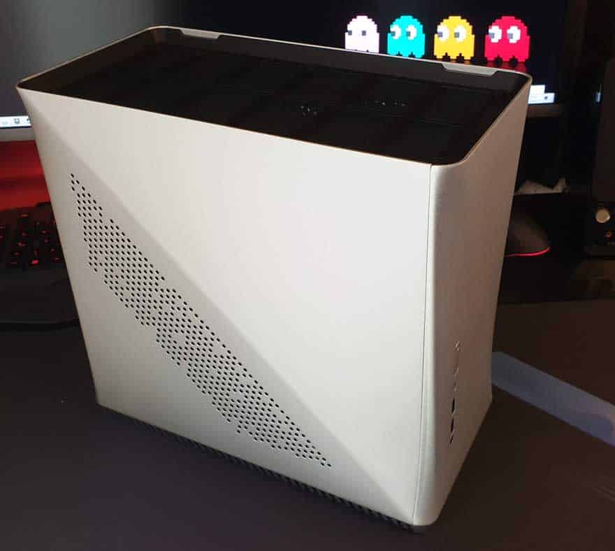
Airflow comes through these funky holes, and there’s a dust filter behind them too, ensuring your system is kept nice and clean.
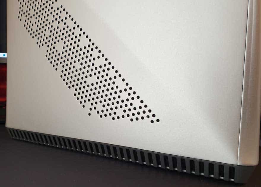
The front panel is interesting, with swooping and curved edges and corners. Nothing extreme, but nothing is quite straight on this case, it looks more fluid and natural. Ironically, I think it also looks like the old Xbox 360. It looks a little more old-school than modern to my eyes.
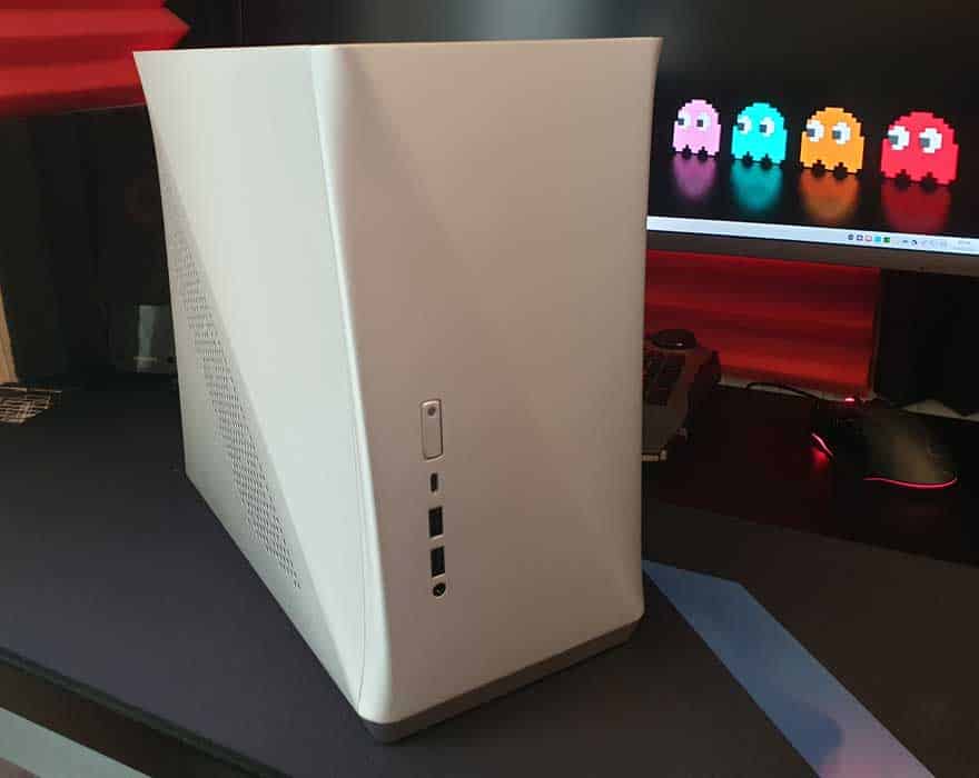
Down the right side, there’s a more of that ventilation, albeit in a different position than on the left and quite a bit more of it.
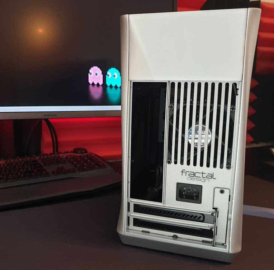
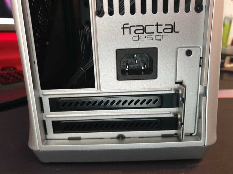
There’s only one fan pre-installed on this case, and it’s a lovely 80mm Fractal Design model at the rear for heat exhaust. You can fit more fans, but most components can draw airflow directly from the vents on the case.
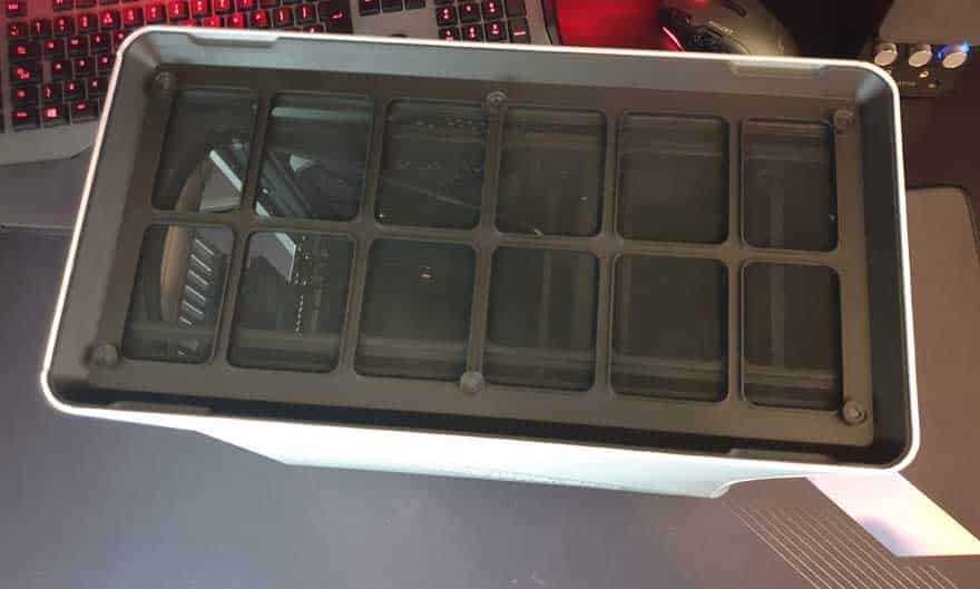
You get quite a lot of passive heat exhaust at the top too, with an enormous dust filter held in place magnetically. However, it’s up to you if you put the hard mesh or wooden panel on the top too.
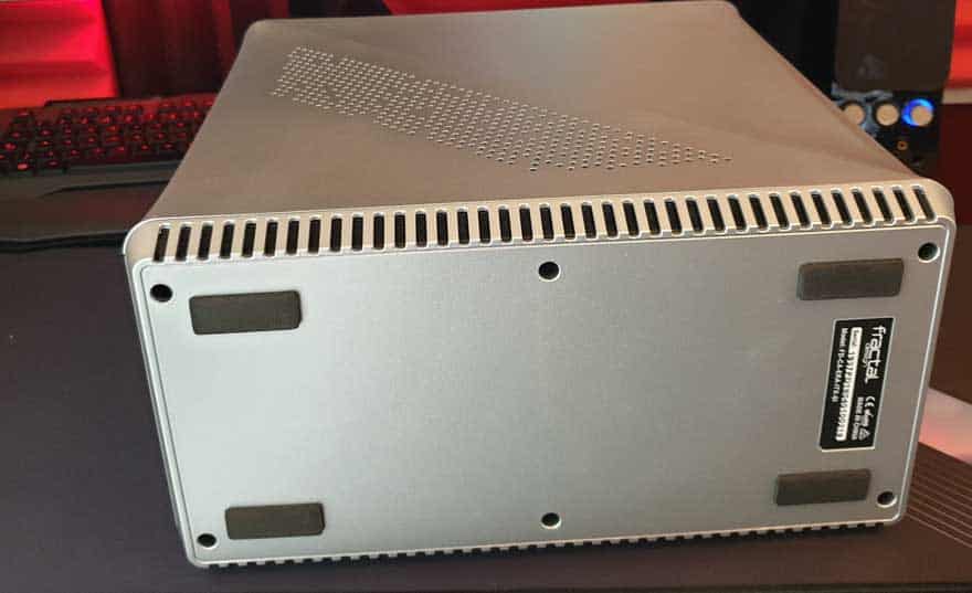
On the base, things are actually pretty tidy, with just four firm rubber feet. However, you can see there are deep air vents all along the left and right sides too.
