Fractal Design Torrent Compact Case Review
Peter Donnell / 3 years ago
Complete System
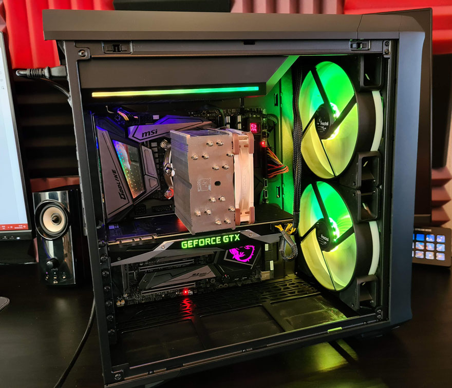
It is of little surprise that this was a really easy PC case to work with. For starters, it feels very familiar, with a layout that’s basically unchanged from the Torrent I reviewed just six months ago, it’s just a bit smaller. It does still amuse me that a Compact version of the case is still bloody massive though, as it still supports an E-ATX motherboard. The end result is awesome though, with good space for all the components and if anything, it looks better with this hardware than the Torrent as there’s not so much empty space.

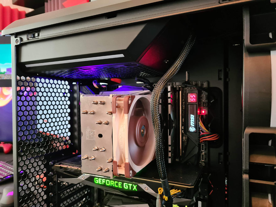
Cable management is excellent throughout, but again, that was certainly expected and those larger grommets and cable tie straps really help keep things neat and tidy.

The cable runs are kept short on all sides of the motherboard.

Plus, you gotta love that vertical pass-through allowing you to run a cable straight down to the graphics card.

Speaking of the GPU, larger cards are clearly not an issue here. However, keep in mind that while the Torrent supports cards of up to 423mm with the front fans or 461 without, the Compact is quite a bit shorter, offering you 330mm with the front fans and 368mm in total. However Fractal say that it’ll support 343 mm with 120/140×25 mm front fans in the lower position.

CPU cooler clearance is excellent too, and I don’t think there are any consumer air coolers that wouldn’t fit. You have 174mm of clearance in the Compact vs 188mm of clearance on the Torrent. So really, anything like the Noctua D15S would fit with ease.

There’s room around all major components for good airflow, there are no restrictions, trailing cables, etc, and it just looks very presentable overall.

Of course, there’s ARGB on the model I have here, so you can enjoy the lighting strip on the PSU shroud.

Meanwhile, those huge front fans throw out plenty of light that bathes the interior of the case in colour.

Plus, they look awesome from the front. They’re heavily recessed behind the front panel and the mesh too, so despite their brightness and size, they don’t flood your room with light like you might expect, and I really appreciate that.

A truly stunning build. I’m glad I got the lighter glass and RGB, but honestly, I’d have been just as happy with no RGB and a solid side panel, as that front mesh is all the style I need!


