Game Max Obsidian Gaming Chassis Review
Peter Donnell / 7 years ago
A Closer Look – Exterior
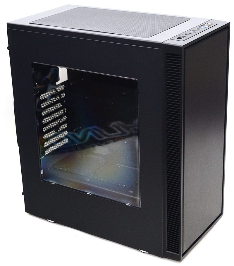
Now that it’s out of the box, the Obsidian looks pretty neat and tidy. It’s not reinventing the wheel, and certainly looks like many other chassis that have come and gone over the years, but it still looks great. Down the left side, there’s a large side panel window. It’s just big enough to show off your hardware but hides the rough edges of your build. Big surprise, it’s not tempered glass, as so many are these days, but I guess the price does reflect this.
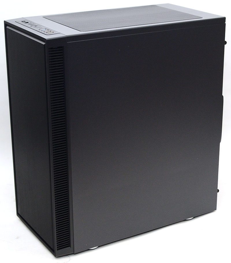
On the right side, not a lot going on, just a standard blank panel. It’s neat and tidy though, so can’t fault it. The front panel has no forward ventilation, keeping it looking nice and clean, but there’s plenty of ventilation on the left and right sides, allowing for loads of airflow.
Front and Back
There’s a brushed metal kind of effect on the front panel, giving it a nice premium look. Of course, it is just plastic, but it’s presentable, and I love the floating panel design with the border.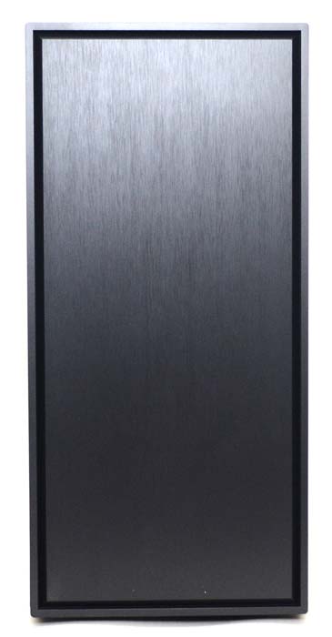
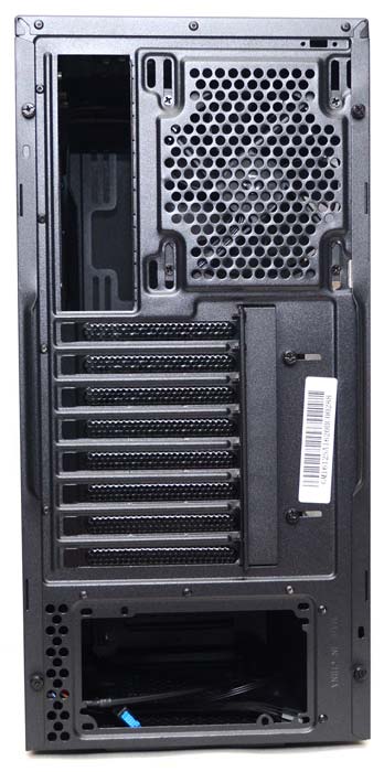
Around the back, again it’s all stuff we’ve seen before, but everything presentable. There’s a 120/140mm fan mount at the top, and thanks to some elongated screw holes, you’ll be able to more easily accommodate an AIO cooler here.
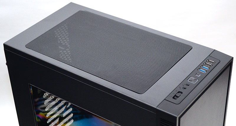
Up top, things are looking a bit more adventurous and exciting. There’s a huge ventilated section, with an easy to remove magnetic dust filter.
Front I/O
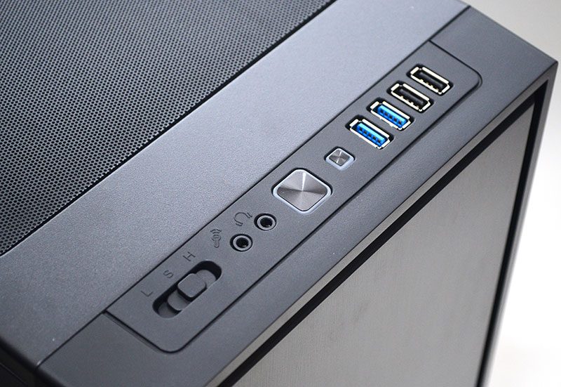
It’s pretty well equipped, especially for a chassis in this price range. There’s a three-speed fan controller, audio jacks, four USB ports, and some nicely designed power and reset buttons. If anything, it’s the fanciest part of the exterior, but it’s plenty practical too.
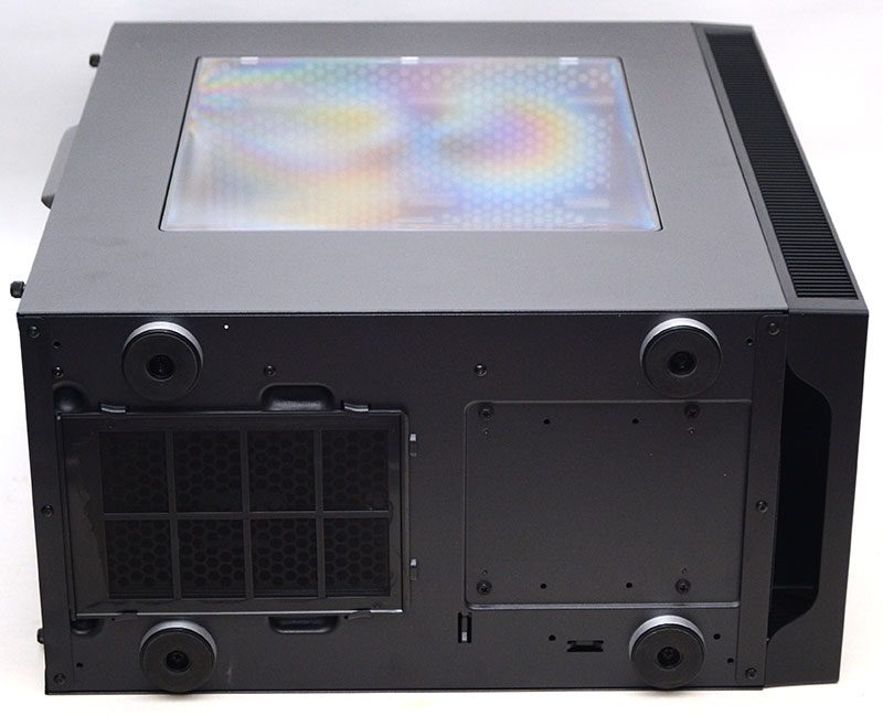
On the base, there are four large feet, giving it great stability. Of course, they also provide good ground clearance, allowing lots of airflow to the large air intake for the PSU. There’s also a slide out dust filter here, allowing for easy maintenance.
