Game Max Starlight Mid-Tower Chassis Review
Peter Donnell / 6 years ago
A Closer Look – Exterior
Now that it’s out of the box, the Starlight is making a good first impression. It’s not particularly crazy, but it doesn’t have to be either. It’s got a nice clean look and I quite like it even with the RGB turned off.

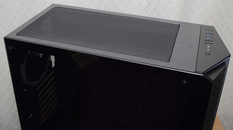
The side panel takes up the entire left side, and Gamemax even trimmed the corner so that everything flows together nicely.

It’s all held in place with four simple thumbscrews, keeping things looking clean and tidy, but also making it easy to access.

The RGB strip is very nicely designed, cutting in and out of the front panel, wrapping around and over/under. It’s a frosted white bar, so it’ll disperse the RGB lights behind it more evenly; just wait till you see it powered up!

I/O Panel
Tucking into the top panel, a simple and clean I/O. There’s a larger button on the front of the chassis for power, but also a small reset button up top. There are two audio jacks, and four USB ports; that’s more than most people will need.

Located behind that, a full-size magnetic dust filter, which is perfect for stopping debris falling into the chassis, as well as letting heat out.

If you want to give that heat a push, there’s room for both 120mm and 140mm cooling hardware up top also.

Right Side
The right side panel is about as standard as they come, but it gets the job done. One thing that you should see, is the extra ventilation down the right side of the front panel; those fans need air from somewhere!

Around the back, it’s all fairly straightforward again. There’s a 120mm fan pre-installed in the back, although it’ll support a 140mm fan, and the mount is height adjustable too. What does please me, is that all the expansion slot covers are reusable, not those nasty break-off ones; good job Game Max!


