Get a Sneak Peak at Chrome’s New Material Design Makeover
Alexander Neil / 9 years ago

It is no secret that Google is planning to polish the UI of their popular web browser, to bring it in-line with the company’s material design aesthetic. As it turns out, the facelift could be here sooner than thought, with the latest stable version of Chrome featuring several optional features that allow some of the tweaks to be enabled early.
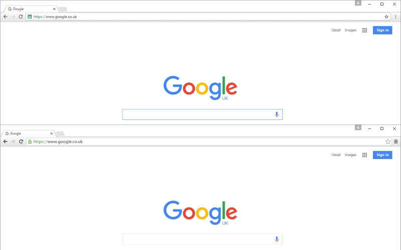
The changes aren’t drastic, with the majority of the browser’s minimalist UI being very similar. Overall, icon borders have been thinned down and the bookmark icons have been switched from their old yellow ‘folder’ look to plain gray icons. The old ‘hamburger’ button used to view the menu has also been switched to 3 vertically arranged dots with a more dynamic visual when opened and closed. The address bar has also seen a reduction in its font size, along with a darker, more obvious icon for sites being securely accessed via HTTPS.
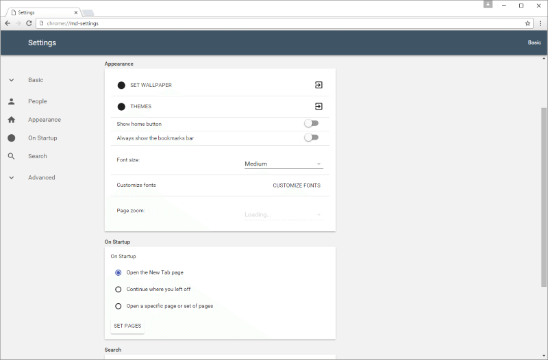
Other parts of the browser have taken more significant changes, looking far more similar to the Material-style interface used in the Android operating system. The downloads menu separates each download as a card, with more obvious links for showing the download’s location and an ‘X’ button being present to remove the card. The settings menu’s overhaul brings in new fonts and colour to the page, with all of the settings being present on one page and links allowing the user to easily find the correct section. The toggle buttons and drop-down menus will also be instantly familiar to an Android user. Chrome’s PDF viewer has also been a part of the overhaul, with a new top bar and a set of circular buttons, both of which remain hidden until mouse movement towards them occurs.

To try out these changes for yourself, head to chrome://flags in the browser and set the following drop-down boxes to Material: “Material design in the browser’s top chrome,” “Enable material UI for PDF,” and “Enable Material Design downloads.” Meanwhile, the preview for the Material Design settings menu can be found at chrome://md-settings.
While these changes to Chrome are still in development and thus, still subject to change, it is nice to see Chrome home getting a facelift after so long. These aren’t the only changes planned for Chrome either, with a dark theme for incognito browsing, similar to that of the mobile version and a new video player interface. All of these changes and more could be ready to go live for as soon as Chrome 50, only two stable versions away.


