Gigabyte M32UC 32″ Curved 4K 144Hz Gaming Monitor Review
Peter Donnell / 2 years ago
A Closer Look
The Gigabyte M32UC makes a strong first impression, quite literally, as the whole thing feels pretty robust. It’s a heavy monitor, coming in at almost 8KG, but for a 32″ panel, I suppose that’s not too bad really. There’s not really a lot to see beyond the panel either, as the frame is kept very small on the top and sides.

There’s a slightly thicker bezel on the bottom, but again, that’s still kept pretty modest.

The gigabyte logo in the middle is simple enough, and not distracting. There’s no RGB lighting on the bottom or anything, and honestly, I’m totally OK with that.

Around the back, the monitor looks very classy, with a two-tone black-on-black finish that’s created using a glossy and more textured finish on the upper and lower half. There are a couple of funky shapes etched in here and there, but they’re purely aesthetic rather than practical; that being said, I do like them.

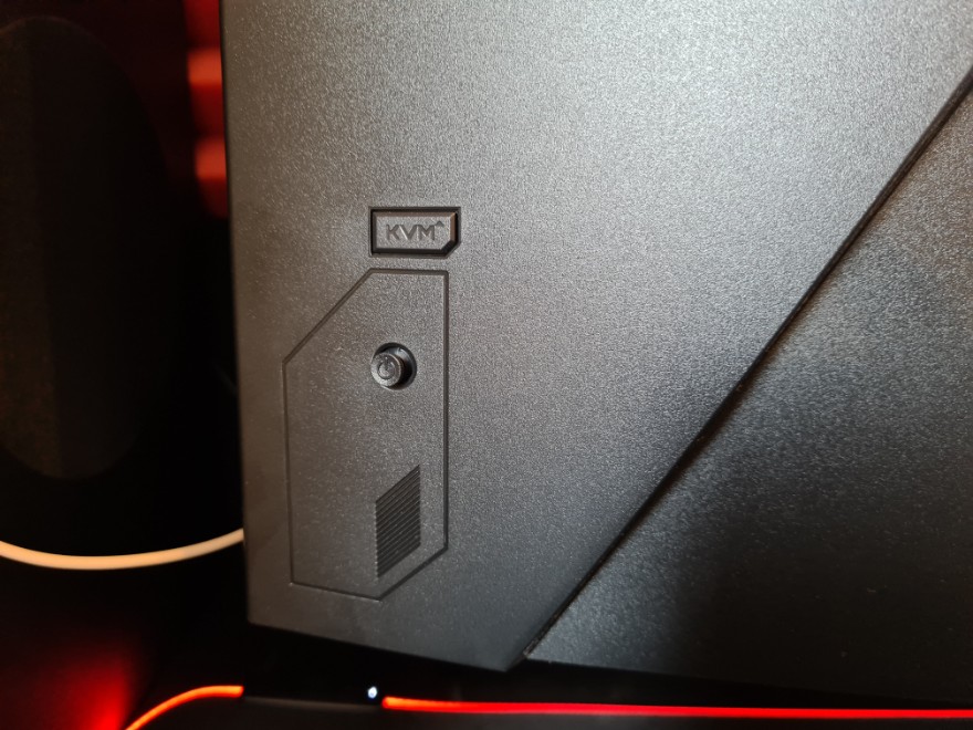
The monitor is controlled by a single thumb stick on the back here; it’s nice and easy to reach and use too.

The stand has a quick-release mount, and the monitor is also VESA compatible should you need it. That being said, I really like this stand. It sits very close to the monitor and doesn’t stick out much at the back, so you can get it really close to a wall if needed.

The stand obviously sticks out more at the front, but the wider leg design follows the curve of the panel so it doesn’t feel particularly intrusive overall. There’s a decent amount of adjustment on offer too, with -5°~+20° tilt.

There’s also 100mm of height adjustment, with the low setting practically sitting on the stand.

And at its full height, it stands nice and tall, but still felt very stable on the robust stand.

The newest HDMI 2.1 ports can deliver 4K @ 144Hz, however, if you’re using the DisplayPort, the monitor can be pushed to 160Hz. I’d argue you’re unlikely to notice the difference though, as it’s only a 16Hz increase.


