Google search page gets an update
Laurence Howe / 12 years ago

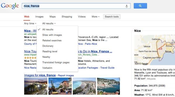
Google has unveiled a new design for its search results page that gives more real estate to its Knowledge Graph results and makes the look and feel on desktop computers consistent with those on smartphones and tablets. In a nutshell, the new layout shifts the advanced search options from the left sidebar to the horizontal bar above results where options to search verticals like Images, News and Maps are located.
You’ll notice a new simpler, cleaner design on the search results page — we’ve been working on ways to create a consistent search experience across the wide variety of devices and screen sizes people use today. We started with tablets last year, got it to mobile phones a few weeks ago, and are now rolling out to the desktop.
With the new design, there’s a bit more breathing room, and more focus on the answers you’re looking for, whether from web results or from a feature like the Knowledge Graph:
The same advanced tools you’re used to are still there when you need them. Just click on “Search tools” to filter or drill down on your results:
It’s going out to Google.com users in the U.S. to start, and we want to get it to users in other languages and regions as soon as we can. We hope you enjoy this design refresh — let us know what you think on our Google+ page.
The advanced search tools themselves aren’t changing. Clicking on the “Search tools” link brings up virtually the same options as before, allowing you to filter results by date ranges and a handful of other criteria (sites with images, related searches, nearby, translated foreign pages, etc.)
Source: Google Inside


