Mad Catz S.T.R.I.K.E.7 Keyboard Review
Tim Mammatt / 12 years ago
Before we take a look at the packaging, we’ll just say again that the branding is due to change to MadCatz and not Cyborg, so the packaging could end up looking different. When we first took delivery of the STRIKE7 we were unsure what it was at first, due to the cuboid shape, instead of the much flatter, longer boxes you generally get keyboards in. Out of the box we are greeted with a sleek, angular box that matches the rest of the Cyborg packaging. For this particular review sample, we were sent the German QWERTZ version, as the UK layout had not yet gone into production. The front of the box features relatively little information, but has a graphic of the keyboard fully assembled.
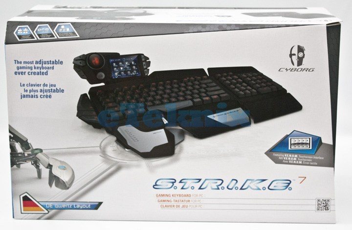
The top of the box featured the keyboard in it’s broken down form, displaying some of the possible layouts one can have with the STRIKE7
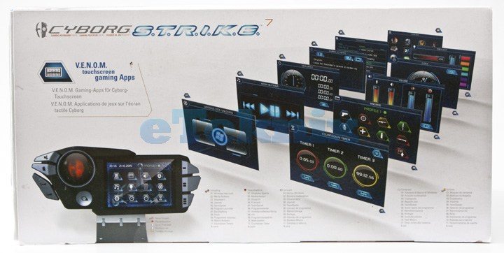
The bottom of the box displays the VENOM touchscreen apps and a brief introduction to what to expect.
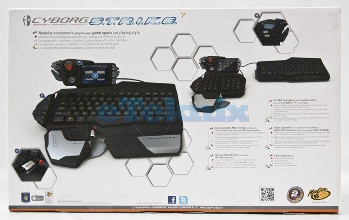
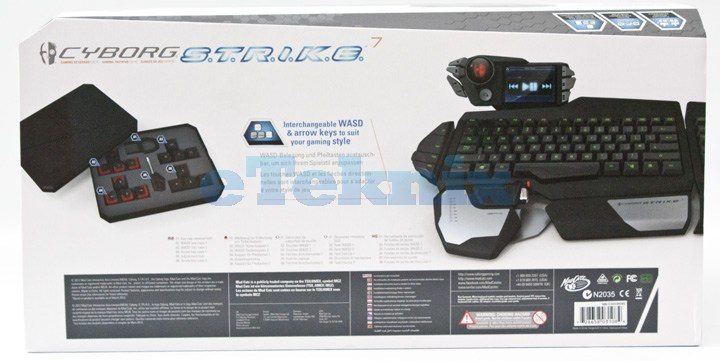
The back of the box displays some of the custom key layouts it’s possible to have with the STRIKE7.
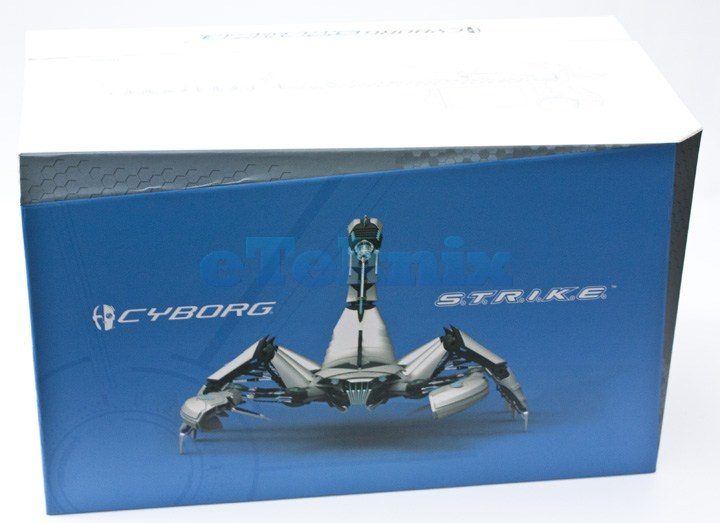
When you have removed the sleeve, a plain box is exposed, with a blue front featuring a scorpion.
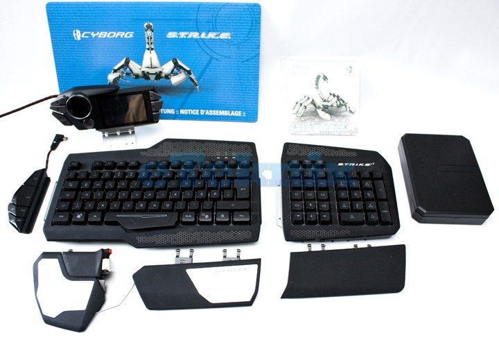
Within this box you have the components of the keyboard itself. As you can see there are many parts to the keyboard, so MadCatz have been kind enough to include an assembly guide.
So now it’s time to construct the STRIKE7 and see how it looks fully assembled.
