
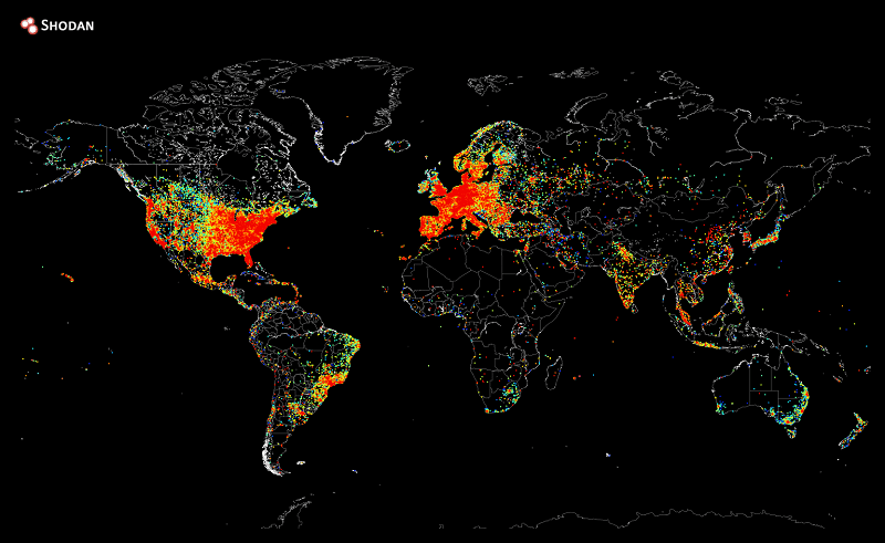
This wonderful map was created by John Matherly, the founder of Shodan, a search engine that searches for connections between devices. It took just five hours to ping every IP address on the internet and store every positive response, then another 12 hours to plot the responses on a heat map. The bright orange areas show densely connected areas while the blue and black areas show sparsely connected areas.
The results are pretty predictable, but also pretty humbling too. As someone who lives in a heavily connected part of the globe and feeling “connected” to everyone around me, it can be easy to forget that large sections of the world still struggle for connection to the rest of us.
Some people have also pointed out a few odd areas on the map, with small islands of ping results in the middle of nowhere, such as the one smack bang in the middle of Greenland, although this is now suspected to be a NOAA observatory. What colour is the area you live in? Let us know in the comments section below.
Thank you Reddit for providing us with this information.
Image courtesy of Reddit.


Do some ships not have some sort of internet connection, via satellite or something?
If so, could some of the ones in the middle of the oceans be from them?
You kidding me? India – The land of tech support
Oh God. I pee’d a lil at that.