Material Design UI Overhaul In Chrome OS Version 50
Alexander Neil / 9 years ago

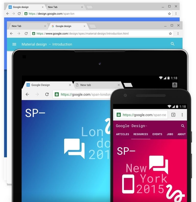
A few months ago, we got a sneak peek at how the Chrome web browser would look following a design overhaul to match Google’s Material Design aesthetic. Now, Chrome version 50 has begun to be deployed to a number of platforms, but for Chrome OS users, this milestone release will also see a complete Material Design makeover according to Sebastian Gabriel, a senior designer at Google.
Material Design is Google’s unifying company-wide style guidelines that started to be deployed to the company’s many products starting with Android 5.0 Lollipop. For Chrome users, the design changes are very minimal and the UI will function in mostly the same way, with many of the adjustments being purely visual. On the whole, the UI makes use of more flat colours, doing away with many of the shadows and gradients that used to feature in the UI.
Chrome OS users will be pleased to know the changes aren’t just skin deep, with the update also increasing performance behind the scenes. The Material Design UI is reportedly rendered fully programmatically, which allows a large number of image resource files to be unnecessary and the UI being based on vectors allows it to scale better to super widescreen and other unconventional screen resolutions.
The update to this new version will be automatic for Chrome OS users while users on Windows and Mac may have to wait a little longer for the final version of the Material UI for Chrome. For those willing to give it a try early using Chrome Canary and accessing “Chrome://flags”, where they will find the ability to enable Material Design. As before this is just a preview and users may run into bugs and the UI is still subject to change.


