Microsoft Teases New Windows 10 “Neon” UI
Samuel Wan / 8 years ago

When Microsoft announced Windows 10, the goal was to turn their OS into a software as a service. One of the key differences is that Microsoft can now push changes out that fundamentally changes how Windows 10 works. As part of their model of continued support and feature updates, Microsoft has teased their new “Neon” UI. The company is set to launch Neon as well provide more details at the BUILD event in May.
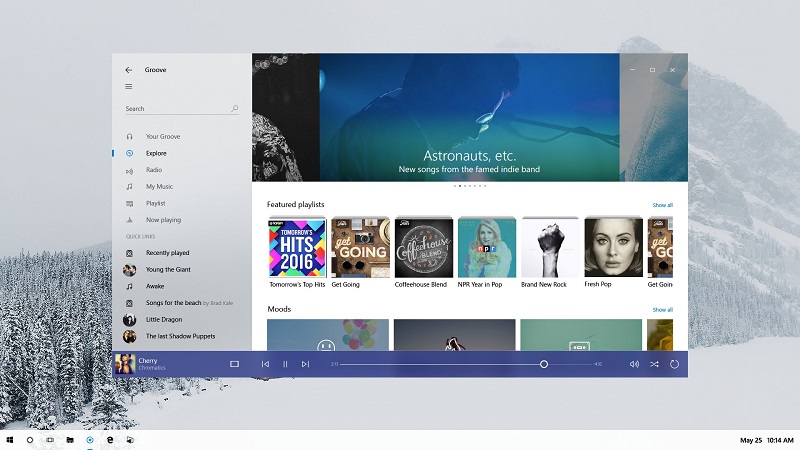
Known internally as Project Neon, we saw some hints of the design from earlier leaks. From their teaser during a recent keynote, the big changes are an increased emphasis on animations and visually blurring various elements together. Gone are the days of old where different UI elements were separated by borders. Instead, it seems like the new design is reliant on contrast and animations to distinguish different elements. Another interesting change is the windows control button placement which is now lower down and shifted to the left. This appears to be done to make it easier for touchscreen/mobile users interact with the window.
In many ways, Neon just takes what was started with Windows 8 (Metro) and Windows 10 (MDL2) and takes it up a notch. While in line with some smartphone OS UI’s, it’s hard to see the allure on the desktop. By going too minimalist, there is an increased of hiding useful information and confusing the user. I for one miss the old flashy days of Aero. There is also the fact that Windows 10 still has a disjointed UI, combining various design elements from the past. While there remains a lot of work to be done for Neon, it may hopefully unify the UI at last.


