Mountain Everest Max Keyboard Review – The Greatest Mechanical Ever!
Peter Donnell / 4 years ago
A Closer Look
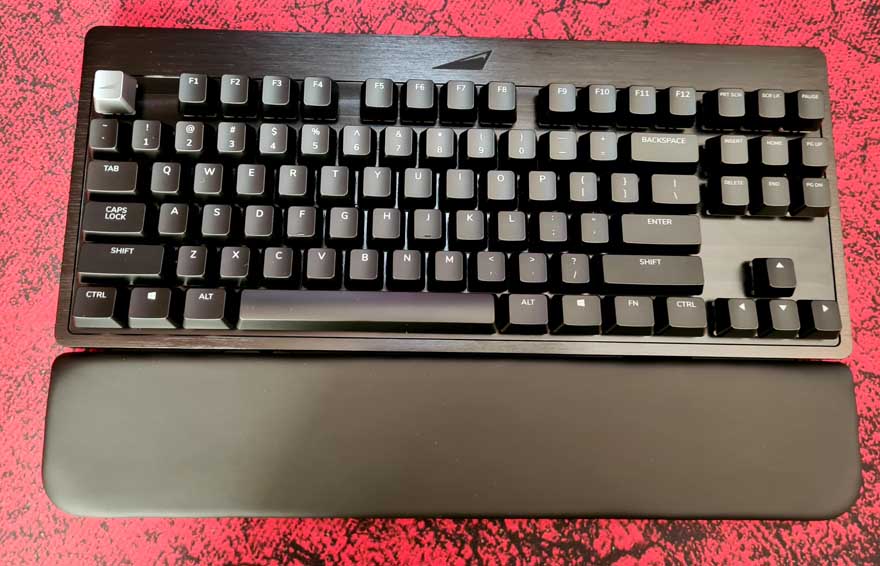
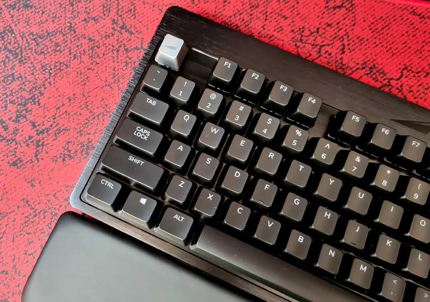
That’s right, we’re nearly 600 words in and I’m finally showing you the keyboard! It was clearly worth the wait though, as this thing is gorgeous! Of course, it also comes with this full-width wrist rest.

It’s just a magnetic mount, so just snap it in place and you’re good to go.
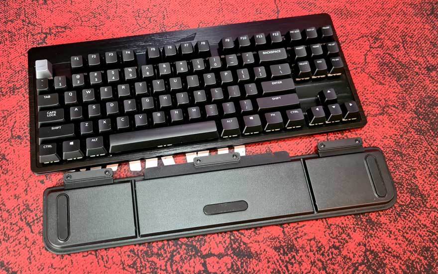
Keep in mind though, it’s not going to extend over the numberpad too, but more on that later.
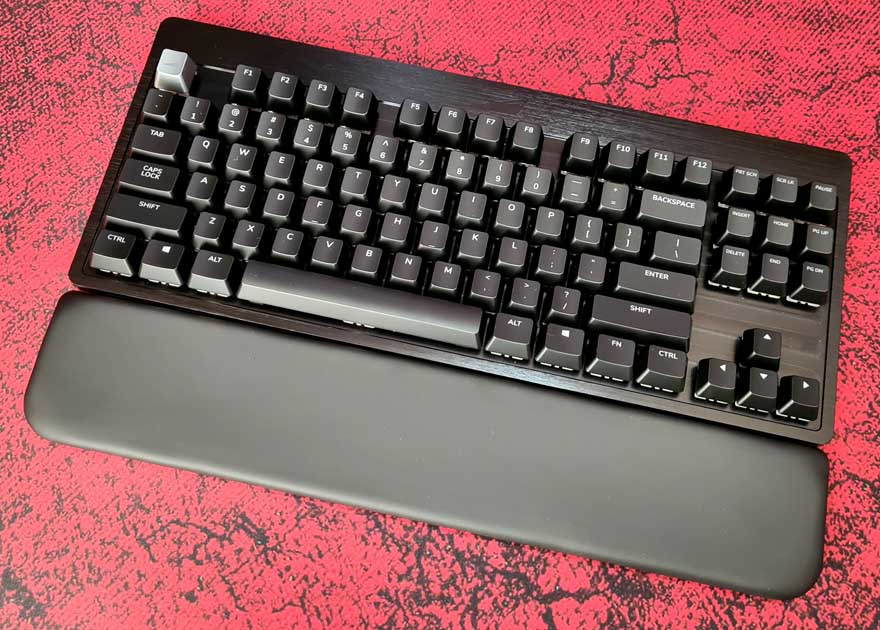
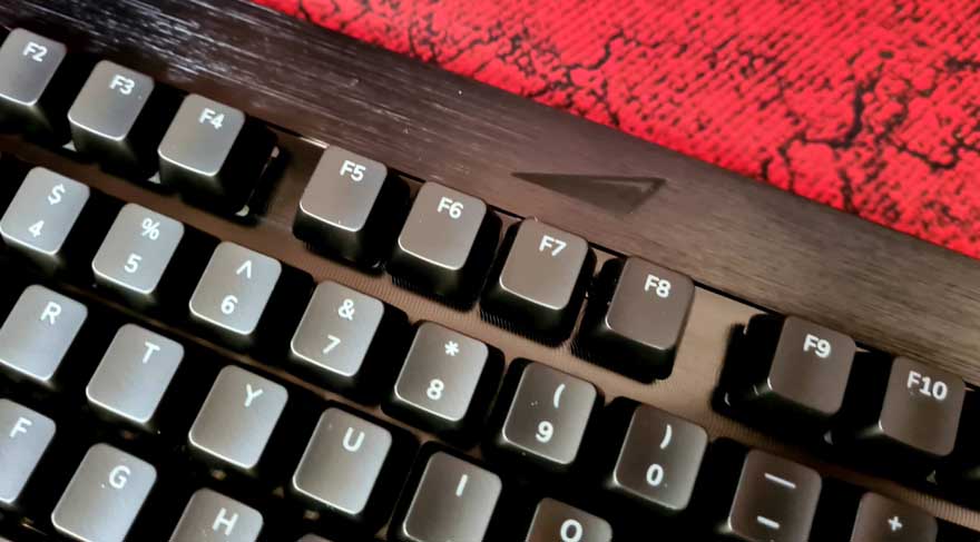
Branding is kept to the bare minimum here, with just a small mountain logo cut into the aluminium top panel. It’s simple, clean and classy.
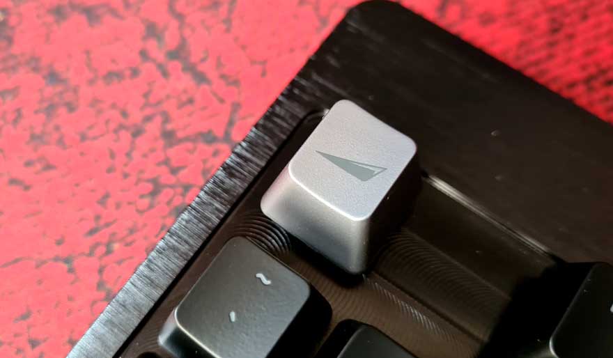
The first thing I noticed was that custom Mountain key cap, which as branding, I think looks great.
However, if you don’t like it, they even include the stock Esc cap back in the box, isn’t that thoughtful of them!
What I did notice quite quickly is how simple and straightforward this all looks. There are no macro keys, no multimedia short cuts, nothing really. It’s just a very nicely made and finished keyboard.
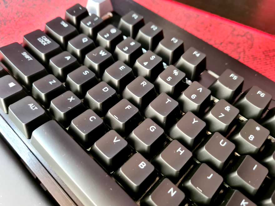
The caps all look sensible, and have laser cut font for the RGB lighting.

There’s a two-texture design to the chassis too, which is unusual but interesting. The bezel comes in a brushed aluminium finish.
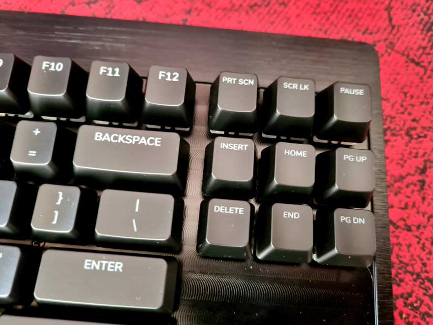
However, between the keys, it has been giving a turned finish that’s a little more reflective and eye-catching.
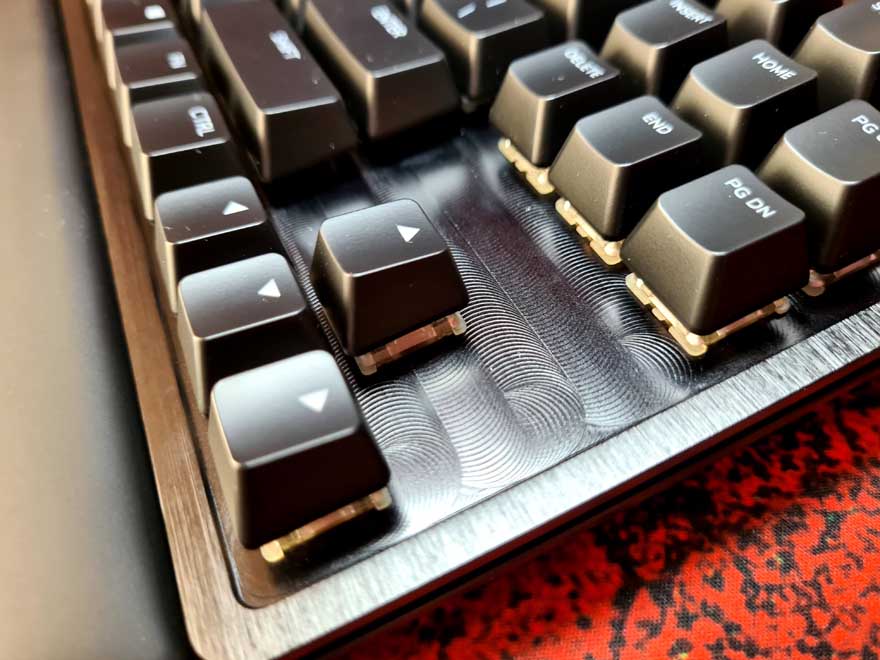
Overall, I’m very pleased with the core keyboard. It’s strong, it has a good weight to it, there’s no flex, nothing feels loose. Honestly, if you just buy the base model, you’ll love it.
