MSI Force GC30 V2 White Multi-Format Controller Review
Peter Donnell / 3 years ago
A Closer Look
The new Force GC30 controller looks fantastic in white, but it’s also been given a few other design tweaks that make it look and feel a lot more modern. It’s actually been four years since I reviewed the original, and if I’m being honest, even four years ago it looked a little bit dated. However, the new design really has had a big impact, making an out-of-date design look much more modern if not borderline futuristic.
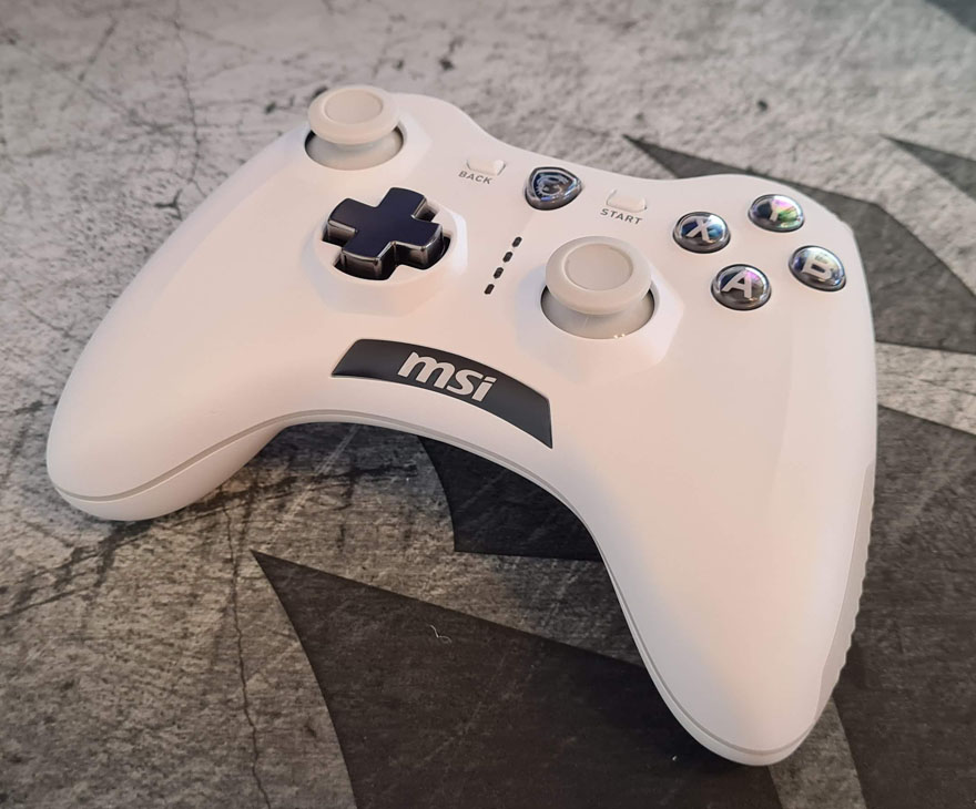
You don’t need me to talk you through what everything is that you see here, we’ve pretty much all handled a modern controller… or ten. However, everything does look and feels to be in the right place, at least if you’re used to a modern Xbox One controller, not the Series X though, as that controller is a little bit smaller than the older ones.

The triggers and back buttons are really nicely designed. I even like the colour, even if it is similar to the grey used on medical equipment and hearing aids. However, it provides a nice soft contrast to the matte whites. The LB/RB have a more mechanical feel to them too, offering a nice “click” action.
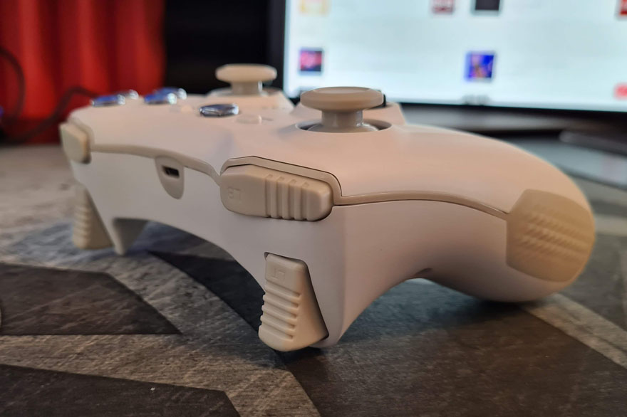
The triggers are nice too, they have a slightly stronger spring than the Xbox One controller, but I like that, it makes them return quickly and allows for smoother adjustments to trigger. Plus, those deep grooves make for a nice feel and comfortable grip overall.

The travel distance is excellent too, around 1.5mm longer than the Xbox One triggers, as these are straight, while Xbox trigger curve out at the bottom.
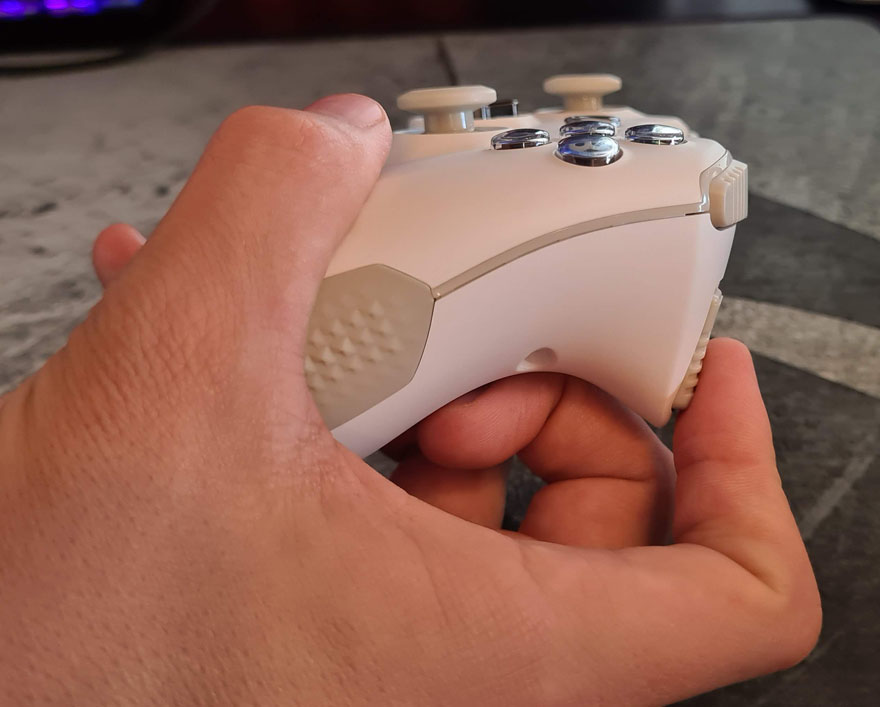
Down the side, you’ll find the rubber grips of the old model remain. However, while the outer dimensions remain the same, the pattern has been completely changed. They’ve now a larger pyramid design rather than the old tyre-tread design.

Another small detail, the MSI logo section is now much smoother, it almost looked glued on in the old model. However, the new design is actually recessed into the body. The D-PAD mounting is also much smoother, with less hard edges. The old one had a strange recessed design that worked fine, but looking back at it, perhaps didn’t look the best.
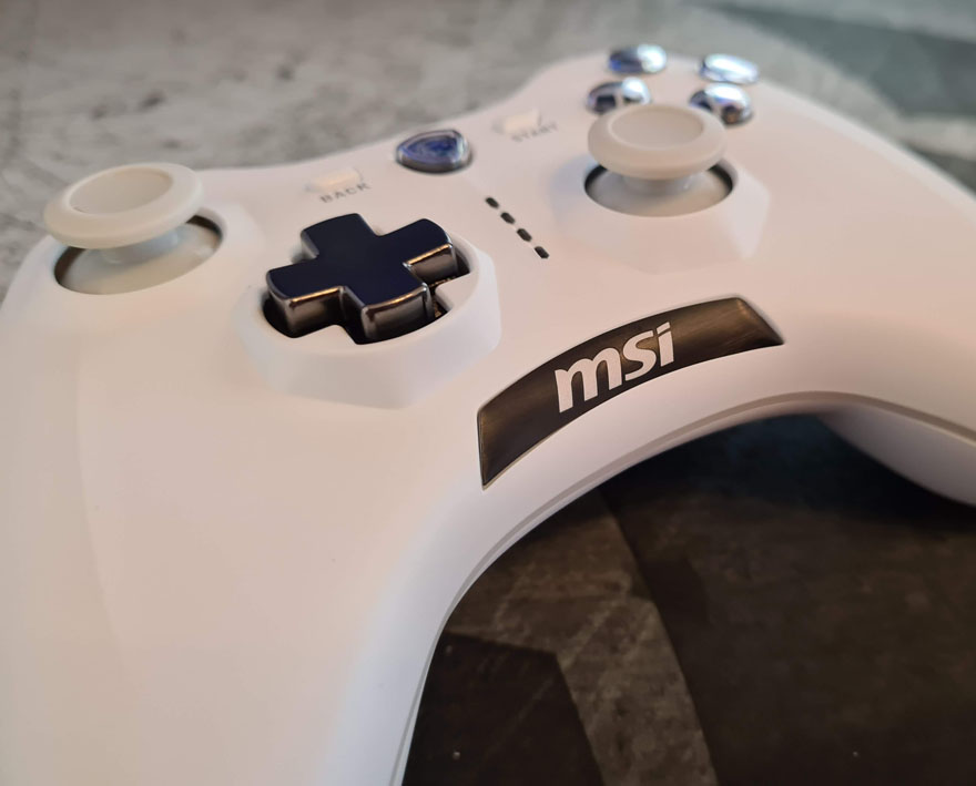
The sticks are redesigned too, with a larger top, shorter stems, but slightly improved range too.

Again, like the analogue triggers, a little heavier to move than the Xbox ones, but I actually like it, it feels very smooth and really well made too.

MSI doesn’t say what kind of buttons they’ve put into the rest of the controller, they feel like traditional rubber domes like you would find in the Xbox or PlayStation controllers. However, they do feel a little more robust and heavy, they also wobble less than the Xbox One buttons and just feel, objectively, better. Plus, that monochrome look they’ve given them looks dope, a stark contrast to the melody of colours on the old controller.

The controller is rechargeable, and there’s a Micro-USB cable provided. However, it’s a stock cable, so any Micro-USB you’ve got should do the job just fine. The controller is wireless with the USB dongle, but you can play it wired too if you so desired; that means you can charge while playing also.
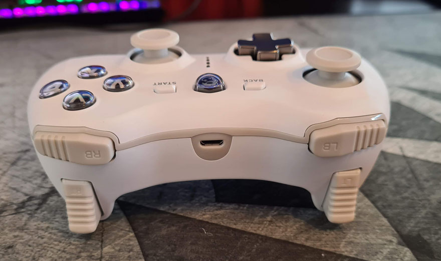
The front of the controller has four red LED lights, which can tell you which mode you’re in, battery levels, pairing status, etc.

Should you forgot what they all mean, I like that the rear of the controller tells you what’s what, that’s really handy! Why change modes? Device compatibility, if it’s not working on a certain game or device, try changing the mode. However, for 99% of uses, the default mode is fine.
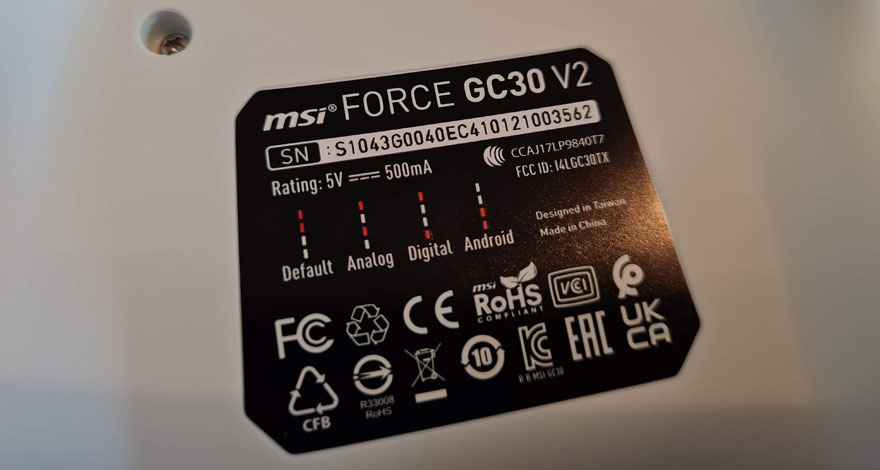
If you think you’ve got things mixed up, there’s a pinhole on the back, jab a paper clip or something in there, and the controller will revert to default settings. Albeit, I haven’t found the need to do so since I got the controller last week.

MSI claims around 8 hours of battery life, and from my own testing, that seems about right. However, when I did get a warning, I just plugged in the USB cable and it seemed to be fully charged after around 30 minutes (while still gaming I might add). The control shuts down after 5mins of no activity. However, pressing B and Back will allow you to turn the controller off manually, which is nice.

The new D-Pad is the last feature here, and the + design one feels pretty fantastic. It’s a HUGE improvement on their old design and certainly beats out the muddy feeling Xbox One D-PAD design (but not the new clicky Xbox Series X D-PAD). Of course, with that magnetic top panel, just pop it off…

…Grab the little pie dish one.

And ta-da, you’ve got a hexagonal dish D-PAD thingy. I quite like it, but it’s not really suitable for all games, but I guess that’s why you can hot-swap it, it’s worthy of experimentation with each game.

It’s a sound replacement for the Xbox One controller. Very similar feel, albeit lighter due to the smaller internal battery, and there’s no headphone jack. However, it does actually feel more robust and has its own merits. Overall, I’m very happy with it.

