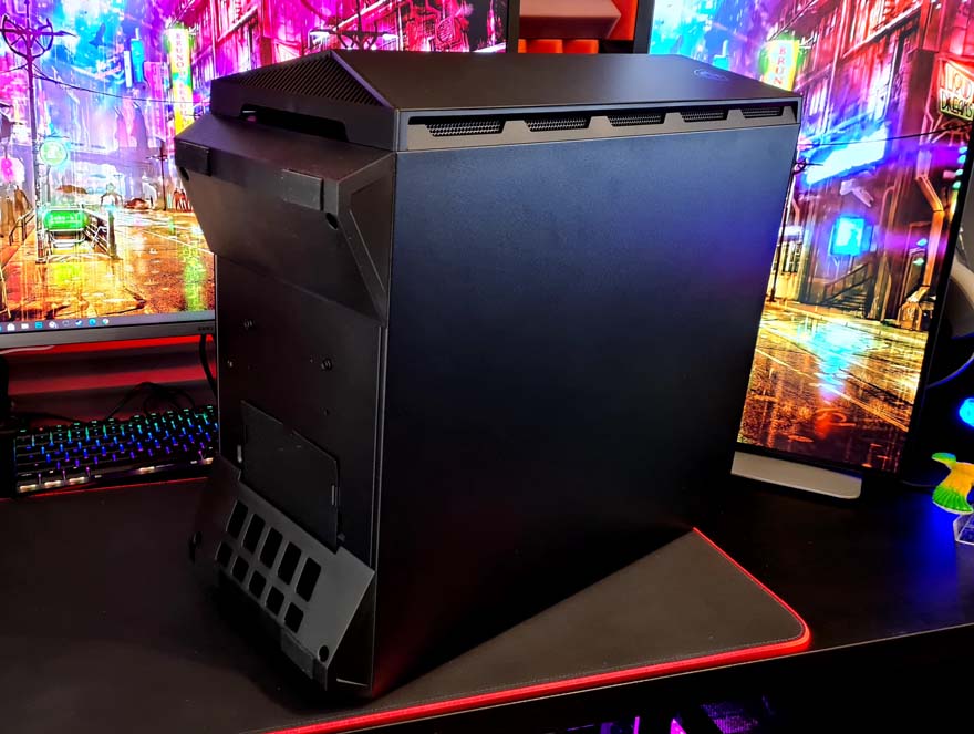
MSI GUNGNIR 110R Mid-Tower Case Review
Exterior
First impressions go a long way, and the GUNGNIR 110R makes a great one! There’s a pair of tempered glass panels on this case, one taking up half of the front and one on the left side. The one on the left is attached by screws at the rear, so the view is unobstructed by mounting hardware. It also has a black trim on the interior, ensuring the edges look nice and smart, and hide any unsightly parts of the case.
Towards the front, you can see there’s a range of ventilation cut into the side of the panel. The front panel is very angular, with the glass cut to a unique shape, giving it a much more dynamic look.
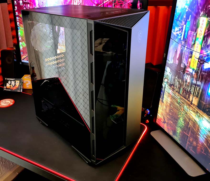
There’s an air gap in the middle, ensuring airflow can pass to the fans. However, there’s also a lot of ventilation at the top and bottom of the panel, so it’s a lot more open that it first appears.
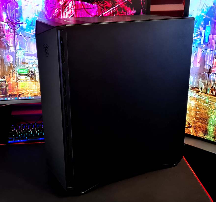
The right side panel is just a blank panel, nothing crazy, buy it gets the job done and looks presentable.
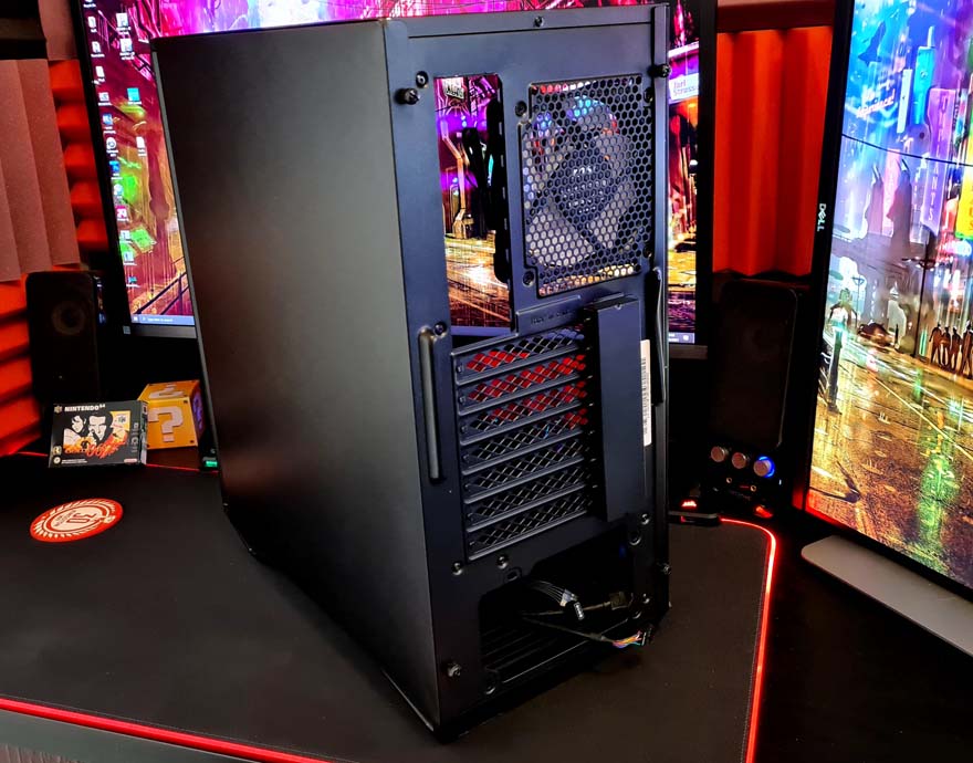
Around the back, you’ll find all of the expansion slot covers are reusable and ventilated. There are none of those nasty snap-off covers here!
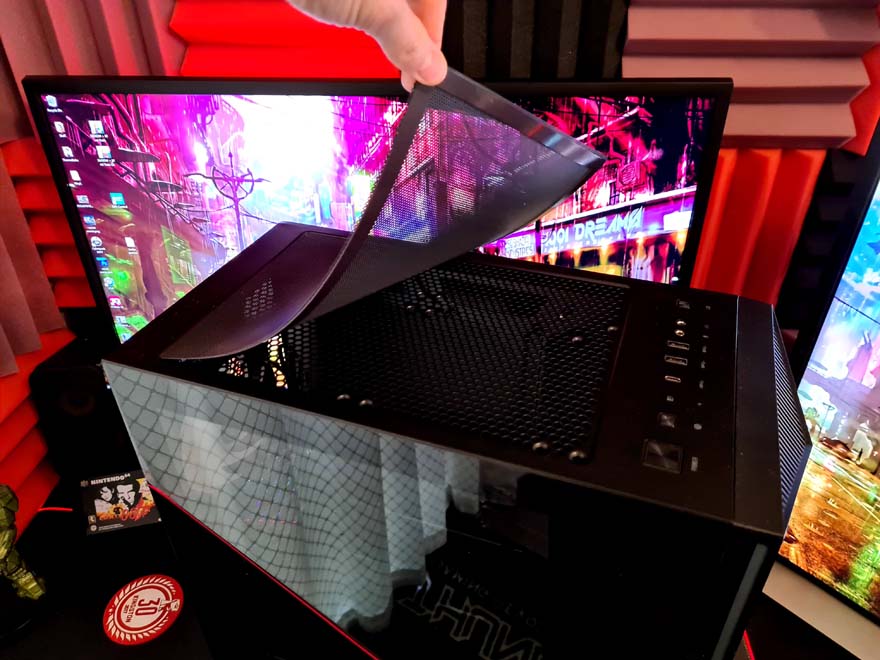
Up on the top, you’ll find a massive dust filter, stopping any crud from dropping into the top of the case. Of course, this huge opening allows for a lot of passive heat exhaust, or active exhaust if you put some fans/radiators in the top of the case.
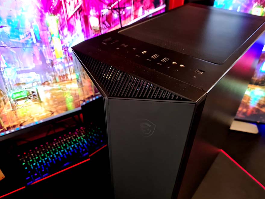
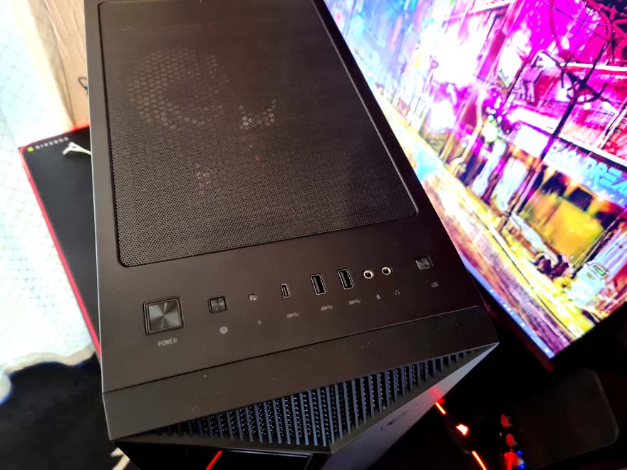
The front I/O panel spans the entire width of the case. From left to right we have the power and rest buttons, LED indicator, USB Type-C, a pair of USB 3 ports, audio jacks, and the ARGB control button.
The feet on this case are really funky, with a wedge shape that provides excellent ground clearance. However, there’s even ventilation cut into them, allowing airflow to the PSU and the built-in dust filter.
