MSI MEG CORELIQUID S360 AIO Liquid Cooler Review
Mike Sanders / 3 years ago
Exterior Packaging
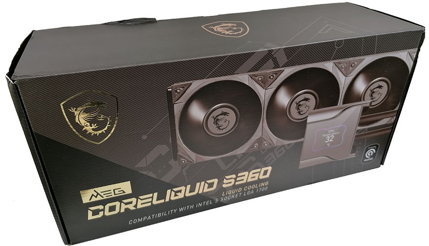
I’ve never seen MSI utilise this aesthetic style with their packaging before, but having seen it here, I like it, and definitely want to see it more! – The overall design is exceptionally eye-catching with the front giving you a nice clear view of the AIO liquid cooler. Overall though, it gives something of a modern and sleek presentation without going too far. It looks premium, and for many manufacturers, this is an aspect of the presentation they often get completely wrong with their own top-spec products.
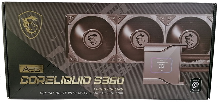
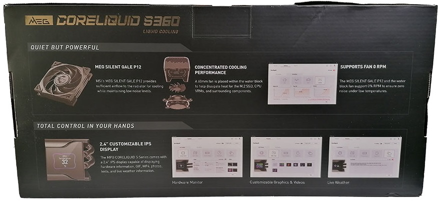
The rear of the packaging provides you with reasonably in-depth details on the key features the MSI MEG CORELIQUID S360 has. – The information is presented well with a nice easy on the eye style as well as also giving you numerous good quality images.
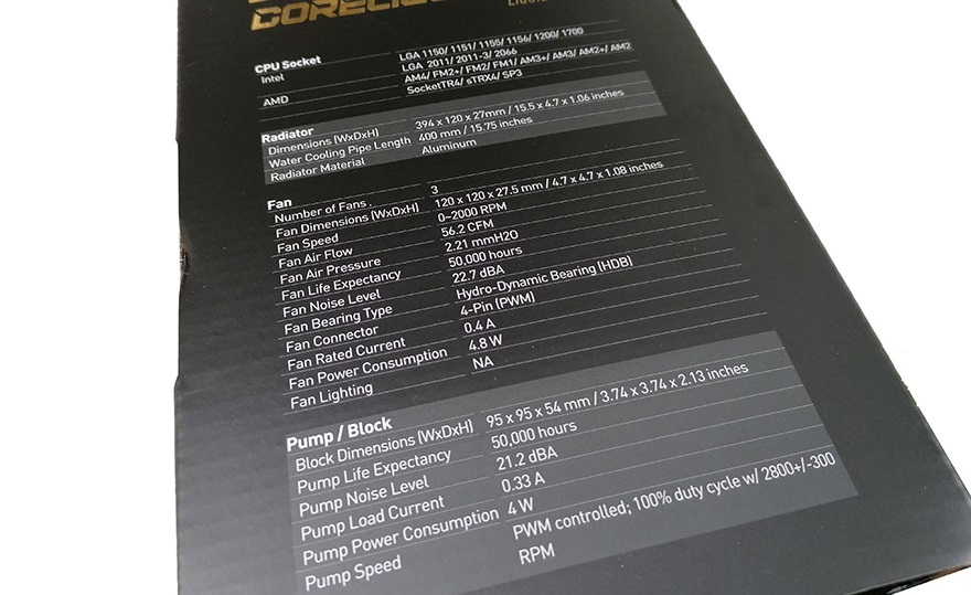
In terms of the technical specifications, everything you could want to know (beyond what’s explained on the back) is provided on the side. Again, this is very easy to read, being both nice and large with a clear contrast between the lettering and the predominantly black/silver packaging. – On the whole, in terms of its presentation, the MSI MEG CORELIQUID S360 really hits it out of the park!
Accessories!
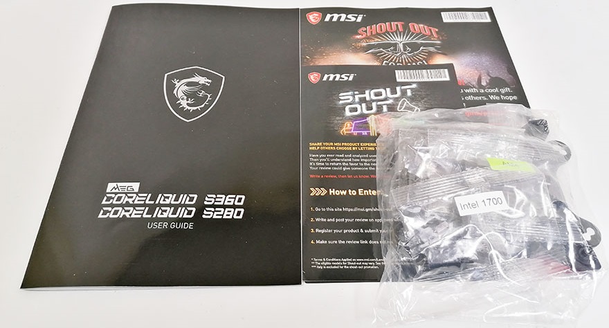
MSI has kept the accessories for the MEG CORELIQUID S360 nice and concise. All of the key installation parts are contained within a sealable bag, which itself contains smaller (unfortunately not resealable) bags for the individual socket types. – In terms of product manuals, you’re given a large glossy instruction booklet as well as some promotional material (albeit, enjoy this while you can as MSI recently made overtures that they would start to look to phase out physical documentation).
