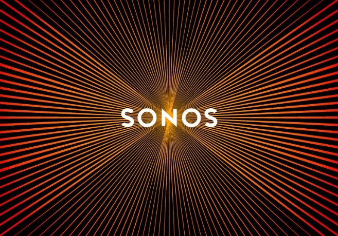
New Sonos Logo Looks Like Pulsating Speakers When Scrolled
Ryan Simmons / 10 years ago

There’s little else to say because you’ve already seen it. Well, just in case you managed to get here without scrolling past the thumbnail, Sonos, speaker manufacturer, has a new logo, a logo that rather cleverly pulses like a speaker when you scroll past it.
Go on, scroll! The thing is, there is no official mention of this effect by the designers, Bruce Mau Design. So one wonders, was this intentional? If so – clever! If not – that’s an amazing coincidence!
The logo is already working for them, a whole host of publications have already written about it, leading to tons of free publicity for the company.
Think of it like an animated gif that isn’t animated. What do you think about it? Intentional or not?
Source: The Verge


