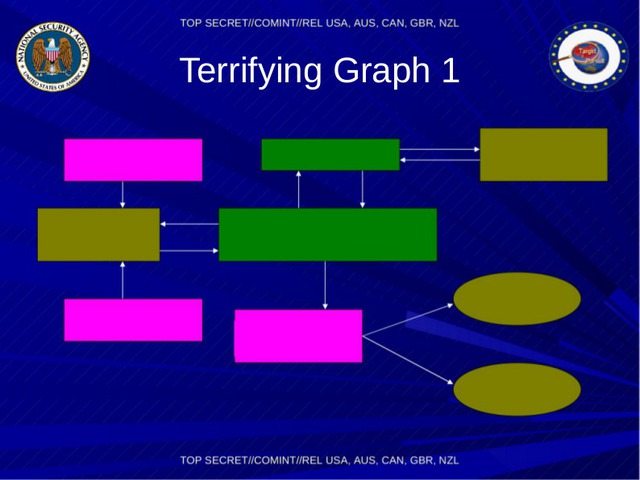
Now Your Presentations Can Look As Bad As The NSA’s
Ryan Simmons / 10 years ago

Most have us under a certain age were lectured in school on how to produce a decent presentation – not to write too much content on one slide, not to use so many zany fonts and graphics… the list goes on. The thing is, the slides produced by the NSA and leaked by Edward Snowdon in 2013 seemed to go against all of those rules.
They were laughable with their silly fonts, backgrounds and poor graphics. Many of them had tons of pointless information on one slide, with little to no sense of design.
Well finally your presentations can look just as bad. Julian Oliver of the Post-Digital Publishing Archive has produced the following Libre Office templates to allow you to come up with your own evil surveillance plans. Fake ones of course.

Source: Fast Co. Design Via: p-dpa.net


