Nvidia Shield TV 2017 Model Android TV Console Review
Peter Donnell / 8 years ago
A Closer Look
A lot has changed in terms of appearance both every component here. There’s a newly redesigned controller, a tweaked remote design, and most obvious of all, the Shield TV is now a heck of a lot smaller than its predecessor.
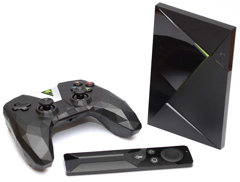
Nvidia has been very creative with the new Shield TV, showing off just how good they can be when it comes to creating a more compact and efficient system. The new Shield TV is a whopping 40% smaller than the first gen model, while still delivering the same GPU performance and all of the features we fell in love with; very impressive!

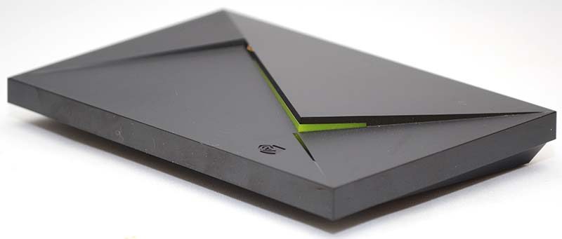
The basic shape is still the same, but little tweaks like swapping the green LED for a green plastic strip with white LED backlighting, it’s barely noticeable in terms of aesthetics, but likely helped save some pennies on manufacturing. The touch button is gone on the front now too, but again, hardly a noticeable change at all.
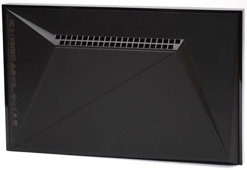
Around the back, a heat exhaust vent, dual USB 3.0 ports, HDMI out 2.0 out with 4K 60hz HDR support (10-bit), Gigabit Ethernet and the power input. That’s a pretty robust I/O for a console that’s little more than the size of my wallet.

On the base, a firm rubber grip to keep it from sliding around, as well as a front air intake to help with cooling the system.
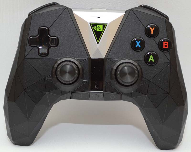
The new controller is certainly interesting, with a low-poly design that I think looks pretty awesome, but I can’t help but think it looks a little uncomfortable too, having spent my years using smoother controllers. One noticeable change, however, is that the controller is a lot smaller and lighter than the previous model.
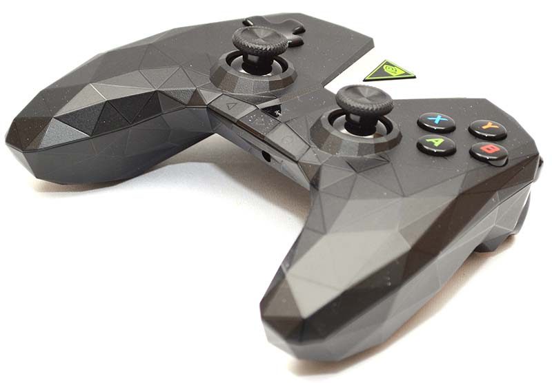
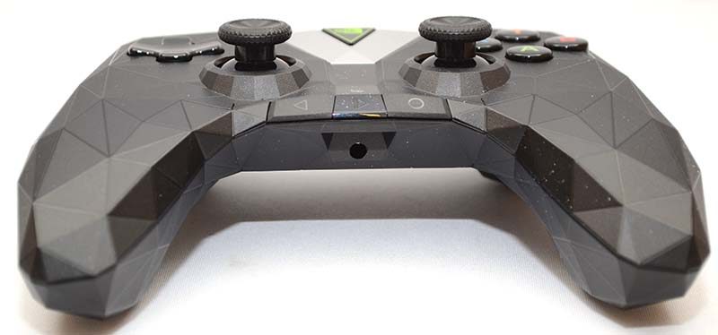
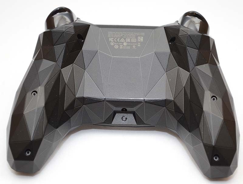
A welcome change here, as the headphone jack is now on the bottom edge, not the rear of the controller. Why the didn’t put it here on the first-gen model I’ll never know, but it’s good to see that Nvidia saw the error of their ways and fixed it. The touch sensitive buttons that were on the silver triangle section are now gone too, with more tactile buttons below the analogue sticks now taking their place for start/return keys, as well as an additional home button for good measure.
Another big change are the new analogue triggers. They’re much longer now, with an ergonomic curve to them, and they’re almost 3x as wide as the old ones too. They feel a lot better, more in line with other high-end gaming controllers on the market and that’s no bad thing.
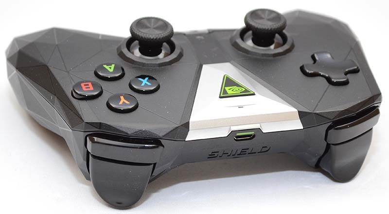
The funky low-poly design continues on the underside too, and the swollen bump towards the bottom edge is gone, giving your fingers much more room to grip the controller.
Finally, the circular D-pad is gone, swapped out for a greatly improved 4-way + shaped one, and the analogue sticks now have longer stems, better grips and a wider throw for improved control. One thing that we didn’t notice at first is that the sticks can now be clicked in easier, as on the original Shield controller, trying to click it in for sprint, especially white the stick was not centred, was extremely tricky, so that’s a very welcome improvement right there.
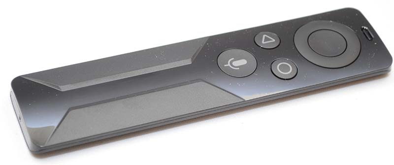
The remote looks the same as before, but now feels a little fatter at the back and uses a plastic back rather than metal. This actually makes it easier to hold and handle. You still get the slide volume control on the lower half, and the same voice controls, back, ok, and D-pad control wheel as before though, so not as drastic a change as the controller.
