Nvidia Shield TV 2019 Edition Review – New and Improved!
Peter Donnell / 5 years ago
A Closer Look
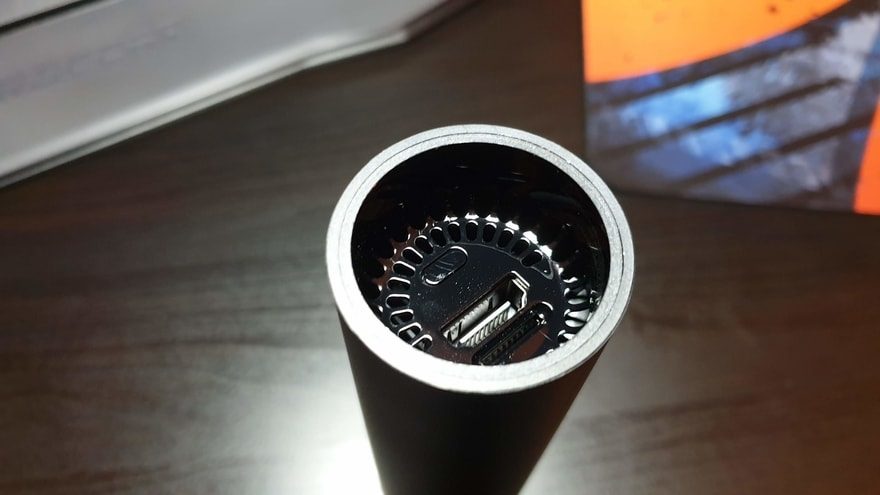
The unit its self is a bit of a strange-looking thing. It’s a tube, so it’ll roll around if you put it on your desktop. It’s got a good weight to it too, and the overall construction feels pretty solid.

It does stand on one end, but honestly, it’s not meant to. You aren’t meant to have this one out on show. It’s designed to be dumped behind you TV stand with all your cables and plugs where nobody will see it. It’s a strange approach to take, but honestly, it’s not a terrible idea either. The less stuff you have on your TV stand, well, it’s one less thing to dust as far as I’m concerned.

On one end, you’ll find a master power button, the HDMI port, and the SD card slot.

On the otherwise, the RJ45 and power connector. That’s it, it doesn’t have any big RGB lights, no big control surfaces, it just lives between the cables and gets on with it.

It’s obviously bigger than an HDMI dongle, but it’s still much smaller than the Shield TV’s we’ve seen before. It is a supersize-dongle-hide-it-somewhere-thingybob!

Remote
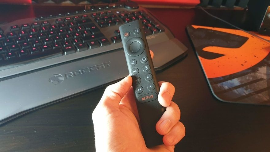
The new remote is looking fantastic though. IT’s a much chunkier affair this time, so it’s much more comfortable to hold. Plus, they’ve solved the issue of the crap internal battery failure from before; it just takes two AAA batteries now, huzzah!

It has a nice weight to it and a lightly textured coating that makes it easy to hold. There’s a big and rather blatant Netflix button right at the bottom.

Plus, you get this nice D-Pad and OK button setup here. However, you can customise the functions of the buttons a wee bit too if you really need to. Right, let’s plug it all in and go watch some TV… It’s a tough job, but someone has to do it.


