NZXT H1 V2 Mini-ITX Case Review
Peter Donnell / 3 years ago
Exterior
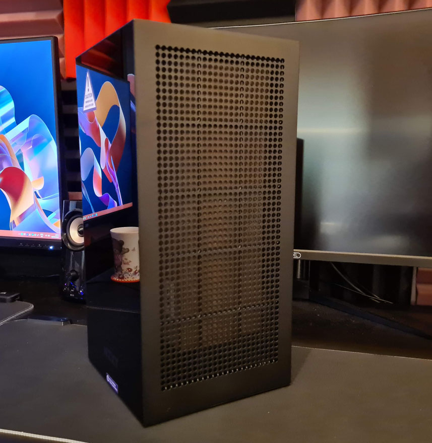
Fans of the original NZXT H1 will find a lot to love here, it still looks pretty much the same. However, that’s hardly surprising given that this is the H1 V2, a revision, rather than being called the H2, which would be a new product overall. It’s hard to see here, but the dimensions are slightly larger. It now measures 405x196x196mm vs 387.7×187.6×187 of the older model.

NZXT say they’ve made it larger based on user feedback, who wanted improved graphics card compatibility. However, the larger dimensions also allow for a higher wattage power supply to be installed in the case, allowing for a higher specification system to be installed overall.

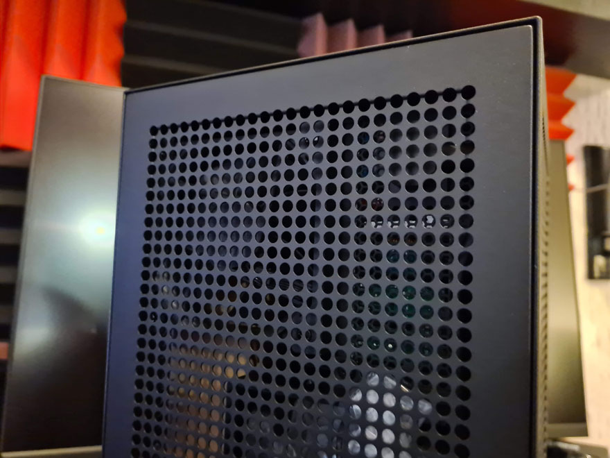
Cooling benefits from the slightly larger design too. NZXT has even made the holes on the perforated panels slightly larger, allowing for more airflow around all the major components. Plus, the perforated design just looks awesome too, I really like it.

NZXT was even able to install a 92mm rear exhaust fan for the graphics card too, further improving the overall airflow; even if you can’t see much difference from the outside.

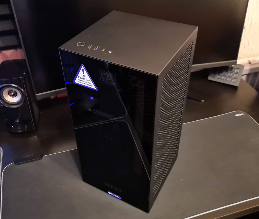
As you can see, there’s a darkened tempered glass front on the case, which looks stunning, but it’ll also show off brighter interior details and lighting once the system is powered up.

Beyond that though, there’s mostly just ventilation everywhere else, and there are dust filters on all intakes to keep things nice and clean.

The front I/O keeps that classic NZXT design and is very clean overall. One nice improvement though is the addition of another USB 3.2 Type-A port. There’s Type-C, and the audio jack is a combi, so you can use 5-pin headphones as you would on your mobile, or use a splitter cable for traditional two jack headsets.


