NZXT H700i Mid-Tower Chassis Review
Peter Donnell / 7 years ago
A Closer Look – Exterior
Those familiar with the NZXT range over the last few years will certainly see some similarities here, but don’t be fooled, as almost everything has been tweaked and improved. The boxy design reminds me of the H400, and the S-series has also lent that internal white bar cable router, but again, that’s improved too. There’s a huge sheet of crystal clear glass on the side, and tucked into the top and front, you’ll find ample side ventilation for cooling.

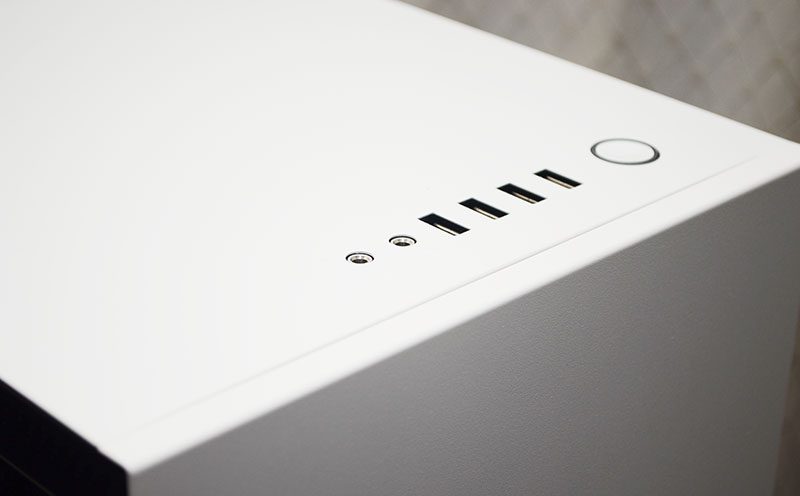
The front I/O is neat and tidy, with four USB ports, HD audio jacks, and a power button. Of course, all in keeping with the strict monochrome design.

The stunning soft white texture front panel looks amazing, with just a slightly glossy finish NZXT logo making its presence known at the bottom.

Right Side Panel
The right side panel is blank but still looks stunning. It has a slightly rolled edge, giving it a clean but smart look, and it has a bit of a party trick too! It’s not mounted with any screws, and there’s a simple push button the back of the chassis. Hit the button, and it’ll pop open, making it super easy to access.

As you can see, it still has plentiful ventilation, just like the left side. Any top or front mounted fans can benefit from all this indirect airflow, which will also help reduce unwanted noise.

Around the Back
Around the back, plenty more passive ventilation, as well as a rear fan mount with support for either a 120 or 140mm fan. The rest is pretty straightforward though, with seven expansion slots, and the PSU mounting bracket.

On the base of the chassis, four durable feet give good ground clearance. This is good news, as it means plenty of airflow for that PSU air intake.


