Opera Releases Early Access Version of Its New Opera One Browser
Jakob Aylesbury / 2 years ago

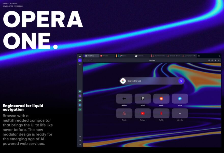
Opera has released the first early access version of its new completely redesigned browser, Opera One.
Opera One
Taking a page out of Microsoft’s book on naming products is Opera One, a new completely redesigned browser designed to feature a cleaner look as well as plenty of open space for future AI features. Opera One is aiming to replace the Opera browser and provide a liquid navigation experience that’s more intuitive and is the first Chromium-based browser to utilize a multithreaded compositor in its user interface.
First Multithreaded Compositor
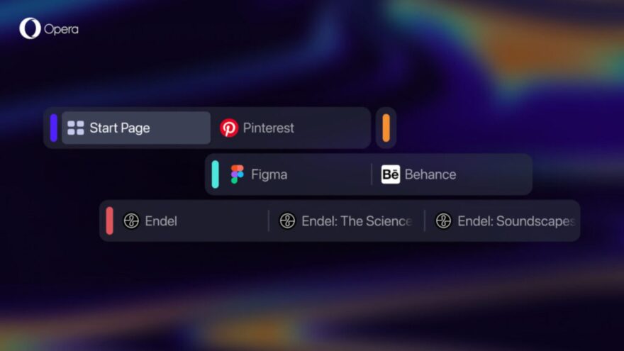
The multithreaded compositor included with Opera One brings a much faster and smoother user interface layer bringing its UI to life like never before. This new architecture allows for the implementation of new features one of those features is Tab Islands. Tab Islands are designed based on the research that the majority of users feel overwhelmed by how messy their tabs get, which I do find to be the case when writing all these articles. Tab Islands addresses this issue by allowing you to arrange your tabs into contextual groups to reduce clutter and keep related tabs linked together.

AI Focus
Another major feature of Opera One is its focus on providing room for future enhancements with AI features. Opera One is designed to be modular and over time will morph to become more intuitive and functional which also provides the groundwork for future AI sidebar integrations.
Where Can I Learn More?
I use Opera myself so if they can do a good job of decluttering the tab bar then I’m all for it.
If you would like to learn more about Opera One you can read the full blog post here, you are also able to download and try Opera One here.


