Philips BDM4065UC 40″ 4K Monitor Review
Rikki Wright / 9 years ago
A Closer Look
Monitor
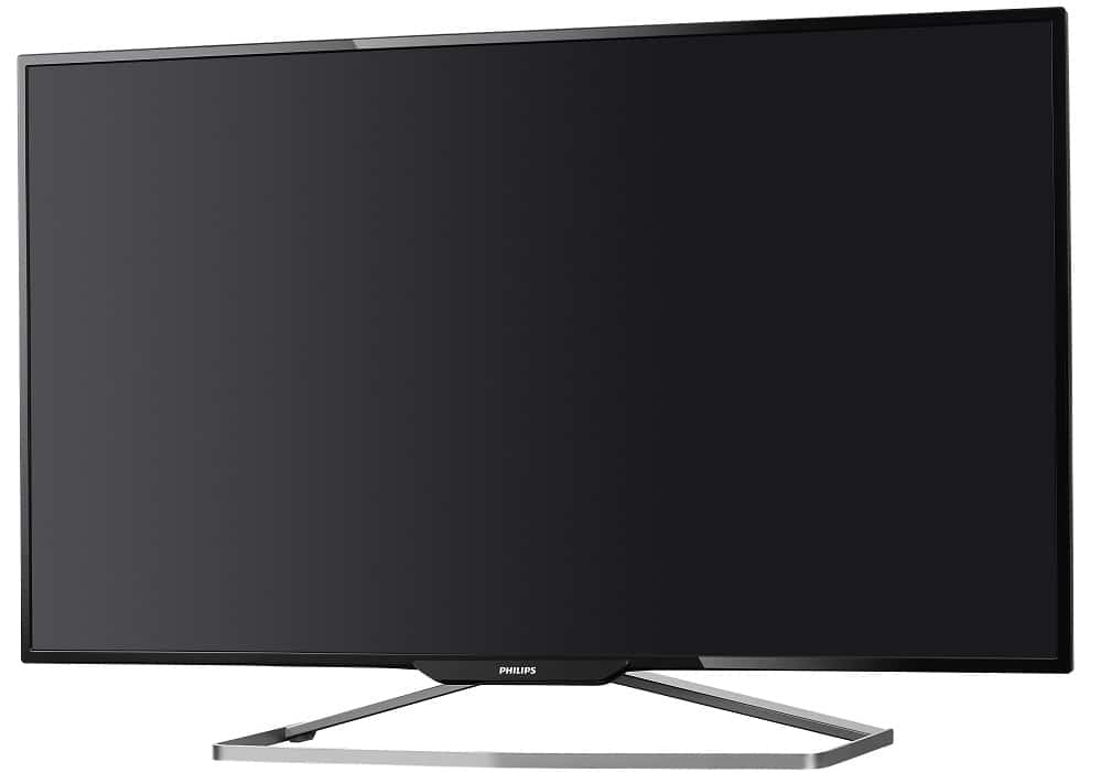
The overall appearance of the monitor is striking and even more so in person by the sheer dominance of my desk. The chassis is well-built and felt extremely robust during the unboxing with no obvious flexing at all.
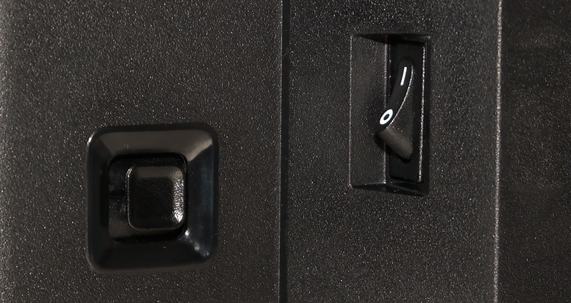
The back of the monitor is extremely plain with just the power connector, menu button and fast charging USB 3.0 ports visible.
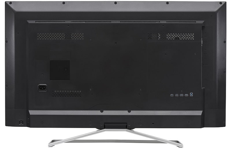
Looking from the right you can then see the I/O ports. There are multiple display ports including 1x VGA, 2x HDMI, 1x miniDP and 1x full-size DisplayPort. Along with those are 1x headphone and 1x audio out jacks.

Accessories
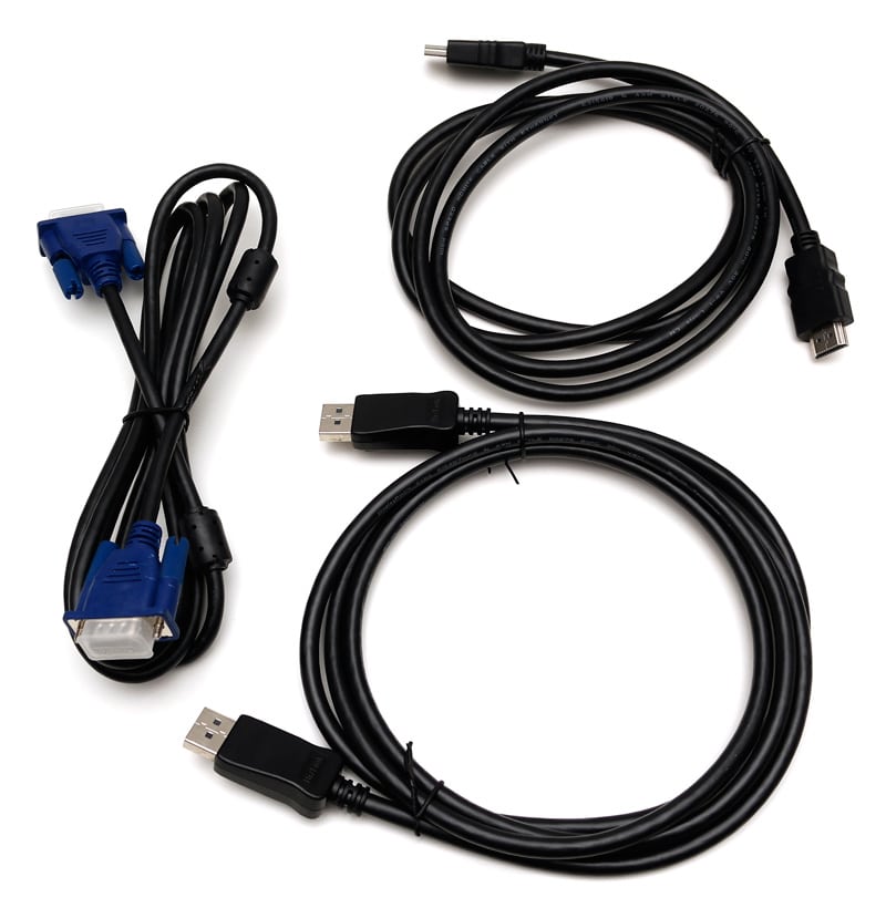
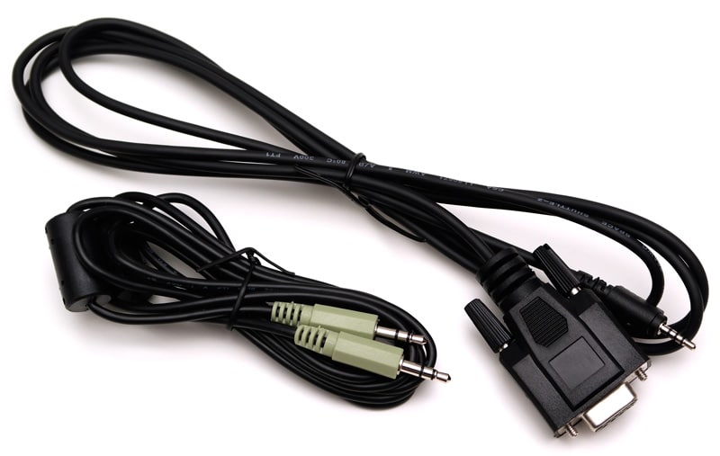
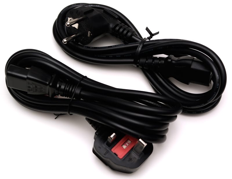
Inside the box is enough cables to re-wire a house. Okay that might be an exaggeration, but just look at all of these. HDMI Cable, DisplayPort Cable, VGA, 3.5mm audio cable, 3.5mm to 9 pin VGA and two power cables for EU and UK.
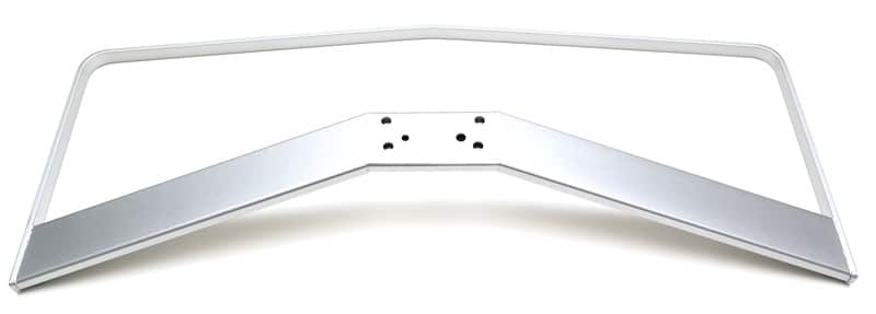
I don’t really know if you can call it an accessory, but the base comes separate and is stunning to look at, but it doesn’t look like there is any pivoting offered at this first glance.
The feet are a textured rubber which keeps the monitor stuck in place; they almost act like mini suction cups.
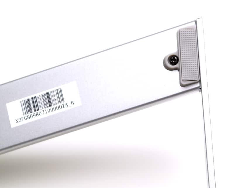
To join the base to the monitor is an extremely robust bracket with 8 screws.
Menus
Entering and navigating the menus is extremely easy with a thumb-stick style controller on the rear of the monitor. It took me quite a while to get used too, the actual operation was easy, but I just kept moving it in the opposite direction for some reason. There are no additional menu buttons, so carrying out some tasks such as closing the menu was slightly annoying. You would have to move in another direction, i.e. if you entered the menu by moving down, you would have to move left or right to close that menu as moving up or down would just navigate the menu. This also become annoying if you were in a setting such as brightness and wanted to close quickly; you would have to exit the brightness setting before carrying out the exiting procedure; This was time-consuming and massively annoying.
The menu is split up into four different sections, the main overall monitor settings, Audio Source, SmartImage and Multi View.
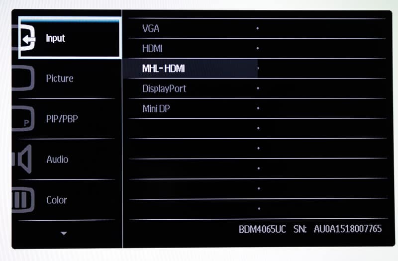
Each menu was a different direction of the movement stick.
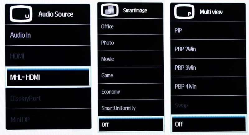
Functionality
Has the question crossed your mind as to why Philips has made a 40″ 4K monitor? Well, it started life as a 40″ TV and after some changes such as removing the TV tuner box; it ended up as a monitor. One MAJOR problem with this is the fact that there is no adjustment of the screen at all. It is between 85° and 90°, not ideal if you have this on a traditional table.
If you do end up using the 200×200 VESA mount, you could then find a mount with these functions and I believe this would be a much better idea than using the stand itself.


