Raijintek Ophion M Evo Case Review
Peter Donnell / 4 years ago
Complete System
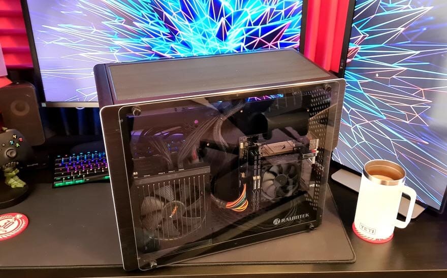
While this is a small form factor case, it is surprisingly spacious on the interior. Because you have separate chambers for the graphics cards and storage, it’s very easy to work inside the case. As you can see, I went with a mini-ITX board, but there’s certainly room for mATX too, and I think both options would look good. Alas, the only mATX board I have is a battered X299 one, hence my choice of this Z390 one. Plus, I wanted to match the colours of the case, rather than go for anything with RGB on it.

Cable management is surprisingly good, as there are a lot of little recesses and areas to take cables through. At least, it could be done to a better standard, but the be quiet! cables that I’m working with are notoriously stiff and stubborn. I’ll tidy it up a little more with cable ties as we progress here.
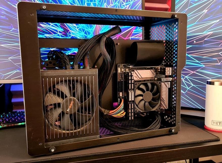
While this little Noctua cooler is more than capable for what I need in this build, there is room for something bigger. Albeit, it’ll still be a low-profile cooler rather than a tower cooler. You can opt for a AIO liquid cool or even custom loop solutions too, as there are mounts and spaces for all the appropriate hardware.

The riser cable is pretty enormous, and would actually run over the entire motherboard, but there’s just enough room to route it between the motherboard and the case. Just remember to do that BEFORE you screw the motherboard down or you’ll be going back two steps. It does look neat and tidy though, and I love that it’s all pre-installed and ready to rock.
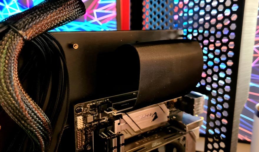
Keep in mind, with two windows on this case, all your cables and hardware will be on show from one angle or another, so keeping it tidy can be vital. Of course, the case has zero fans or RGB hardware as standard, so it’s all dark in there at the moment, but you can always add your own to suit your style and needs.
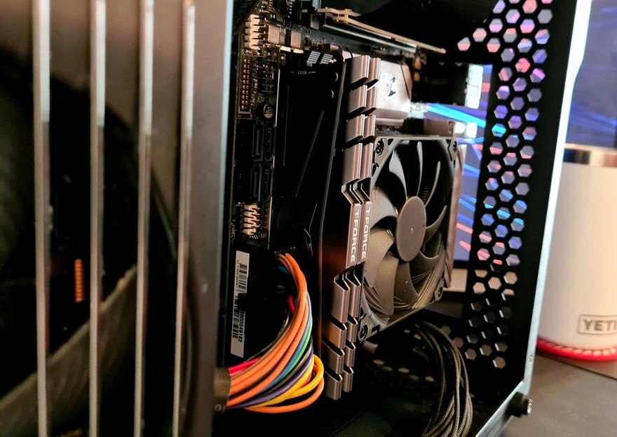
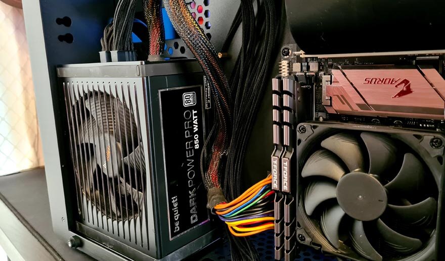
One of the most impressive aspects is the PSU clearance, as even a massive be quiet! unit barely takes up the available space. If you wanted something really beefy in here, it honestly shouldn’t be an issue.
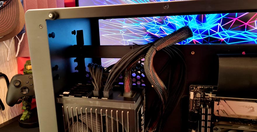
As you can see, there’s a HUGE amount of room in the top. Of course, you can fit some SSD in the front there, radiators in the top, route liquid tubing through the gap and much more. There’s a lot of options available to you for this space, and I really like that.
So what about the other side? Well, it offers up a vast amount of room for a graphics card. Even some of the titanic sized flagships should fit in here with room to space, and clearly, width will never be an issue either.
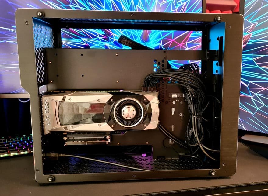
It’s an interesting way to show off the GPU, but again, it also keeps the airflow and heat from the CPU cooler and the GPU cooler fairly separate, and should help with overall temperatures.
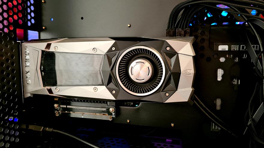
I’ve used the forward space for a bit of cable routing, but again, there are more storage mounts here also.
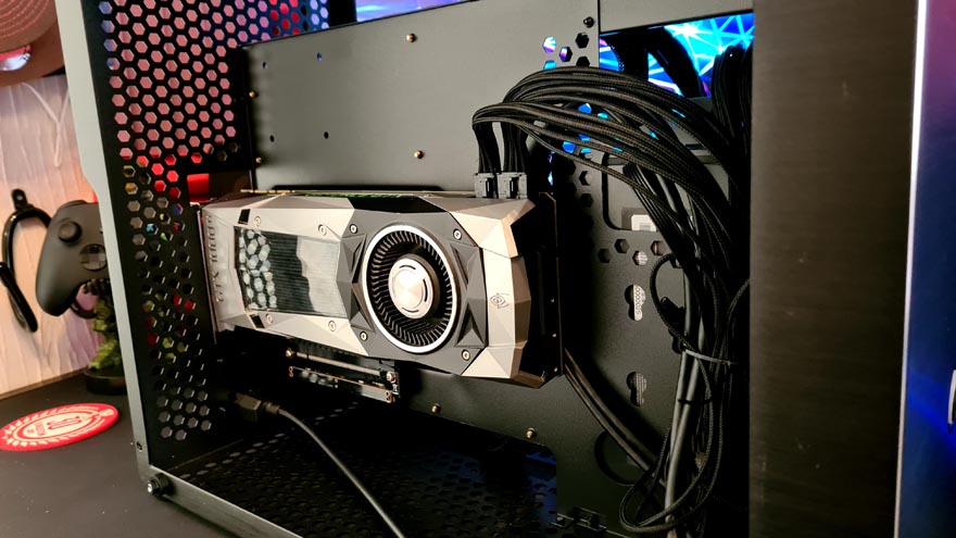
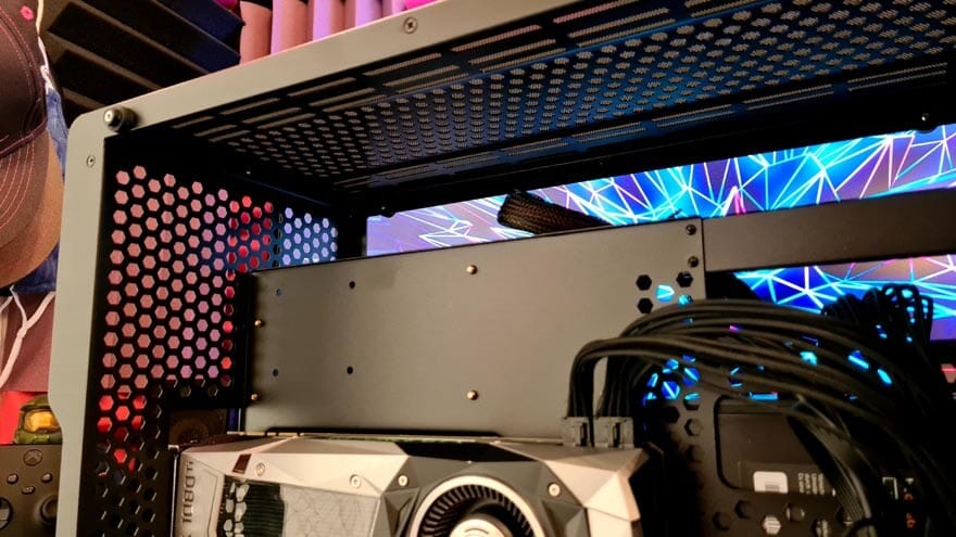
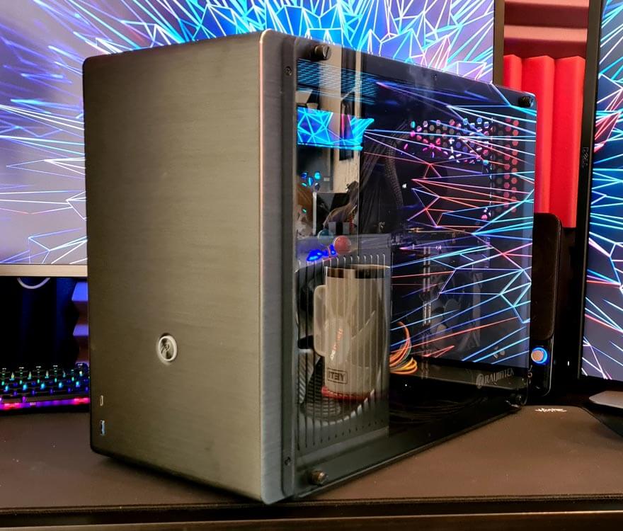
With the glass back in place, you can really see the GPU very well. The glass is crystal clear. Again, all the more reason to take your time with the cable routing.
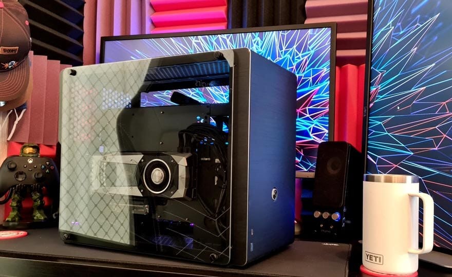
The other side looks great, as all the black cables blend in to the shadows well enough, allowing you to enjoy the view of the hardware easily enough.
I rather like it with zero RGB and lighting in there, it looks slick, and leaves it rather reflective too.
