Razer Ornata Chroma Keyboard Review
Peter Donnell / 8 years ago
A Closer Look
The latest keyboard from Razer certainly looks nice, with an angular chassis that’s not unlike that of the MX Board 6.0 from Cherry, not identical, but certainly similar (I have one on my desk). There’s a very nice matte black finish with a very light texture that gives it a premium quality look and feel and it should also give us a nice contrast between the keyboard and its LED lighting.

The low-height key caps look really nice and are mounted in a way that gives them a good amount of space on the underside. This isn’t for increased travel distance, but rather more space under the keys for under lighting effects thanks to that glossy white interior that you can see lining the interior of the keyboard.
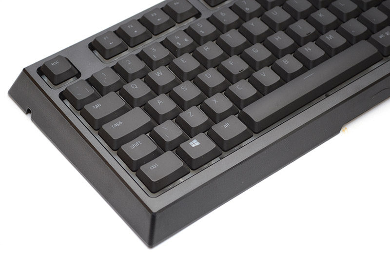
On the top row, some FN-Shift functions that allow you to control your desktop audio levels.
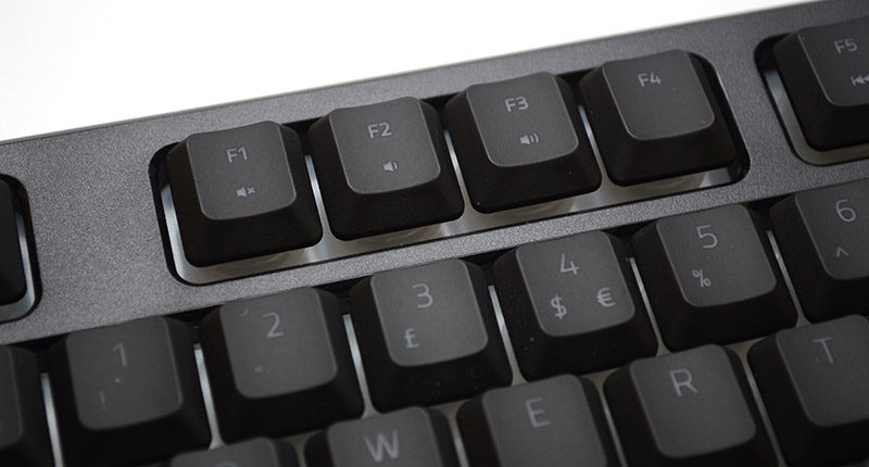
Basic multimedia controls here.
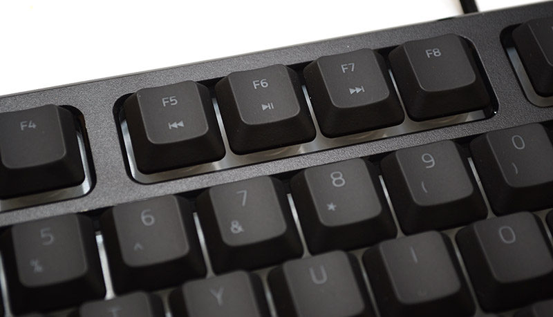
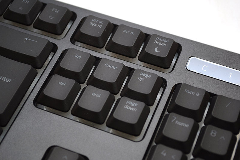
And here a few more controls for gaming more (disables Windows key) and lighting brightness up/down.
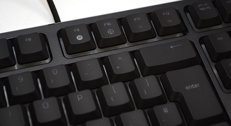
A full-size number pad, perfect for work and gaming.
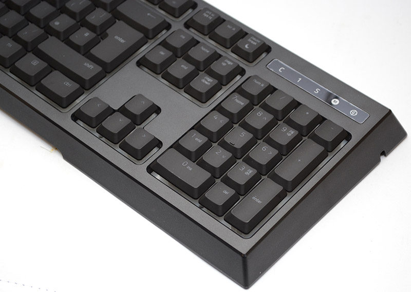
We love the font on this keyboard too, most keyboards have started to shift to huge typeface that allows more light through, but can look a little childish in my opinion. So I’m happy to see a sharper and smaller font on the Ornata.
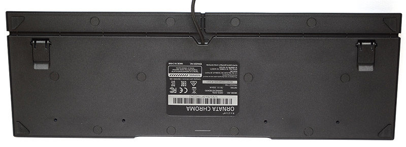
On the underside, you’ll find durable rubber grips to keep the keyboard from sliding around your desktop, a three-route cable channel for the USB cable, and two durable kickstands to increase the overall typing angle.
The wrist rest is gorgeous, and tool-free too! Just put it in front of the keyboard and it’ll snap into place thanks to its magnetic mounting system.

