Razer Ornata V2 Mecha-Membrane Keyboard Review
A Closer Look
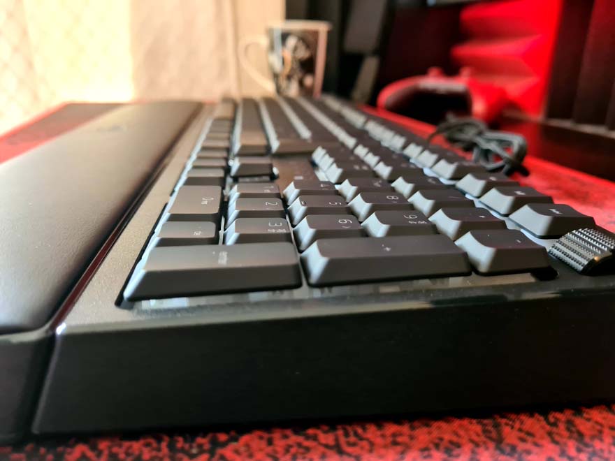
The keyboard looks, well it looks like it always has actually. If you’ve seen the old one, you would have to look pretty hard to see what has been changed. Thankfully, there ARE changes though. What remains is all good too though, such as the huge magnetic wrist rest. I can’t type without one these days, so I’m very happy to see that included.

The key caps are still those low profile design, and have a subtle matte finish and a fine font on them. It looks ultra stylish overall, and should look great when we power the RGB up.

Between the keys, there’s a white background, which will help better reflect the light from the LEDs, giving the keys some cool underlighting effects.

The F-keys don’t really hide many extra features, but skip over to F9-F12, and you’ll find a quick macro record button, game mode, and brightness controls.

The keyboard indicator lights have been moved on the V2, and are now placed above the arrow keys.

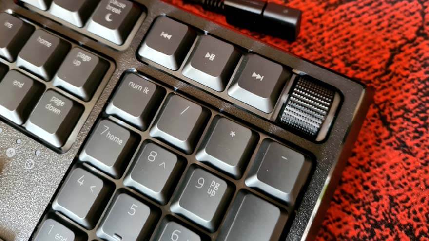
The move means that Razer was able to put dedicated multimedia controls on the keyboard. I love that they’ve given it matching keyboard switches too, rather than just rubber buttons. There’s a big scroll wheel here too, which is also clickable; neat!

The frame of the keyboard is actually quite chunky, but because the keys are recessed and already low profile with a short actuation, the keyboard doesn’t feel any thicker than a typical mechanical.

Everything has tough rubber grips too, helping keep it planted on your desk. It’s all fairly heavy too, so the chances of it sliding around when you’re smashing away at the keys is pretty slim.

Hmmm lovely soft padding. My sore wrists are very thankful for this.

The little details go a long way too, such as this lovely Razer stamped USB header, which also has a dust cap on the end.

As you might expect, green!


