SteelSeries Nimbus MFi Wireless iOS Controller Review
Peter Donnell / 9 years ago
A Closer Look
The controller is nicely designed, with a nice mixture of straight lines and angular edges that give it a modern and stylish appearance. The body of the controller has a nice matte finish to it and while it is obviously made from mostly plastics, it has a good weight and feels pretty robust.
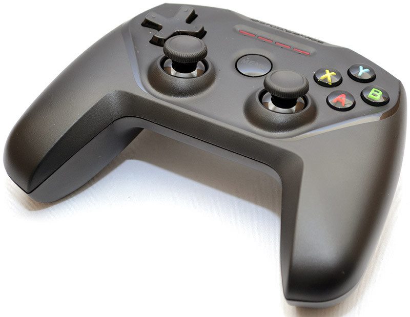
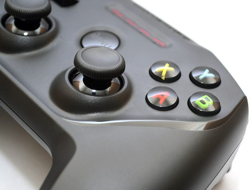
Those familiar with the Xbox One controller will feel right at home, with familiar face buttons on show. The nice bonus here is that these buttons are pressure sensitive, so long as the app or game in question supports such a feature. This is a nice feature and the buttons do feel “ok” but I would like more tactile feedback as the button is pressed. The button returns quickly when released, giving a small click, but it feels out of timing to me; this isn’t a deal breaker, just a side effect of having pressure buttons. The analogue sticks have a nice grip to them, with a little notch for your thumb and some side grips for added control. Playing a few games on the iPad worked easily enough and the sticks seem just as confident playing arcade games as they do strutting around the worlds of classic final fantasy games.
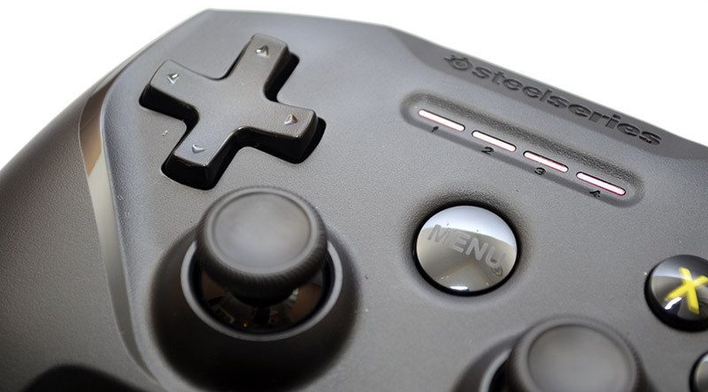
A nice large D-pad with a curved design that makes it very easy to control. It’s also closer to the original Nintendo D-pad, not like those stupid dish-shaped D-pads we’ve seen on many modern controllers. It feels accurate enough for gaming so far, but the “bump” on the directions would be even better if it was a little more pronounced.
Around the back, a Bluetooth pairing button, that all important Lightening connector and the hold/power button. It’s worth pointing out here that the controller is rechargeable, but doesn’t come with one. This seems a bit odd, but the idea is that you would use your Apple Lightning charger, and with 40+ hours battery life on the controller, that shouldn’t be very often.
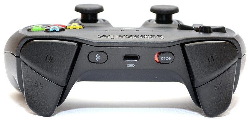
There are two huge shoulder buttons on each side of the controller. The oversized design makes them really easy to grip and control and they feel far better than the current crop of console controller shoulder buttons in my opinion.
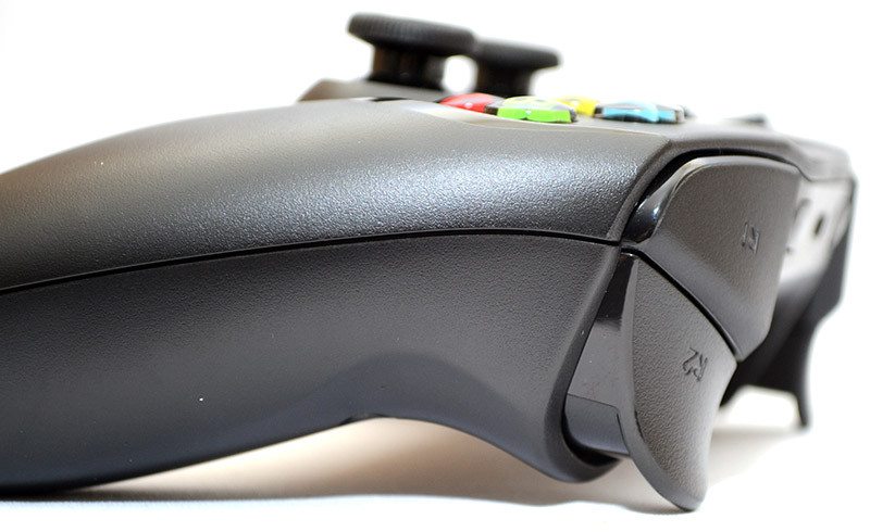
There’s a good range to the analogue triggers, and they’re soft enough for accuracy in driving games, but snappy enough to feel competitive in shooting games, so quite well-balanced in response overall. The slightly curvy design promotes a good finger resting position, the triggers don’t catch the side of your fingers after long gaming sessions and there’s a small lip at the base to stop your fingers slipping off.
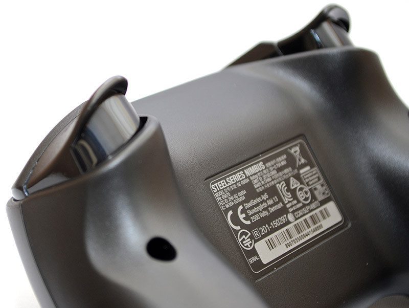
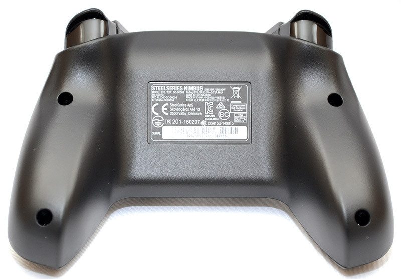
There’s not much to see on the base, just the ergonomic grips, which fit my big hands quite well.
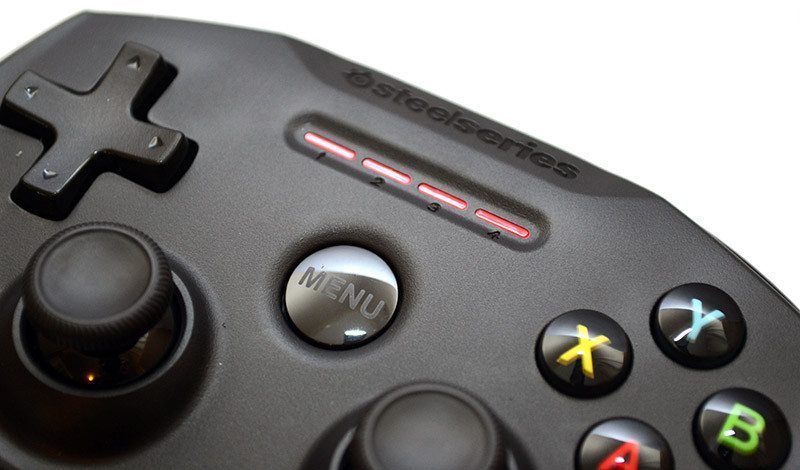
Finally, when the controller is powered, pairing, etc. you get a set of notifications via the four red LED lights on the top. The final and I guess key feature here is the big menu button in the middle, same as you would find on the Apple TV remote, meaning that you’re not losing that part of the functionality when it comes to navigating the device.
