Thermaltake 300 TG Snow ARGB Case Review
Peter Donnell / 4 years ago
Complete System
The Thermaltake 300 TG is a really great looking PC case, there’s no doubt about that. However, when it comes to the build, it’s what’s on the inside that really matters, and the 300 TG has space, and plenty of it. I actually installed an E-ATX motherboard, which runs a little wider than the cable routing holes, however…

…the cable routing holes are at a 45-degree angle.

This means they can pass freely behind the motherboard and still make the port, so it really fit rather well.

There are cable routing holes above and below the motherboard too, ensuring shorter cable runs wherever they’re needed. As you can see, I can pass the GPU cables up vertically.

The entire rear bracket is removable, just take out four small screws, and you can rotate it 90-degrees making a multi-GPU vertical mount!

That means you can display your GPU in a stunning fashion from the side panel window. Of course, since you have all the slots there, you can choose how far forward/backward it is from the glass.

The PSU cut-out allows you to see the PSU design from the side, well, not really as there’s no glass on this section, but still, here it is.

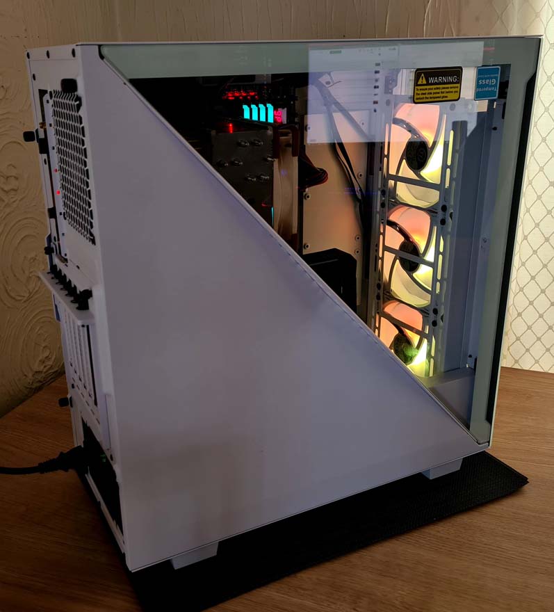
Overall though, it’s such a clean looking build and I’m surprised by how much space there seems to be here. It didn’t seem like a big case when I started the review.

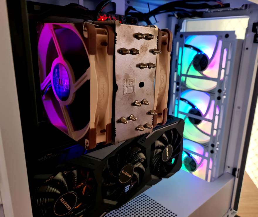
CPU cooler clearance is excellent, and there’s loads of room for good airflow from the front and side ventilation, plus good exhaust from the rear and top ventilation.

As for the fans, they’re pretty awesome. What I didn’t expect was for them to have a more pastel colour rather than the deeper colours we see on many other brands. I quite like it though, it’s a softer and friendlier looking colour pallet and isn’t as “in your face” as some RGB fans can be.

The lightness of the colours works well with the frosty white finish of the case, as it really helps capture the light easily.

The built-in hub allows you to control the lighting colour and effects by tapping the reset button on the front I/O. With all the usual range of effects and static colours for you to cycle through at your leisure.

I really is a stunning looking thing. I’m not sure if the half glass design is better, but it gets bonus points for just looking different. The PC case market is starting to blend into the same design, so it’s nice to see something that really stands out.

I’m sure the black version looks great too, but honestly, I’m happy I got this white one.


