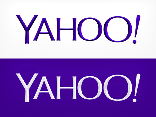
Yahoo Reveal Final New Logo After Extensive Redesign
Ryan Martin / 11 years ago

After a month of revealing logo runner-up designs Yahoo have finally revealed to the public their new logo. The logo is Yahoo’s first update in 18 years and for a company worth nearly $10 billion dollars changing the brand’s logo is quite a big move. While it may just seem like a simple logo quite a lot of thought has gone into it, though whether that is noticed by anyone remains to be seen.
- We didn’t want to have any straight lines in the logo. Straight lines don’t exist in the human form and are extremely rare in nature, so the human touch in the logo is that all the lines and forms all have at least a slight curve.
- We preferred letters that had thicker and thinner strokes – conveying the subjective and editorial nature of some of what we do.
- Serifs were a big part of our old logo. It felt wrong to give them up altogether so we went for a sans serif font with “scallops” on the ends of the letters.
- Our existing logo felt like the iconic Yahoo yodel. We wanted to preserve that and do something playful with the OO’s.
- We wanted there to be a mathematical consistency to the logo, really pulling it together into one coherent mark.
- We toyed with lowercase and sentence case letters. But, in the end, we felt the logo was most readable when it was all uppercase, especially on small screens.
Read more mathematical details on the new Yahoo logo right here on Marissa Mayer’s Tumblr. Interestingly the letter Y appears in the shading at the end of each letter – I wonder how much they paid someone to think of that!
Image courtesy of Yahoo


