Zergotech Freedom Review – A Keyboard Split in Two?
Peter Donnell / 4 years ago
Packaging
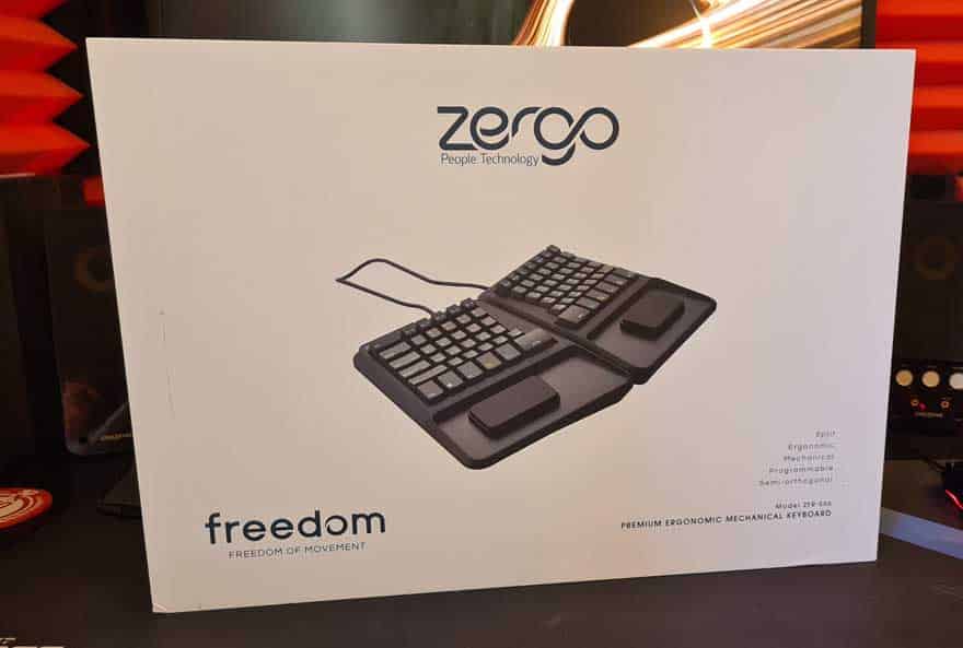
This keyboard is pretty chunky, and the box reflects that. You could easily fit TWO mechanical keyboards in this box, likely four if you don’t mind stacking them. It’s pretty heavy too, it’s a thick and durable cardboard that really reinforces the fact this is a premium product. I’m not sure why the keyboard photo is so small though, they’ve got a lot of white space there that could show off the design.
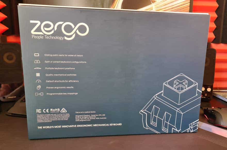
Around the back, they’ve got the Zerogo logo and a little list of the main features. Nothing too crazy really, but a good quality and durable box overall.
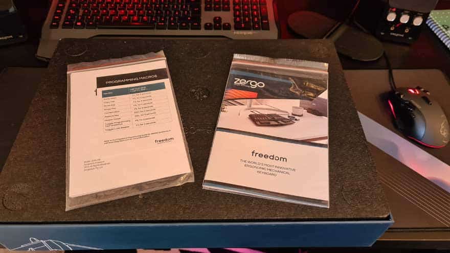
Open the box, and you’ll find all the usual documentation. This isn’t your everyday keyboard though, it has a strange layout, so best to read up on this.
Below a layer of thick foam you’ll find another layer with custom cut interests ensuring all components of the keyboard are exceptionally well protected. They shipped this all the way from Australia to the UK for me, and it’s here in fantastic condition.
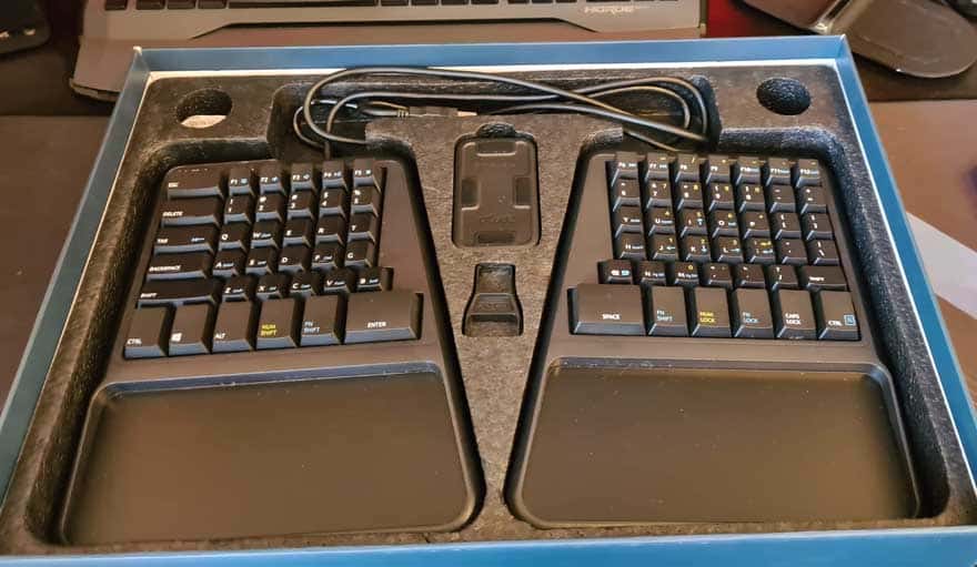
A Closer Look
Not I should point out, I’m not the first to open this box, I assume it’s been a demo model somewhere along its life. With that in mind, cables are a bit pre-twisted, erratic and used. Plus there’s a few bits of dust and debris kicking about. I tried cleaning it up, but it’s a hot, sweaty and dusty day in the office and I was getting nowhere, so apologies for that.

In the box, you’ll find these two compact size wrist rests. I was a little confused by these at first, but it’ll all make sense soon enough.
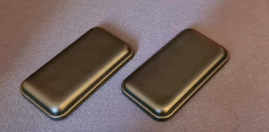
They have slip mats on the bottom, much like you would find on the bottom of a gaming mouse.

Plus they offer up some really nice padding that should keep your wrists nice and comfortable.

You also get a key-cap pulling tool included in the box. It’s two sided, one for standard, and one for those custom large caps on the bottom row.

The Keyboard
Well, it’s not exactly standard, is it? You can obviously see it’s split in two, but it’s not just that. The layout is VERY unique. You can’t push the two halves together and have it look like a standard keyboard. It’s semi-orthogonal, so unless you space it like the image below, it’ll also way at an angle; as are your wrists and hands, so that makes sense!

Each half kinda looks like a normal keyboard. It’s a QWERTY layout, well, QWERT, the Y is on the other side of the fence now. The bottom row is a big chance though, as you’ll notice Num Shift, Fn Shift and Enter are on the left side of the keyboard. However, you can reprogram this if you desire.
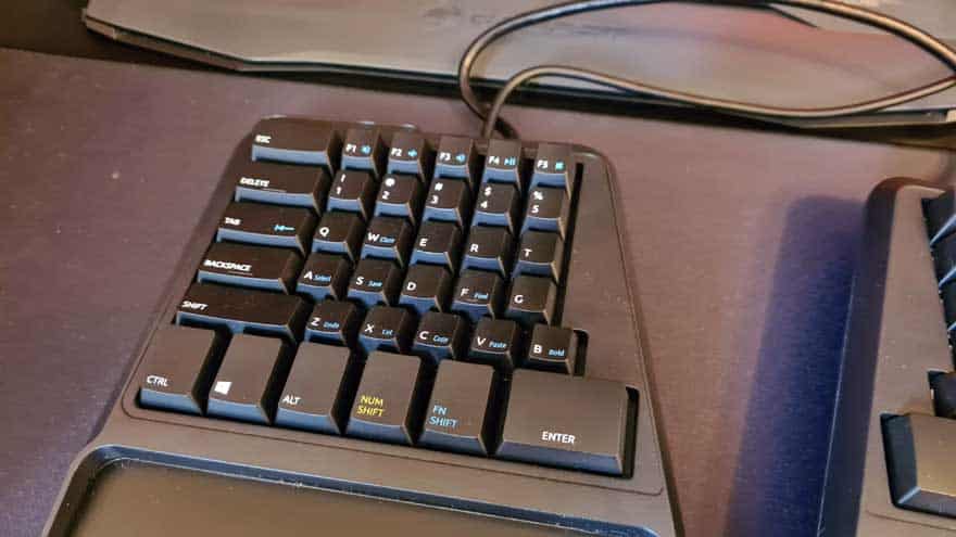
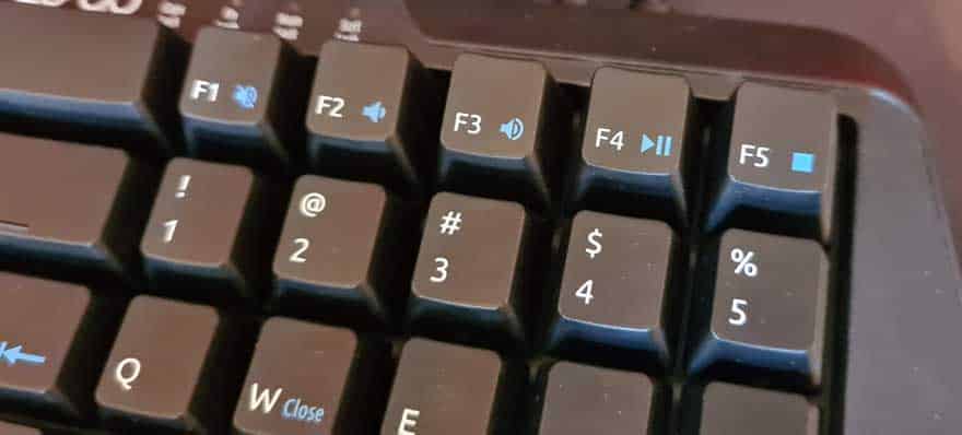
The F1-F5 keys offer up a few multimedia controls, allowing for play/pause, stop, and volume adjustments.
In the top left, you’ve got all your usual indicator LEDs, as well as a small Zergo logo.

The bottom row of buttons are much larger and designed for ease of access and thumb control. It seems obvious, but each half really does have to be designed for one-handed control. However, they don’t want you taking your hands out of that ergonomic position either.

You’ll notice that QWERT and ASDF rows are aligned any symmetrical rather than offset as they commonly would be. However, the ZXCV row is still offset. It’s a small change, but one that is very easily adapted too, even if you touch type. This as Zergo say better themselves “creates an asymmetry of reach for your fingers. You have under-reach for your left fingers and over-reach for your right fingers. We’ve aligned these by pushing the rows to the right. It just feels right.”

the right side of the keyboard is equally familiar and strange at the same time. You’ll notice there’s no enter key on the right, as that’s now on the bottom row of the left side. There’s no real number pad, instead, you get a Num Lock button on the bottom row and a built-in number pad on the keyboard its self. You can see 1, 2, and 3 on J, K and L, etc. The same is true of the arrow keys, which are on J, K, L, and I, which can be used with the Fn Shift or the Fn Lock.
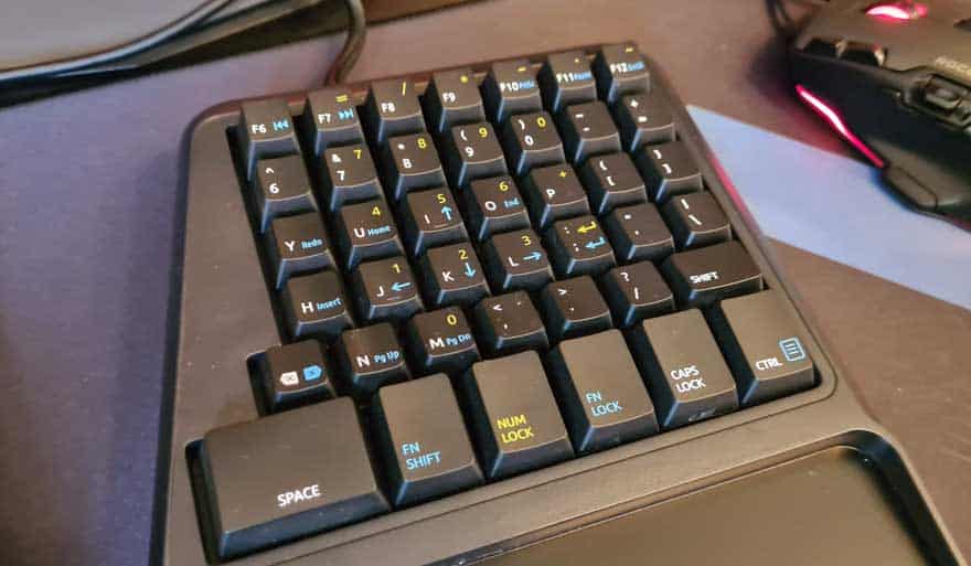
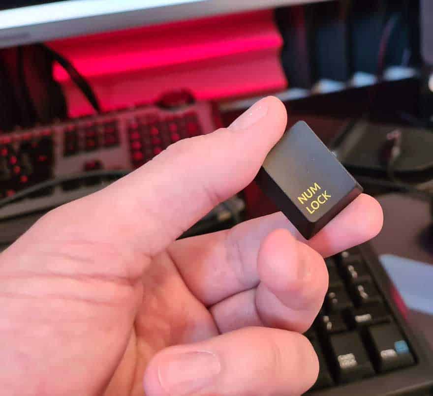
The number lock button id printed in yellow and the Fn in blue, which colour matches the additional functions on the keyboard. I’ll be honest, this looks very busy at first glance, but it’s not a far cry from most laptop configurations.

Up on the top row, you’ll find a few more multimedia controls for skip oon the F6 and F7.

I do like these larger buttons though, they’ve change a lot, but at the same time they’ve not changed it to anything you can’t quickly learn.
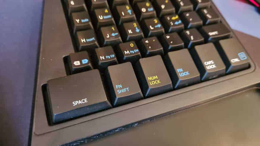
As you can see, the keyboard leans off to the side just a little bit too.

What really cool is that you can level it out again by deploying the feed on one side, increase the angle by using the feet on the other side. You can tip it forward or back and even just full-on raise the height.

There are four feet on each half of the keyboard, so you really can plant it on your desk however you like.
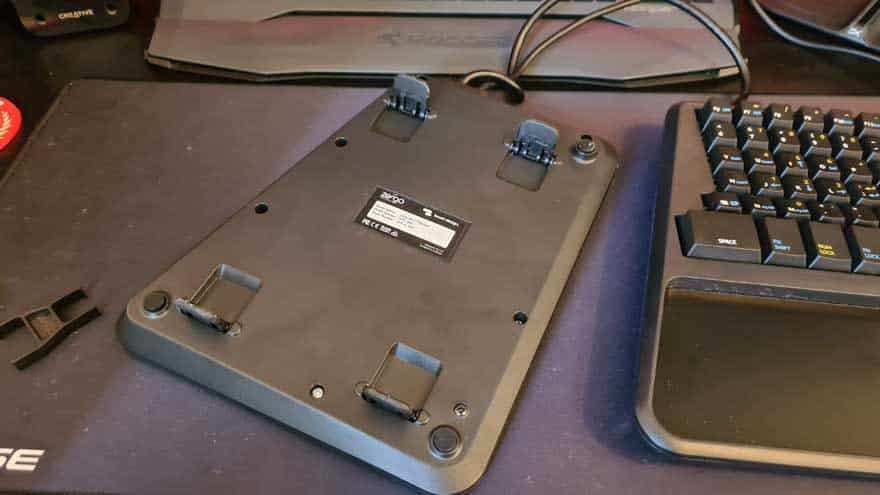
It doesn’t look like much, but that height adjustment is pretty significant from the flat layout.


The key cap removal tool is simple enough, just jam it over the cap, push down and you can get it removed with a firm pull.

With it removed, you can clearly see they’ve used the latest Box Switch Brown from Kailh, easily one of the best typing switches on the market today. Each comes rated for 70 million clicks and a 1.8mm actuation with a 3.6mm travel. The extra “box” around the + is to prevent additional cap wobble.

The large caps at the bottom use the same design.
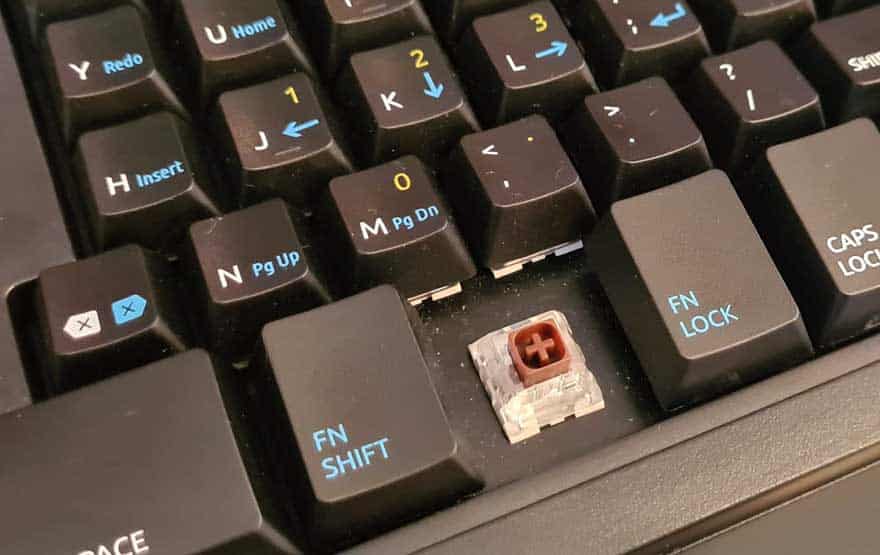
The caps are fantastic quality, really sturdy and thick plastics. No LED or RGB here folks, just good quality hardware.

