Zowie Celeritas Mechanical Pro Keyboard Review
Peter Donnell / 11 years ago
A Closer Look
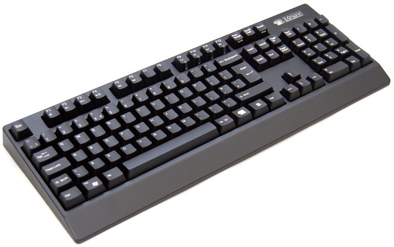
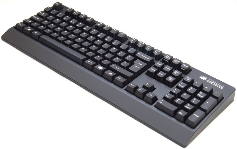
The keyboard is pretty straight forward in terms of design, although we typically find this to be common among most mechanical keyboards. There is a solid matt black finish to the entire keyboard, with a thick wedge shape chassis with a small palm rest at the front.
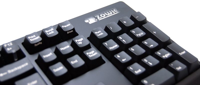
The keyboard features a full size number pad and in the top right we have a LED black-lit Zowie logo.
There are no fancy macro keys to play around with here, in fact there are no macro functions what so ever. However, there are some multimedia short-cuts on the F-keys which can be accessed via a function shift key.
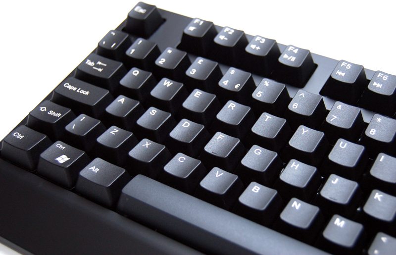
F9-F12 features four LED indicators, when in PS2 mode you can change the response rate of the keyboard with these.

There is a slight curve to the key layout, but overall it’s fairly standard in terms of design. The key spacings are quite wide though and that may make touch typing a little more effort, but should help with gaming as its harder to accidentally hit two keys at once.
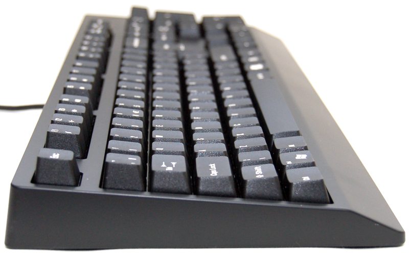
The wrist rest is hardly a real wrist rest, but it does add a little touch of style to the front and is certainly more comfortable to use than a keyboard with a straight edge.

A blank panel around the back, the only feature here being the wire connected in the middle for the USB cable.

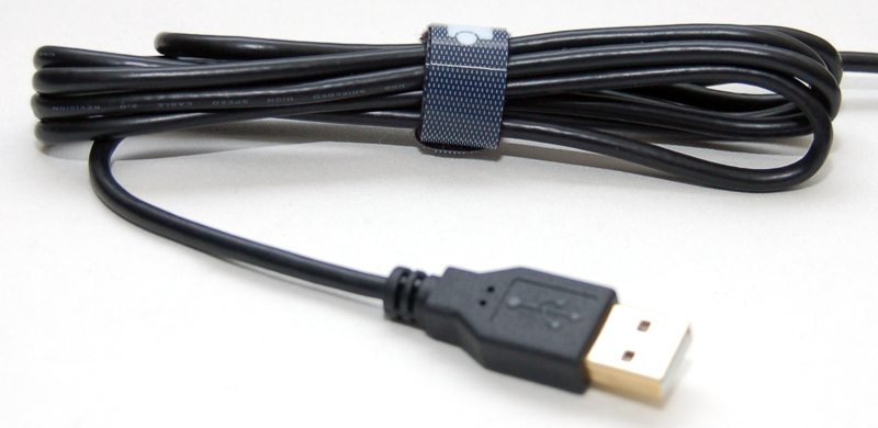
The cable feels nice and durable, features a small Velcro tidy strip and a 18k gold plated connector.
The front end of the keyboard features a windows key on the left side, but instead of actually just being a windows key, it can function as a second Ctrl key, much better than a disabled key as if you go for control and miss, you’re still hitting Ctrl!
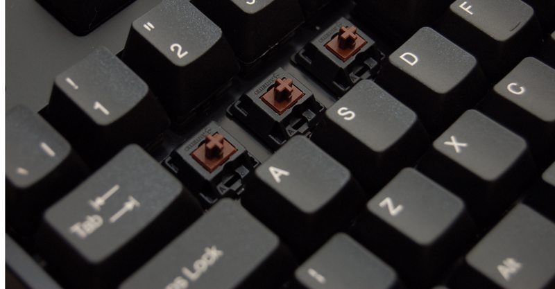
The key caps are nylon and have a nice tactile feel to them and an ever so slight texture. The underside features Cherry MX brown switches.
The underside of the keyboard features four large grip strips that help keep the keyboard in place, there are no flip out feel to raise the keyboard.

